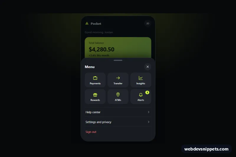
Bottom Sheet Mobile Menu
Dark mobile app menu that slides up from the bottom as a rounded sheet with a drag handle, quick action tiles, scrim, focus trap and swipe to close.
Menus and elements that help users move around a site or app.
30 component(s)
Dark mobile app menu that slides up from the bottom as a rounded sheet with a drag handle, quick action tiles, scrim, focus trap and swipe to close.
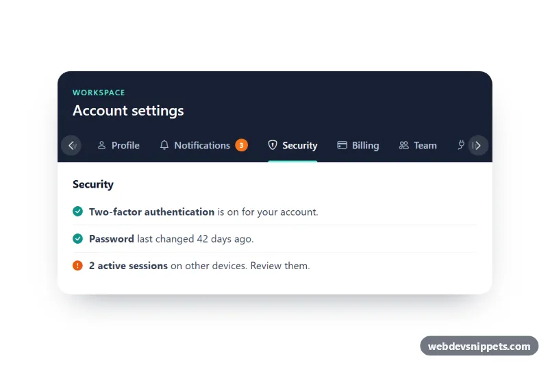
Bootstrap 5 tabs that scroll horizontally on small screens, with fade edges, arrow buttons, scroll snapping and the active tab centered automatically.
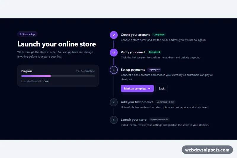
Dark Tailwind CSS vertical stepper with completed, current and upcoming states, step descriptions, a progress bar and Back / Mark as complete controls.
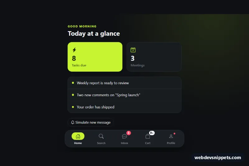
Fixed Bootstrap 5 mobile bottom navigation with icons, labels, notification badges, a 9+ overflow badge and a floating pill on desktop.
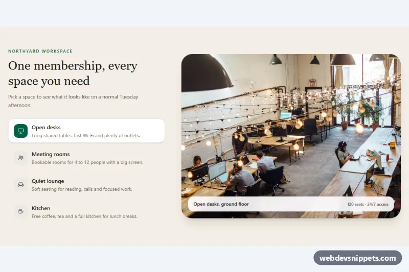
Tailwind CSS feature tabs that swap a large photo preview with a caption for each selected tab, with full keyboard support.
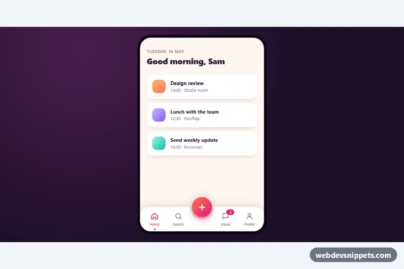
Pure CSS mobile tab bar with a curved notch, a raised gradient center button and three quick actions that fan out when it is tapped.
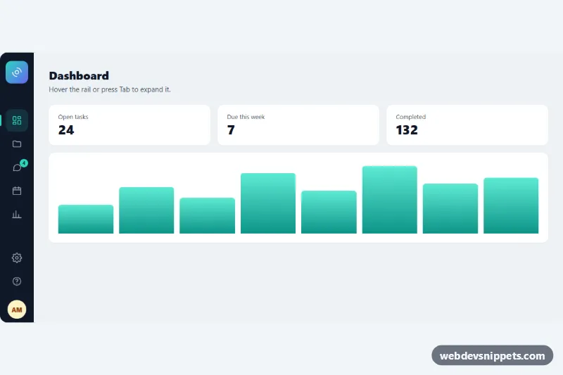
Pure CSS icon rail that widens to reveal labels, section headings and a profile on hover or keyboard focus, with an active link and badge.
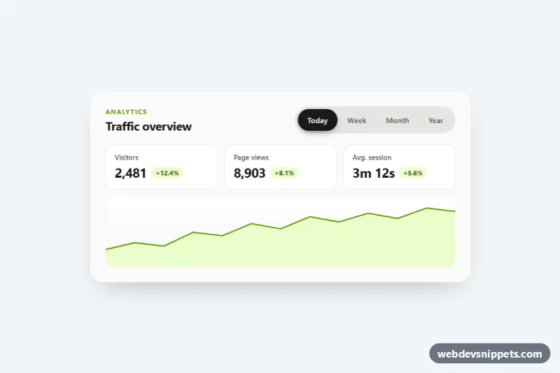
Segmented pill tabs with a sliding, springy background, ARIA tabs keyboard support and fading panels, shown on an analytics card. Pure CSS and vanilla JS.
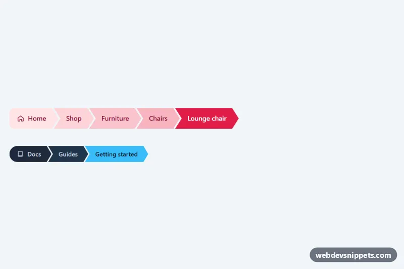
Chevron-shaped breadcrumb steps cut with CSS clip-path, with an interlocking layout, a color ramp toward the current page and a compact dark variant. No JavaScript.
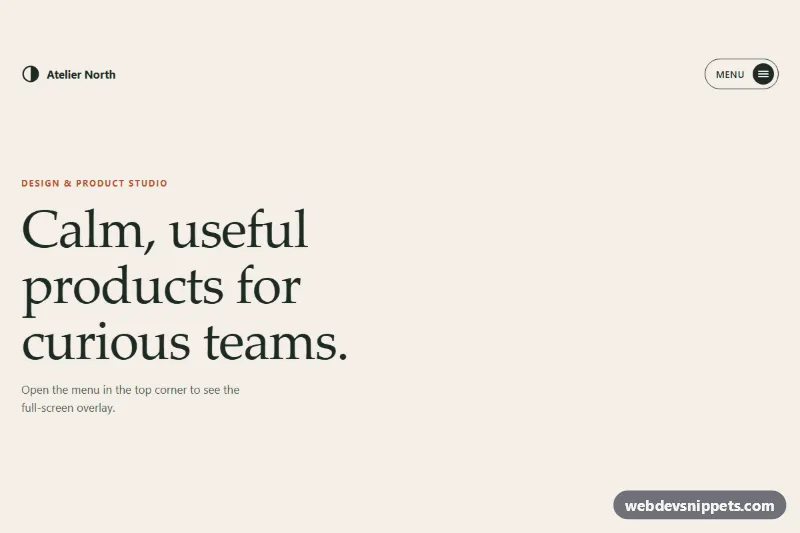
Hamburger button that opens a full-screen menu with a circular clip-path reveal, staggered serif links, focus trap and Escape to close, in pure CSS and vanilla JS.

Dark responsive navbar with a glowing underline that slides between links on hover, focus and click, built with CSS custom properties and vanilla JS.
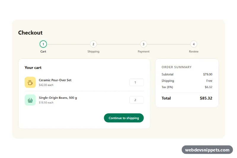
Bootstrap 5 four-step checkout with cart, shipping, payment and review steps, a progress bar, per-step validation, Back/Continue buttons and a live order summary.
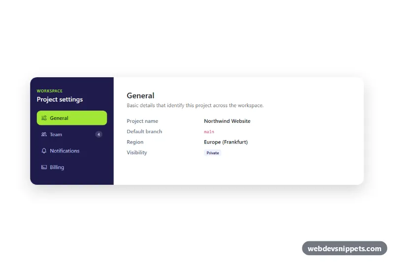
Bootstrap 5 vertical nav-pills tabs styled as a settings panel with a dark sidebar, icons, fading content panes and a scrollable mobile tab strip.
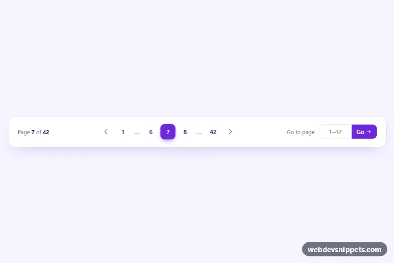
Bootstrap 5 pagination with smart ellipses, previous and next arrows, a page counter and a validated 'go to page' input.
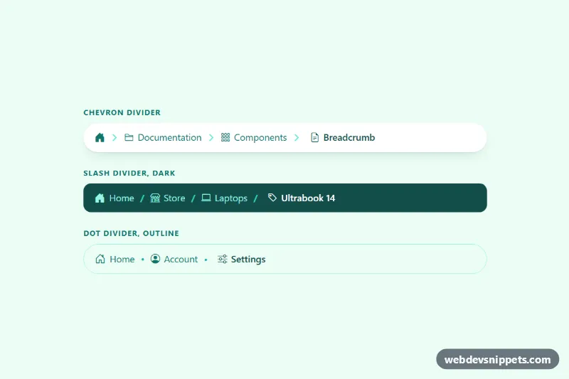
Bootstrap 5 breadcrumbs with a home icon, icons per level and custom chevron, slash or dot dividers that collapse middle levels on mobile.
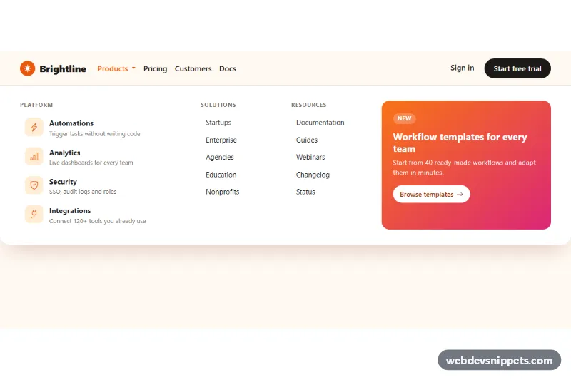
Full-width Bootstrap 5 mega menu with icon feature links, link columns and a gradient promo block, keyboard friendly and stacked on mobile.
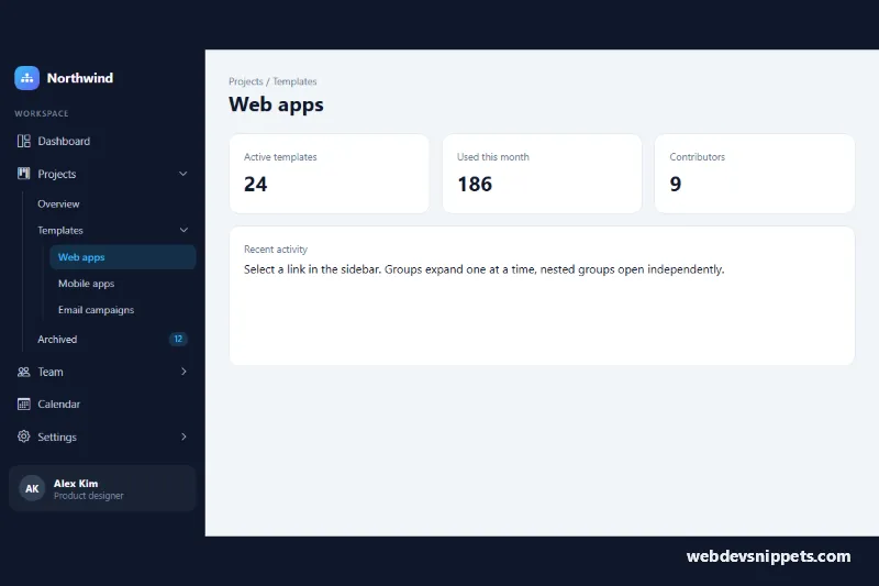
Dark Bootstrap 5 sidebar with three-level collapsible menu groups, accordion behavior, active link highlight and an off-canvas panel on mobile.
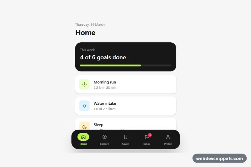
Fixed Tailwind CSS bottom tab bar with icons, labels, an active pill, an unread badge, safe-area padding and optional hide-on-scroll.
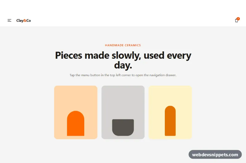
Tailwind CSS off-canvas mobile menu that slides in from the left with a backdrop, focus trap, Escape to close and an expandable submenu.
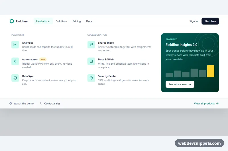
Tailwind CSS mega menu with two columns of product links, icons and descriptions, a featured promo card and full keyboard support.
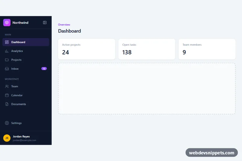
Dark Tailwind CSS dashboard sidebar with icons, grouped sections, an unread badge and a button that collapses it to an icon rail with tooltips.
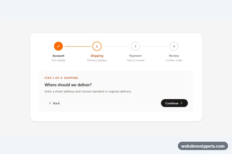
Tailwind CSS horizontal stepper with numbered circles, animated connector lines, completed/current/upcoming states and Back/Continue controls.
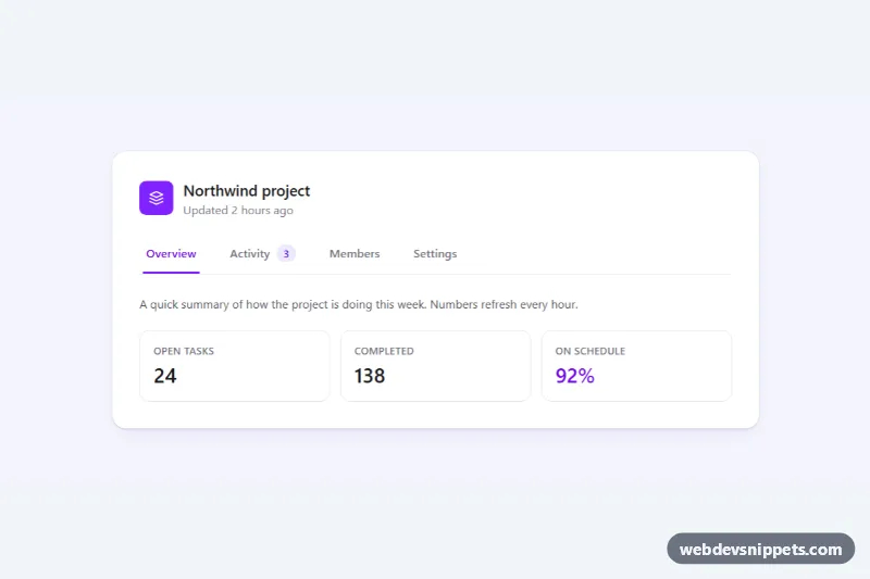
Accessible Tailwind CSS tabs with a sliding underline indicator, arrow-key and Home/End navigation, count badge and scrollable tab bar on mobile.
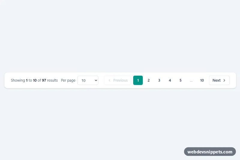
Tailwind CSS pagination bar with Previous/Next, numbered pages with ellipsis, a per-page select and a live 'Showing 1 to 10 of 97 results' summary.
Navigation is the set of menus and controls that let people find their way around a site or web app. It covers the top navbar, side navigation in dashboards, large mega menus for content-heavy sites, mobile menus, bottom tab bars, breadcrumbs, pagination, tabs and steppers. Good navigation answers three questions at a glance: where am I, where can I go, and how do I get back.
Wrap menus in a <nav> element and give each one a distinct aria-label when a page has more than one. Mark the current page with aria-current="page" so screen readers announce it. Every toggle should be a real <button> with aria-expanded and aria-controls, and every interactive item must be reachable with the Tab key and show a visible focus outline. Keep labels short and predictable, avoid hiding primary links behind a hamburger on desktop, and check that link colours meet contrast requirements against the background.
On small screens, plan the collapse behaviour first: decide which links stay visible, which move into a menu and how the menu closes (Escape key, close button, clicking outside).
Most navigation snippets come in Bootstrap 6, Bootstrap 5, Tailwind CSS and pure CSS versions. The Bootstrap 6 examples use the new alpha with ES module JavaScript, <dialog>-based components for off-canvas patterns and theme-* colour roles, while the Bootstrap 5 versions rely on the familiar collapse and dropdown plugins. Use the framework filter to narrow the list, check the live preview, then copy the HTML, CSS and JS from the code tabs or download the snippet and swap in your own links and brand.