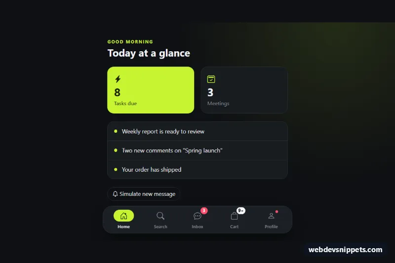
Bottom Navigation Bar with Badges
Fixed Bootstrap 5 mobile bottom navigation with icons, labels, notification badges, a 9+ overflow badge and a floating pill on desktop.
App-style tab bars fixed to the bottom of the screen.
3 component(s)
Fixed Bootstrap 5 mobile bottom navigation with icons, labels, notification badges, a 9+ overflow badge and a floating pill on desktop.
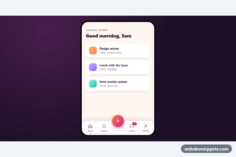
Pure CSS mobile tab bar with a curved notch, a raised gradient center button and three quick actions that fan out when it is tapped.
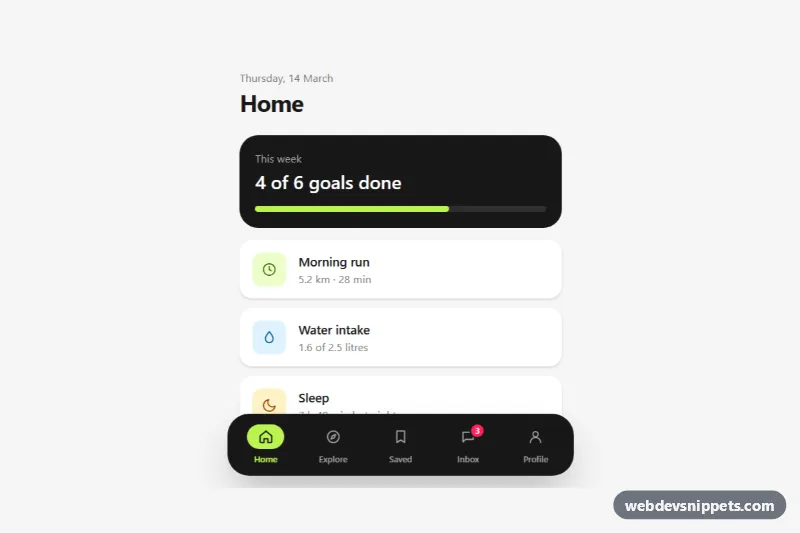
Fixed Tailwind CSS bottom tab bar with icons, labels, an active pill, an unread badge, safe-area padding and optional hide-on-scroll.
Bottom navigation is an app-style tab bar fixed to the bottom of the screen, typically with three to five icons and short labels. It is familiar from native mobile apps and works well in progressive web apps, mobile dashboards and mobile-first sites because the controls sit within easy reach of the thumb.
Use it for the top-level destinations of a mobile interface that users switch between often, such as Home, Search, Orders and Profile. It is not a good fit for more than five items, for sequential steps or for secondary actions. On larger screens, swap it for a sidebar or top navbar, since a bottom bar on desktop feels out of place.
<nav> element with an aria-label and mark the active tab with aria-current="page".padding-bottom: env(safe-area-inset-bottom) so the bar clears the home indicator on modern phones, and set viewport-fit=cover in the viewport meta tag.Bottom navigation snippets are offered in Bootstrap 6, Bootstrap 5, Tailwind CSS and pure CSS. Bootstrap versions combine fixed positioning with flex utilities, and the Bootstrap 6 alpha examples use theme-* colour roles so the bar adapts to light and dark themes. Tailwind and pure CSS versions are lightweight and need little or no JavaScript. Filter by framework, view the live preview at mobile width, then copy the HTML and CSS or download the snippet and replace the icons and links.