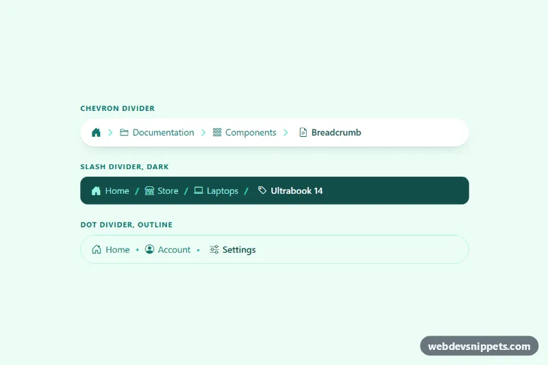
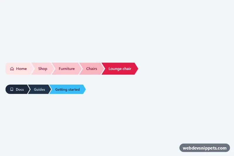
Three Bootstrap 5 breadcrumb styles with a home icon, an icon for every level and a custom divider: an SVG chevron, a slash on a dark bar and a dot on an outlined pill. Use them above page titles in documentation, online stores and account areas.
How it works
Each breadcrumb is a nav.bci-crumbs around Bootstrap's ol.breadcrumb. Every breadcrumb-item is a flex row, and links and the active item use inline-flex with a small gap so the Bootstrap Icons line up with the text. The first item in the chevron style shows only a house icon, with a visually-hidden "Home" label for screen readers.
The dividers come from Bootstrap's own ::before pseudo-element. The .bci-crumbs--slash and .bci-crumbs--dot modifiers set --bs-breadcrumb-divider to "/" and a bullet. The .bci-crumbs--chevron modifier replaces the text with an empty box painted in --bci-divider-color and shaped by an inline SVG mask, so the chevron can be recolored with one variable.
On screens narrower than 576px the middle levels marked .bci-mid are hidden and a .bci-more item with a three-dot .bci-more-btn takes their place. The script listens for a click on that button, adds .bci-crumbs--expanded to the breadcrumb, which shows the hidden levels again, sets aria-expanded="true" and moves focus to the first revealed link. On wider screens the full trail is always shown and the button stays hidden.
Customization
--bci-divider-coloron.bci-crumbsinstyle.css: changes the color of the chevron, slash or dot.--bci-divider-size: makes the SVG chevron larger or smaller.--bci-bg,--bci-linkand--bci-text: set the background, link color and current-page color for each style.--bci-radius: switch between a pill (999px) and a rounded bar (0.75rem).--bs-breadcrumb-dividerin.bci-crumbs--dot .breadcrumb: use any character, for example"\203A"for a single angle quote.- Remove
.bci-midfrom an item to keep it visible on small screens, or add it to more items to collapse them. - Swap the
bi-*classes on theielements to use other Bootstrap Icons per level.
Accessibility
Every trail is a nav with aria-label="Breadcrumb" and an ordered list, and the current page carries aria-current="page". Icons are aria-hidden, and the icon-only home link has a visually-hidden text. Dividers are generated by CSS, so they are not read aloud. The expand button has aria-expanded and an aria-label such as "Show 2 hidden levels". Links and the button get an outline on :focus-visible, and hover transitions are turned off under prefers-reduced-motion.
Usage notes
Requires Bootstrap 5 (added automatically) and Bootstrap Icons. Pick one style for your page and delete the other two nav blocks and their .bci-label captions. Without JavaScript the collapsed levels stay hidden on phones, so keep the script if you use .bci-mid.