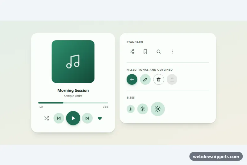
Icon Buttons with Ripple
Round icon buttons with a Material-style ripple, toggle states and tooltips: standard, filled, tonal and outlined variants in three sizes.
Components tagged with "icons".
10 component(s)
Round icon buttons with a Material-style ripple, toggle states and tooltips: standard, filled, tonal and outlined variants in three sizes.
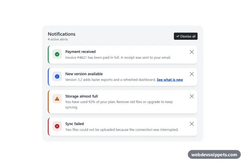
Bootstrap 5 dismissible alerts with icons, headings, per-alert close buttons, dismiss all, restore and screen reader announcements.
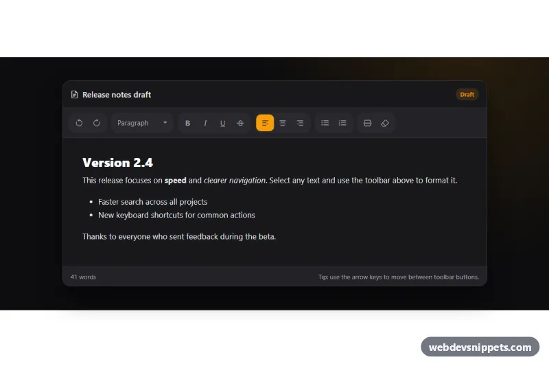
Dark Bootstrap 5 text editor toolbar with grouped icon buttons, toggle states, a block style dropdown, arrow key navigation and a working editable area.
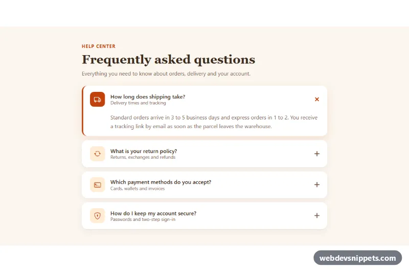
Bootstrap 5 FAQ accordion with leading icon tiles, subtitles, rounded cards, a rotating plus icon and a warm accent color.
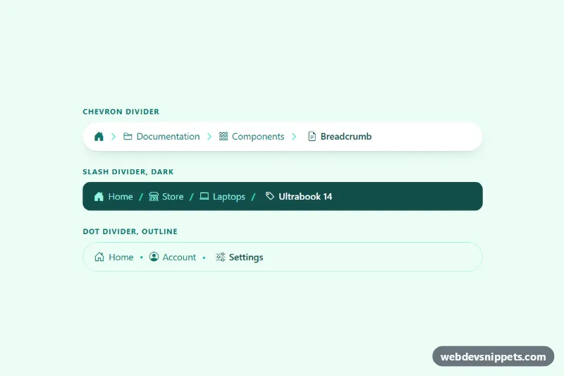
Bootstrap 5 breadcrumbs with a home icon, icons per level and custom chevron, slash or dot dividers that collapse middle levels on mobile.
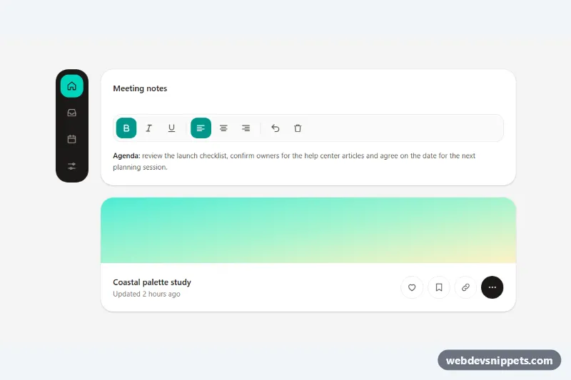
Accessible Tailwind CSS icon buttons with tooltips as labels, toggle states, a keyboard-friendly toolbar, a navigation rail and Escape to dismiss.
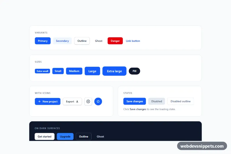
Tailwind CSS button set with primary, secondary, outline, ghost, danger and link variants, five sizes, icon buttons, loading and disabled states.
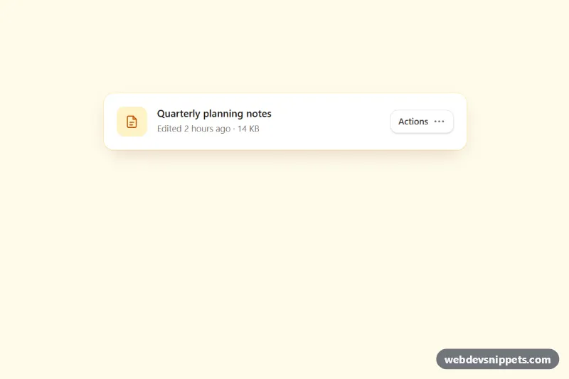
Accessible Tailwind CSS menu button with icons, grouped items, dividers, shortcut hints, typeahead and full arrow-key navigation.
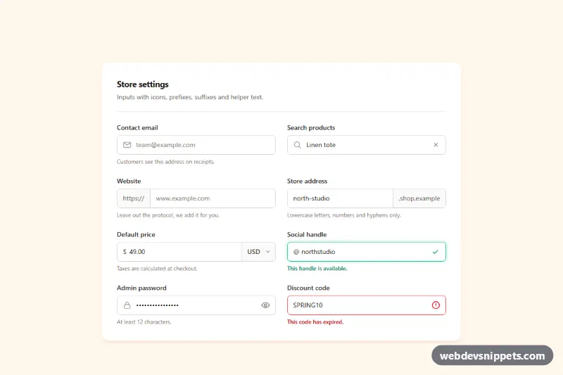
Tailwind CSS input group examples with leading icons, text prefixes and suffixes, a currency select, password toggle, clear button and helper text.
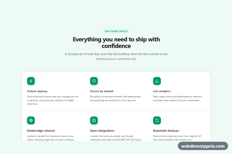
Responsive Tailwind CSS feature section with six features, inline SVG icons, hairline dividers and a subtle hover accent.