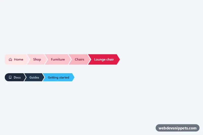
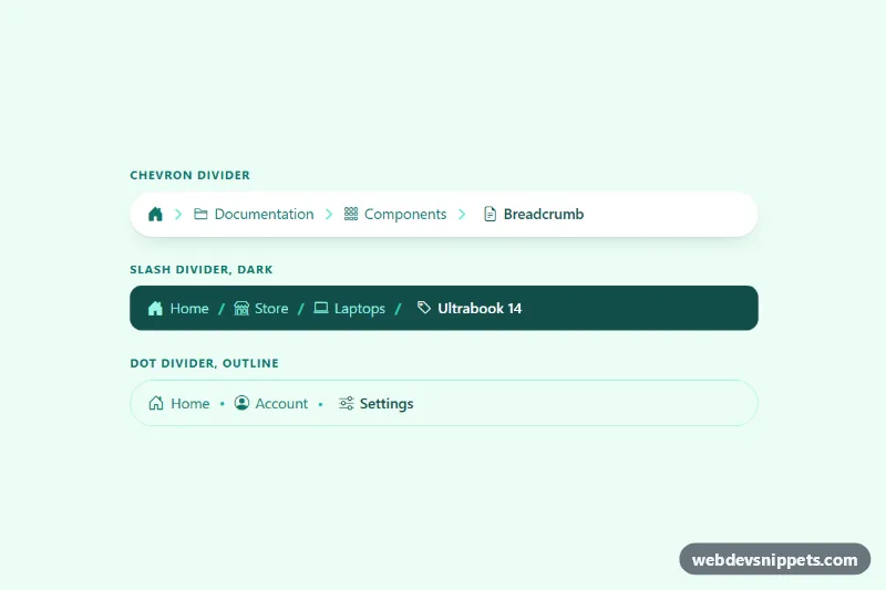
Arrow-shaped breadcrumbs in pure CSS, with no JavaScript at all: every step is a chevron cut with clip-path, the steps interlock like puzzle pieces, and each one is slightly deeper in color than the last, leading the eye to the current page. Use them in shops, documentation and admin panels.
How it works
Each trail is a nav.ab-crumbs with an ordered list ol.ab-list. Every li.ab-item contains one .ab-link: an anchor for parent pages, or a span with aria-current="page" for the current page. The first step can hold an inline SVG icon next to its .ab-label.
The chevron is a clip-path: polygon() on .ab-link with a notch on the left and a point on the right, both sized by --ab-tip. A negative left margin on .ab-item + .ab-item pulls each step into the notch of the next, leaving a thin --ab-gap that reads as a white separator. The first step uses a second polygon without a notch plus border-radius for a rounded start.
The color ramp comes from --ab-mix, set to 0%, 8%, 16%, 24% and 32% with nth-child rules, and color-mix() blends --ab-current-bg into --ab-bg by that amount. Hover raises the mix to --ab-hover-mix, and the current step uses the full accent. Browsers without color-mix() fall back to the flat --ab-bg.
The .ab-crumbs wrapper scrolls horizontally if the trail is wider than its container, and below 480px the text of the first step is visually hidden so only the icon remains. The .ab-demo wrapper only spaces out the two examples.
Customization
--ab-bg,--ab-textand--ab-current-bgon.ab-crumbs: the base step color, the text color and the accent of the current step that the ramp blends toward.--ab-tip: depth of the arrow point and notch; use0.5remfor a subtle angle or1.25remfor sharp arrows.--ab-gap: width of the separator between steps;0makes the chevrons touch.--ab-heightand--ab-font-size: step height and text size.--ab-radius: rounding of the first step,999pxgives the pill start used in the compact trail..ab-crumbs--compact: add it to anav.ab-crumbsfor the smaller dark slate and sky variant, or copy its variable block to make your own theme.- Edit the
--ab-mixvalues on the.ab-item:nth-child()rules for a stronger or flatter color ramp.
Accessibility
Each trail is a nav landmark with its own aria-label, and the steps are an ordered list, so screen readers announce the position and the number of levels. The current page is a non-link span with aria-current="page", and the icons are aria-hidden="true". The visually hidden label on small screens keeps the first link named. Because clip-path would cut off a normal outline, .ab-item:focus-within draws a focus ring around the chevron shape with four drop-shadow() filters and the text is underlined. The only transition is disabled with prefers-reduced-motion: reduce.
Usage notes
Add or remove li.ab-item elements freely; steps after the fifth share the deepest ramp color.