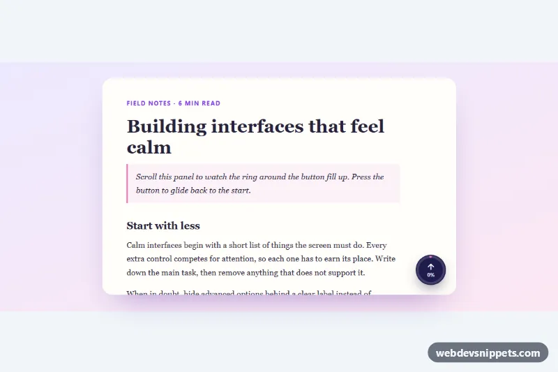
Back to Top Button with Scroll Progress
Round back-to-top button with an SVG ring that fills as you scroll, a percentage label and smooth scrolling, for the page or any scroll container.
Components tagged with "accessible".
20 component(s)
Round back-to-top button with an SVG ring that fills as you scroll, a percentage label and smooth scrolling, for the page or any scroll container.
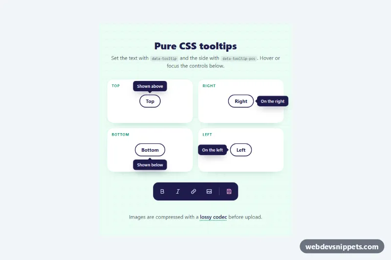
JavaScript-free tooltips driven by data attributes, with top, right, bottom and left placement, arrows, color tones and hover or focus triggers.
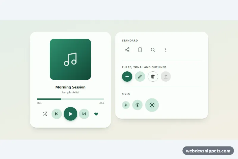
Round icon buttons with a Material-style ripple, toggle states and tooltips: standard, filled, tonal and outlined variants in three sizes.

Accessible pure CSS star rating input with half stars, built on native radio buttons, hover preview and a live value label.
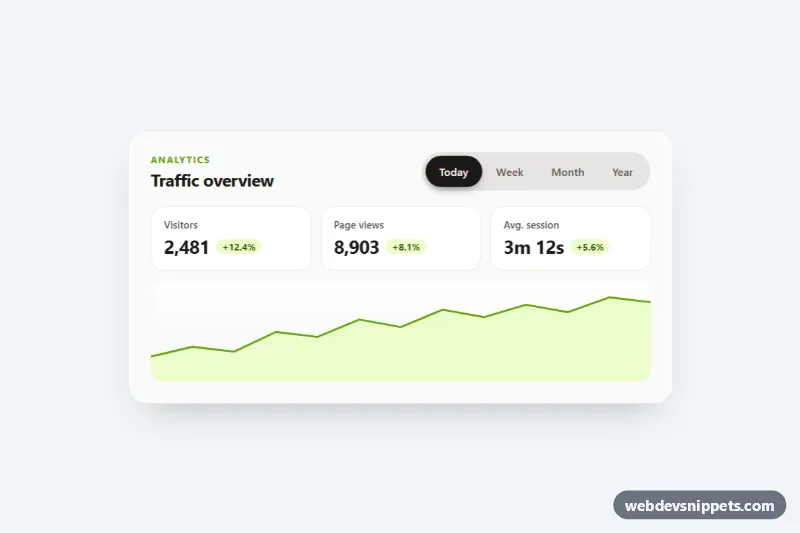
Segmented pill tabs with a sliding, springy background, ARIA tabs keyboard support and fading panels, shown on an analytics card. Pure CSS and vanilla JS.
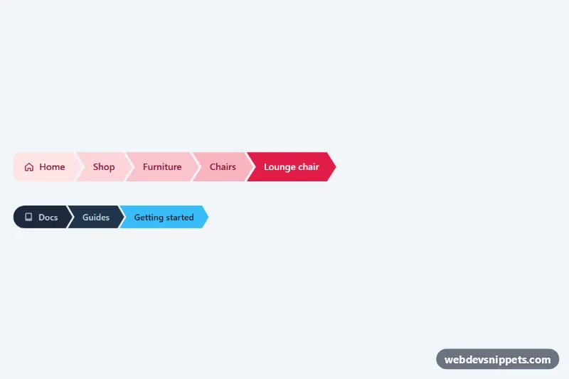
Chevron-shaped breadcrumb steps cut with CSS clip-path, with an interlocking layout, a color ramp toward the current page and a compact dark variant. No JavaScript.
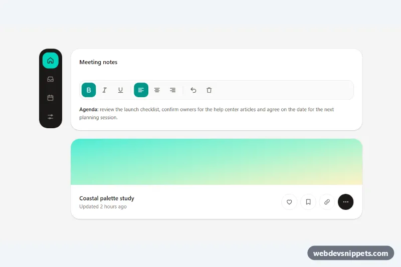
Accessible Tailwind CSS icon buttons with tooltips as labels, toggle states, a keyboard-friendly toolbar, a navigation rail and Escape to dismiss.
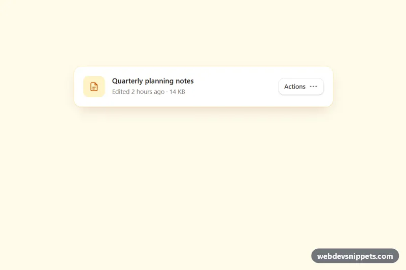
Accessible Tailwind CSS menu button with icons, grouped items, dividers, shortcut hints, typeahead and full arrow-key navigation.

Accessible Tailwind CSS combobox that filters options as you type, highlights matches and supports full keyboard navigation.
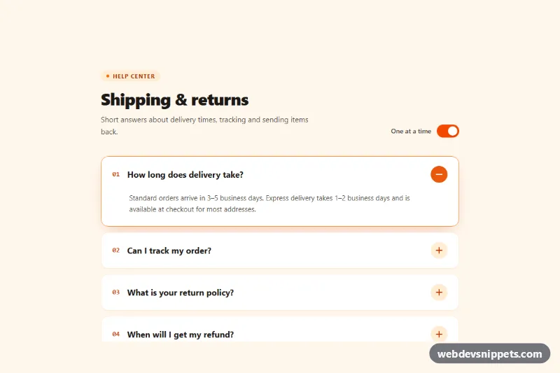
Tailwind CSS accordion with a rotating plus/minus icon, smooth height animation, keyboard navigation and a switch for single-open or multi-open mode.
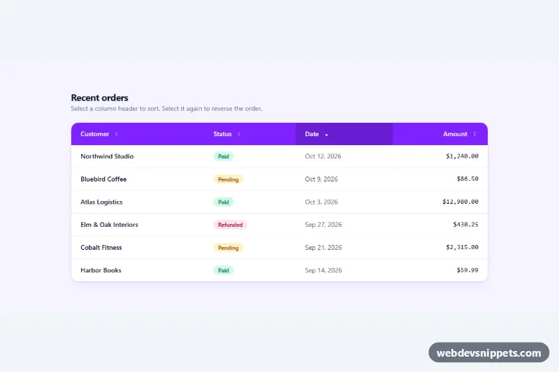
Tailwind CSS data table with clickable column headers that sort text, dates and numbers, with aria-sort, arrow indicators and a responsive scroll wrapper.
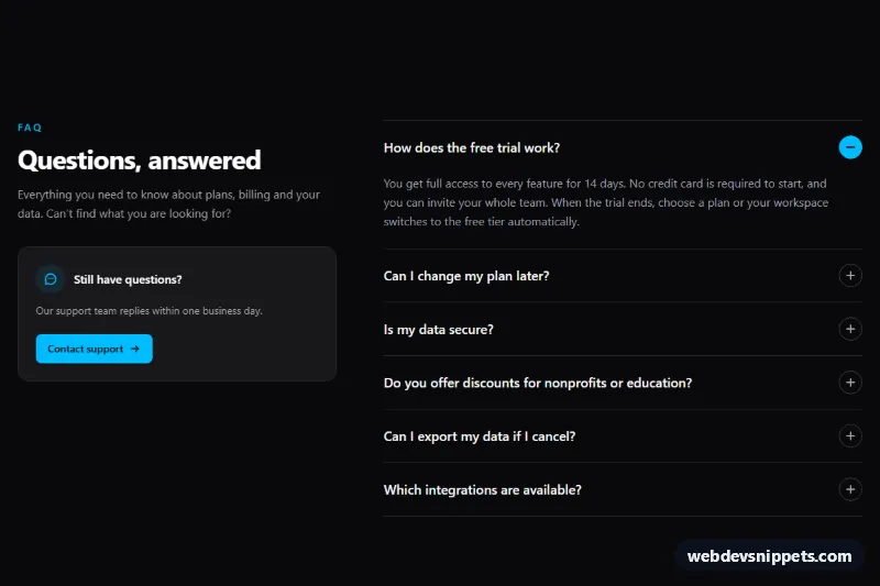
Dark Tailwind CSS FAQ section with an accessible accordion, smooth expand animation, keyboard navigation and a support contact card.
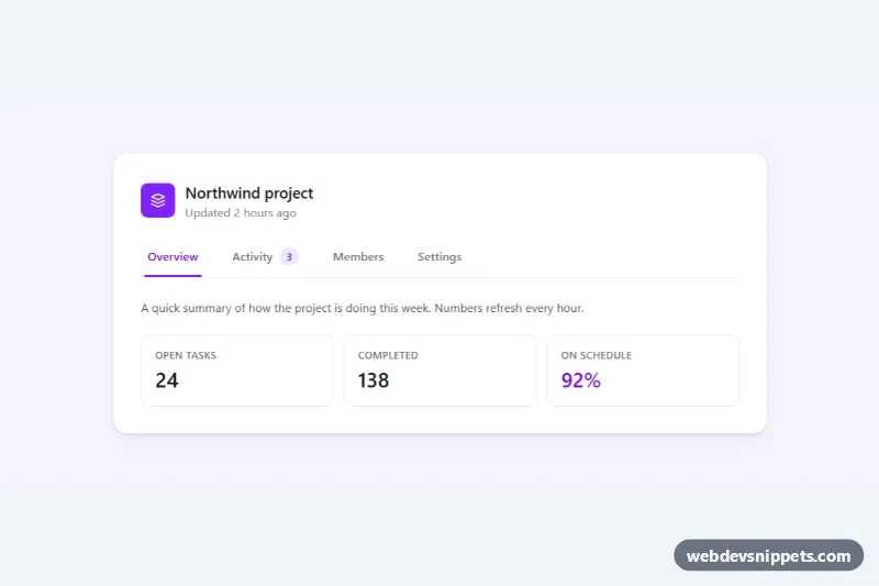
Accessible Tailwind CSS tabs with a sliding underline indicator, arrow-key and Home/End navigation, count badge and scrollable tab bar on mobile.
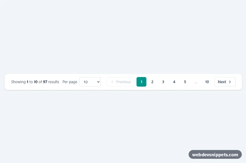
Tailwind CSS pagination bar with Previous/Next, numbered pages with ellipsis, a per-page select and a live 'Showing 1 to 10 of 97 results' summary.
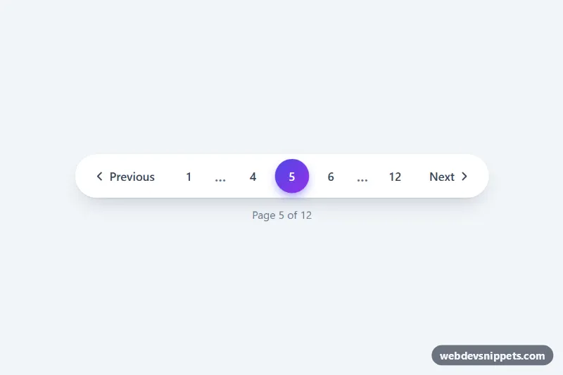
Pill-shaped pagination with ellipsis, previous/next buttons and a gradient active page, made interactive with a few lines of vanilla JS.
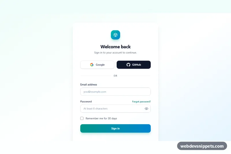
Tailwind CSS login form with Google and GitHub buttons, remember me, password visibility toggle and accessible inline validation.
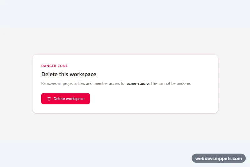
Accessible Tailwind CSS modal dialog with focus trap, Escape and backdrop close, scroll lock and a type-to-confirm delete action.
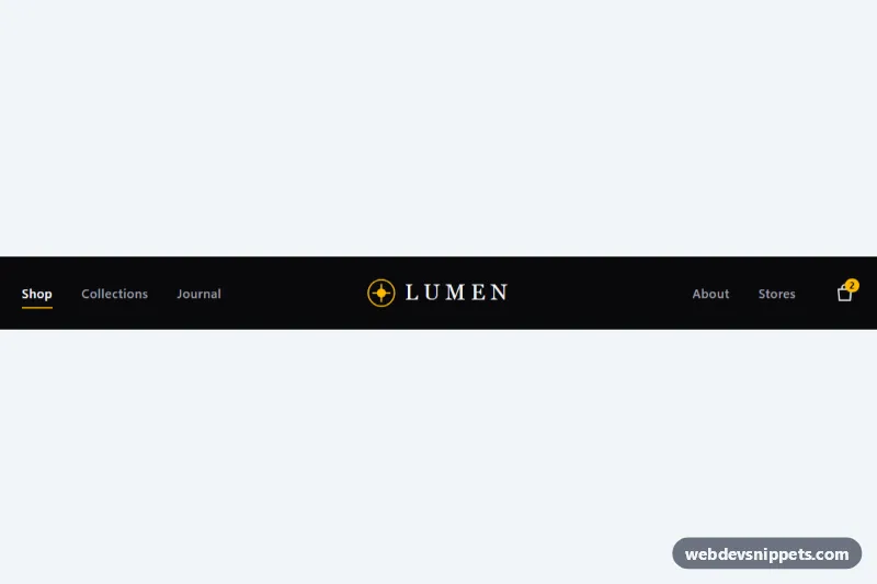
Dark Tailwind CSS navbar with links split around a centered logo, animated underlines and an accessible slide-down mobile menu.
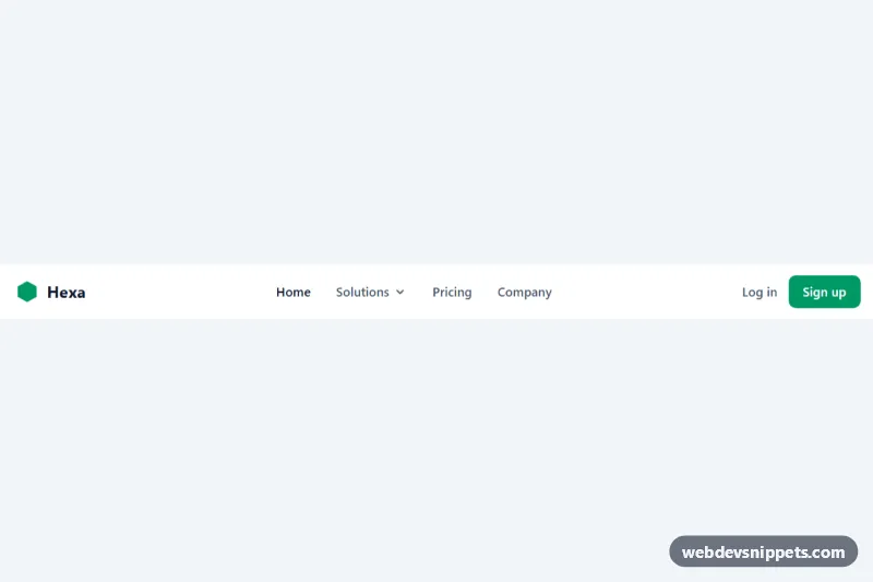
Tailwind CSS navbar with an accessible dropdown, call-to-action buttons and a collapsible mobile menu.
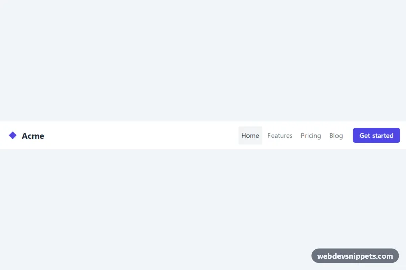
Accessible pure CSS navbar that collapses into a hamburger menu on small screens.