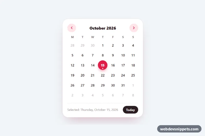
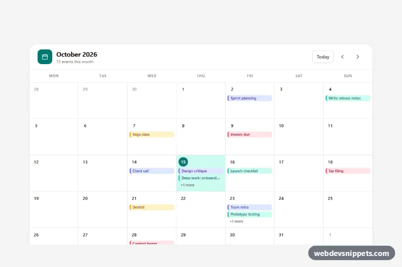
A compact month calendar generated with vanilla JavaScript and styled with pure CSS. It shows one month at a time, marks today with a dot, lets users pick a day with mouse or keyboard and reports the choice in a footer. Use it in sidebars, booking widgets, dashboards or as the base of a custom date picker.
How it works
The root .mc-cal carries data-mc-calendar plus three options: data-week-start, data-locale and data-selected. The markup only contains the shell: the .mc-head row with .mc-prev, the .mc-month heading and .mc-next, an empty table.mc-grid, and the .mc-foot row with the .mc-picked text and the .mc-today button.
On DOMContentLoaded the script fills the header row with weekday names from Intl.DateTimeFormat, so they follow the chosen locale, and renders the month into .mc-body. It always draws six weeks so the calendar never changes height. Days of the current month become button.mc-day elements with a data-date value in YYYY-MM-DD format; days of the previous and next month are muted .mc-day--outside spans. The selected day gets aria-pressed="true" and a filled circle, and today gets aria-current="date", shown as an accent number with a small dot.
Clicking a day, or pressing the Today button, selects it, updates data-selected on the root and fires a bubbling mc:select event whose detail.date holds the ISO date. The arrow buttons move one month back or forward.
Customization
data-week-start="1"on.mc-cal: use0to start weeks on Sunday.data-locale="en-US": any BCP 47 tag such asde-DEorfr-FRtranslates the month name, the weekday headers and the formatted dates.data-selected: set an ISO date like2026-03-14to preselect a day; leave it empty to select today.--mc-accentand--mc-accent-soft: the selected day, today marker, hover circle and navigation buttons.--mc-size: the maximum diameter of each day circle.--mc-radiusandmax-width: 21remin.mc-cal: the card corner radius and width.- Listen for
mc:selecton the root to fill a hidden input or load events for the chosen date.
Accessibility
The calendar is a real data table labelled by the month heading through aria-labelledby, with weekday column headers whose abbr titles give the full names. Each day button has a full date aria-label such as "Thursday, October 15, 2026" and uses aria-pressed for the selection. A roving tabindex keeps only one day in the Tab order: arrow keys move by day and week, Home and End jump to the start and end of the week, PageUp and PageDown change the month (with Shift, the year). The month heading and the selection text are aria-live regions. Every control has a visible :focus-visible outline, and prefers-reduced-motion turns off the transitions.
Usage notes
The calendar needs JavaScript to render its days. Several calendars can share a page; each gets its own heading ID.