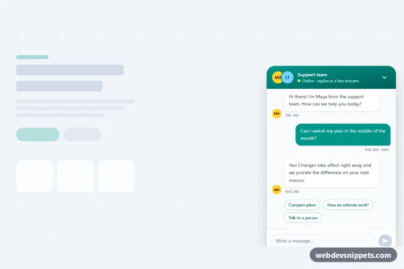
A customer support chat widget built with Tailwind CSS and vanilla JavaScript. A round launcher button opens a floating chat window with an agent header, message history, suggested replies, a typing indicator and an auto-growing message box. Use it as the front end for a help desk, sales chat or AI assistant.
How it works
The root is .tcw-widget. Inside it sit the #tcw-panel chat window (data-tcw-panel) and the launcher button (data-tcw-launcher). In this demo both are positioned absolute inside the root and the panel starts open so you can see it; the launcher toggles the panel's hidden attribute and its own aria-expanded, which CSS uses to swap the chat and close icons.
The message list (data-tcw-log) is a role="log" region. When the form (data-tcw-form) is submitted, the script trims the text, removes the suggested reply chips (data-tcw-quick-group), and appends a user bubble built with createElement and textContent, so typed HTML is never rendered. It then shows the typing indicator (data-tcw-typing) and, after a short delay, adds an agent reply chosen by getReply() from the keyword rules in the REPLIES array. If the window is closed when a reply arrives, the data-tcw-badge counter on the launcher shows the number of unread messages.
The textarea (data-tcw-input) sends on Enter and adds a new line on Shift + Enter, grows up to 128px tall, and keeps the send button (data-tcw-send) disabled while empty. style.css holds the panel pop-in, the .tcw-msg-in slide for new messages and the bouncing .tcw-dot animation.
Customization
absoluteon.tcw-paneland.tcw-launcher: change both tofixedto pin the widget to the corner of the viewport on every page.- Add
hiddento#tcw-paneland setaria-expanded="false"on the launcher so the chat starts closed. data-tcw-agenton.tcw-widget: the agent name used in screen reader labels and the avatar initials of new replies.from-teal-600 to-teal-800in the header andbg-teal-600on the user bubbles, send button and launcher: swaptealfor your brand color.REPLIESandFALLBACKinscript.js: edit the demo answers, or replacegetReply()and thesetTimeoutinrespond()with afetch()call to your chat API or LLM endpoint.max-w-smandh-[min(36rem,calc(100%-7.5rem))]on.tcw-panel: make the window wider or taller.- Add or edit the
data-tcw-quickbuttons to offer different suggested replies.
Accessibility
The panel is a labelled section, and the message list uses role="log" so new messages are announced politely. Each bubble starts with hidden text such as "You wrote:" or "Maya wrote:", and decorative avatars are aria-hidden. The launcher exposes aria-expanded and aria-controls, and its hidden label includes the unread count. Escape closes the window and returns focus to the launcher, the textarea has a real label, and every control has a visible focus ring. Animations are disabled under prefers-reduced-motion: reduce.
Usage notes
The widget uses fixed id values (tcw-panel, tcw-input), so place one per page. Messages live only in the DOM, so persist them server-side if needed.