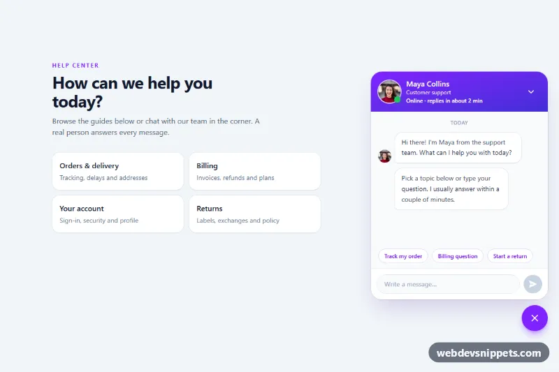
Support Chat Popup with Agent Photo
Tailwind CSS support chat popup with an agent photo, online status dot, suggested questions, typing indicator, unread badge and simulated replies.
Chat bubbles and messaging UIs.
3 component(s)
Tailwind CSS support chat popup with an agent photo, online status dot, suggested questions, typing indicator, unread badge and simulated replies.
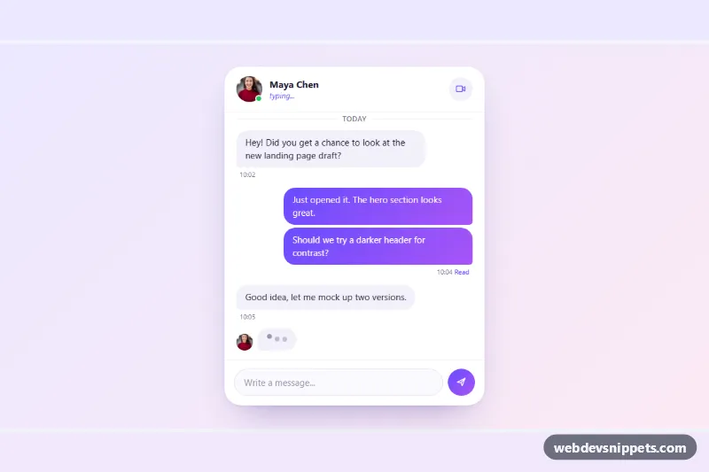
Pure CSS chat window with grouped incoming and outgoing message bubbles, an animated three-dot typing indicator and a working composer.
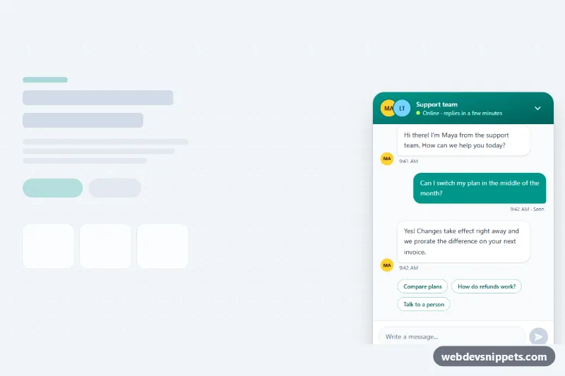
Tailwind CSS support chat widget with floating launcher, unread badge, message bubbles, suggested replies, typing indicator and Enter-to-send input.
A chat widget is a messaging interface embedded in a web page. It can be a floating chat bubble that opens a support window, a full messenger layout with a contact list and conversation pane, or an AI assistant panel. Typical parts are message bubbles, timestamps, avatars, typing indicators, a message input and a send button.
Use these templates when you are building customer support chat, internal messaging, a chatbot front end or a prototype for a messaging app. They give you the layout and interaction states; you connect them to your own backend, WebSocket or chat API.
Best practices for an accessible chat interface:
role="log" and aria-live="polite" so new messages are announced without interrupting.Each chat widget comes with a live preview and code tabs for HTML, CSS and JS. Bootstrap 6 versions use the new alpha ES module build, theme-* colour roles and, where a chat opens as a panel, the <dialog>-based components. Bootstrap 5 versions use cards, offcanvas and utilities, Tailwind CSS versions use utility classes, and pure CSS versions stay framework-free. Use the framework filter, copy or download the code, then wire it to your messaging logic.