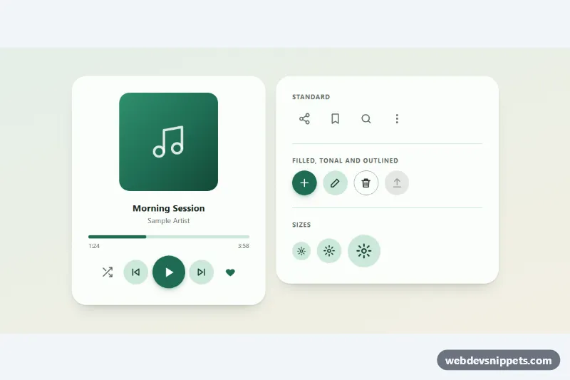
Icon Buttons with Ripple
Round icon buttons with a Material-style ripple, toggle states and tooltips: standard, filled, tonal and outlined variants in three sizes.
Components tagged with "toggle".
9 component(s)
Round icon buttons with a Material-style ripple, toggle states and tooltips: standard, filled, tonal and outlined variants in three sizes.
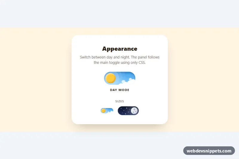
Animated pure CSS day and night toggle switch where the sun turns into a cratered moon, clouds drift away and stars appear.
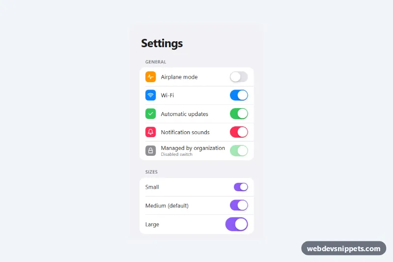
Pure CSS iOS style toggle switches built on real checkboxes, in a grouped settings list with three sizes, five colors and a disabled state.
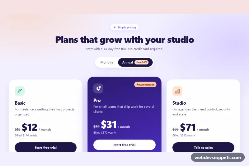
Bootstrap 5 pricing cards with a Monthly / Annual segmented switch that updates prices, savings and yearly totals, plus a highlighted featured plan.
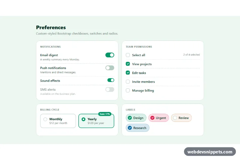
Restyled Bootstrap 5 checkboxes, large switches, select-all with indeterminate state, radio cards and colored checkbox chips.
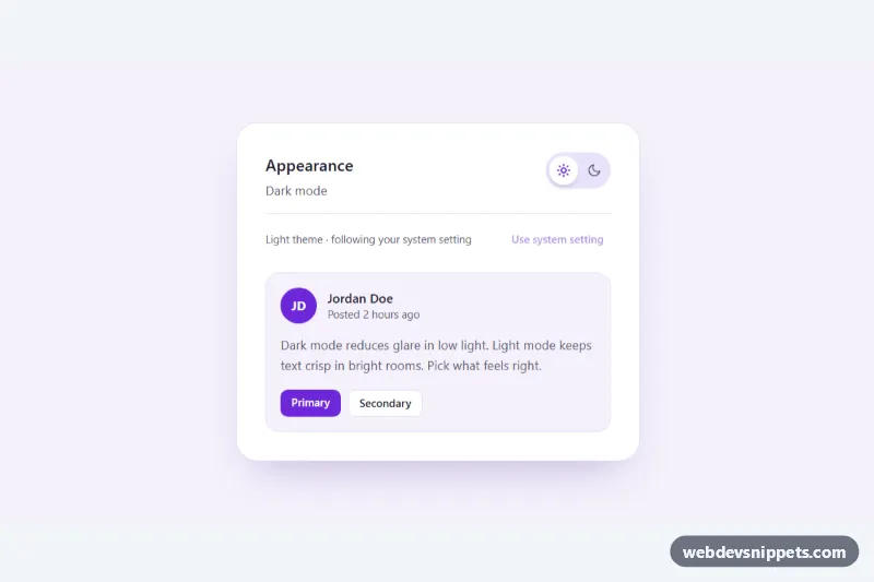
Tailwind CSS dark mode toggle with an animated sun/moon switch that follows the system preference, remembers the choice and can reset to system.
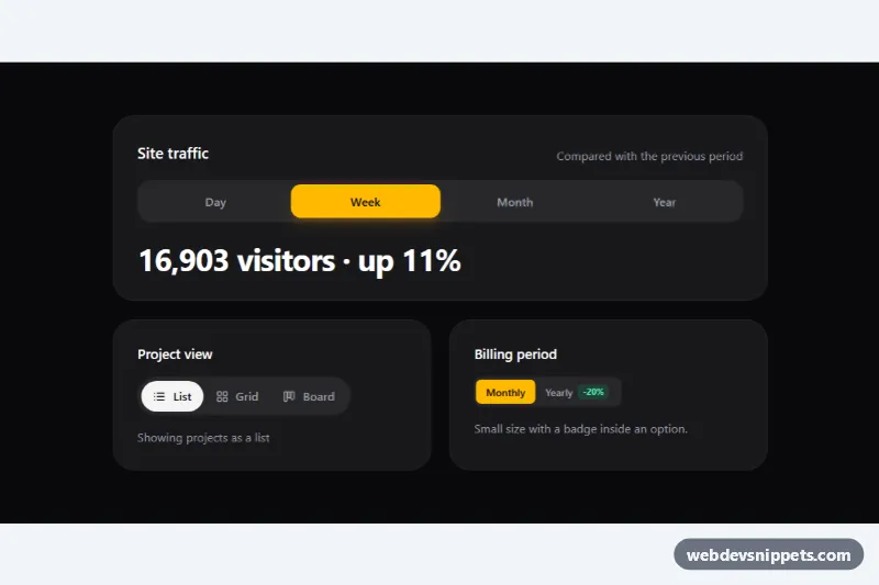
Tailwind CSS segmented control with a sliding thumb, built on native radio inputs for single-choice view, range and billing toggles.
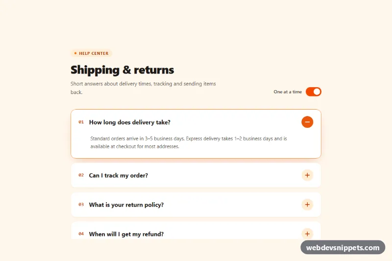
Tailwind CSS accordion with a rotating plus/minus icon, smooth height animation, keyboard navigation and a switch for single-open or multi-open mode.
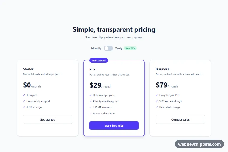
Three-tier Tailwind CSS pricing section with an accessible billing switch and a highlighted plan.