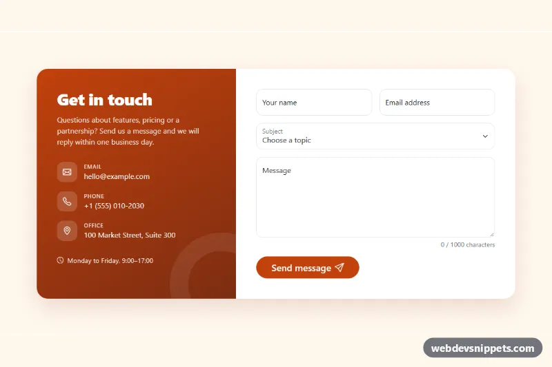
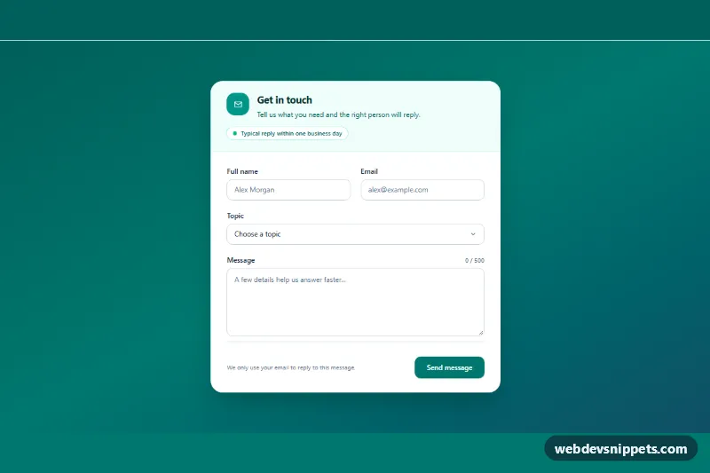
A Bootstrap 5 contact form with floating labels, client-side validation, a live character counter and a success message, paired with a colored panel for email, phone, address and office hours. Use it on contact pages, support pages and the footer area of company sites.
How it works
The root is section.cf-contact. Inside it, .cf-shell is a rounded white card split by a Bootstrap row g-0: the .cf-aside panel (col-lg-5) with a diagonal gradient and the .cf-details list, and .cf-main (col-lg-7) with the form. Below the lg breakpoint the panel sits on top of the form.
The .cf-form uses novalidate and Bootstrap form-floating fields: name (minlength="2"), email (type="email" plus a pattern that requires a dot in the domain), a subject select and the .cf-message textarea (minlength="20", maxlength="1000"). The script listens for input on the textarea and writes "120 / 1000 characters" into .cf-count; at 90% of the limit .cf-count--limit makes the counter bold. On submit it calls checkValidity(). Invalid forms get was-validated, aria-invalid and aria-describedby are set on every field and the first invalid field is focused. A valid form shows a spinner in .cf-submit, then resets the form, clears the validation state and reveals the .cf-alert message with the sender's first name.
Customization
--cf-accent,--cf-accent-hoverand--cf-accent-rgbin.cf-contact: recolor the submit button and the focus ring of the fields.--cf-aside-fromand--cf-aside-toin.cf-contact: change the gradient of the contact details panel.--cf-page-bgin.cf-contact: set the section background, ortransparentto blend into your page.--cf-radiusin.cf-contact: make the card corners rounder or square.maxlength="1000"on.cf-message: change the message limit; the counter reads the value automatically.height: 11remin.cf-form .cf-message: make the message box taller or shorter.- The options of
#cf-subject: replace them with your own topics. - The
window.setTimeoutcall inscript.js: replace it with afetch()to your backend or form service.
Accessibility
The section is labelled by #cf-title and the details panel is an aside with its own label. Every field has a real label. Error messages are linked through aria-describedby only while a field is invalid, and the textarea is always described by the counter. The success alert lives inside a .cf-status element with role="status", so it is announced without moving focus. During sending the button uses aria-disabled, so focus stays on it. Icons are aria-hidden, and the alert's slide-in animation is turned off with prefers-reduced-motion: reduce.
Usage notes
Requires Bootstrap 5 and Bootstrap Icons. Client-side validation helps users but is not security: always validate again on the server.