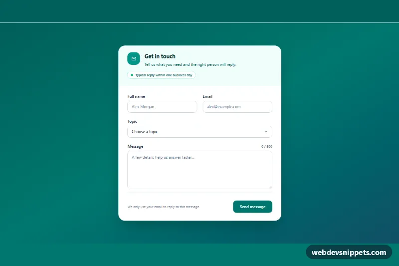
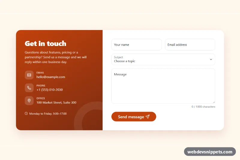
A contact form card built with Tailwind CSS and vanilla JavaScript, with name and email fields, a topic select, a message textarea with a live character counter and progress bar, inline validation and a simulated send state. Drop it into a contact page, a support section or a landing page footer.
How it works
The root is section.tcf-contact, a teal gradient background that centers a white card. The card header holds an icon, the title and a response-time pill. The form marked data-tcf-form uses a two-column grid from the sm breakpoint for name and email, then a full-width select with a custom chevron and the message textarea. Every input carries the class .tcf-field, a data-tcf-label and an aria-describedby that points to its error paragraph (data-tcf-error).
The script initializes every .tcf-contact on DOMContentLoaded. On each input event in the textarea, updateCounter() writes "used / max" into data-tcf-count, scales the .tcf-meter bar and sets data-tcf-state on the root to ok, warn or full, which style.css uses to turn the counter and bar amber or red. The form has novalidate, so the script runs checkValidity() itself on submit, writes a readable message per field (missing value, invalid email, too short), sets aria-invalid and focuses the first invalid field. After the first attempt, fields revalidate as the user types. A valid submit shows a spinner for SEND_DELAY milliseconds, resets the form and reveals the success panel (data-tcf-success) with a personalised message.
Customization
maxlength="500"on#tcf-message: change the character limit; the counter and meter read it automatically.data-tcf-warn="50"ondata-tcf-count: number of remaining characters at which the counter turns amber.minlength="20"on#tcf-message: minimum message length, or remove it to allow short notes.- The
optionelements in#tcf-topic: list your own topics; the chosen label appears in the success message. from-teal-800 via-teal-700 to-cyan-900on.tcf-contactandbg-teal-700on the submit button: swap for another color pair to rebrand the card.SEND_DELAYand the timeout in thesubmithandler ofscript.js: replace the timeout withfetch('/api/contact', { method: 'POST', body: data })to send real messages.max-w-xlon the card: widen it tomax-w-2xlfor longer forms.
Accessibility
Every control has a visible label, and errors are linked with aria-describedby and flagged with aria-invalid, so screen readers read the message with the field. The counter is also part of the textarea description, while a polite live region (data-tcf-limit) only announces when the user gets close to or reaches the limit instead of on every keystroke. The submit button sets aria-busy while sending, and the success panel is a focused role="status" region. Focus rings are visible on all fields and the button, and the meter transition and spinner speed respect prefers-reduced-motion: reduce.
Usage notes
For several forms on one page, give each copy unique id values and update the matching for and aria-describedby attributes.