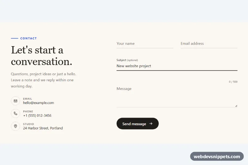
Minimal Contact Form with Animated Underline Inputs
Pure CSS minimal contact form with floating labels, underlines that sweep in on focus, a character counter and accessible inline validation.
Contact and inquiry forms.
3 component(s)
Pure CSS minimal contact form with floating labels, underlines that sweep in on focus, a character counter and accessible inline validation.
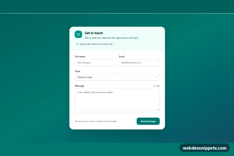
Tailwind CSS contact form card with a topic select, live character counter and meter, inline validation and a simulated sending state.
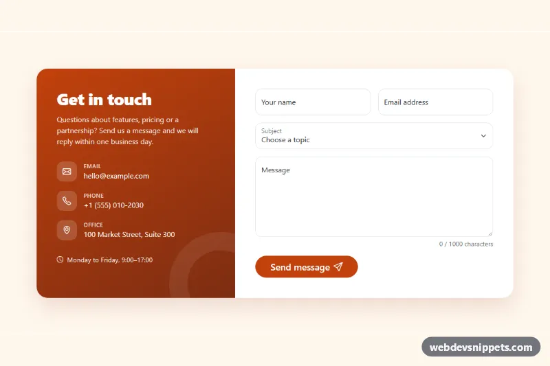
Bootstrap 5 contact form with floating labels, client-side validation, a character counter, a success message and a contact details panel.
A contact form lets visitors send a message without opening their email client. A typical form asks for a name, email address, subject or topic and a message, and sometimes a phone number, company or budget for quote requests. Contact forms appear on contact pages, in footers, in sidebars and inside modals on service and product sites.
<label> and mark required fields clearly, in text, not just with colour or an asterisk.type="email" with autocomplete="email", type="tel" with autocomplete="tel", autocomplete="name".aria-describedby.<select> or radio buttons for topics so messages reach the right team.The responsive contact form examples on this page include simple stacked forms, two-column layouts, forms with contact details and forms with a map beside them. Bootstrap 6 versions use theme-* colour roles for focus and validation states. Bootstrap 5 versions use .form-control, .form-select and the grid, Tailwind CSS versions use spacing and focus ring utilities, and pure CSS versions are framework-free HTML and CSS. Preview, copy and adapt them, then point the form action to your own endpoint or backend script.