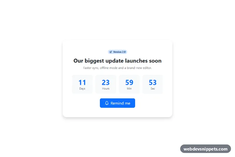
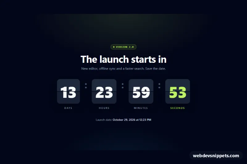
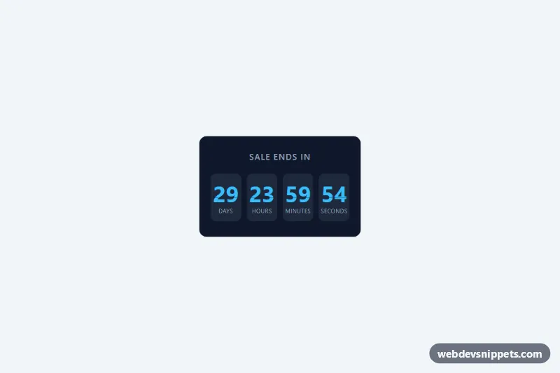
A Bootstrap 5 launch countdown card with a version badge, headline, four live time boxes and a "Remind me" toggle button. It is made for product release announcements, feature launches, beta openings and event teasers.
How it works
The root is section.card.lc-launch, a borderless shadowed card limited to 560px and centered with mx-auto. Inside the card-body are a badge with a rocket icon, the #lc-title heading, a short description, a Bootstrap row of four col-3 columns and the .lc-remind button. Each column holds an .lc-box tile (tinted with var(--bs-tertiary-bg)) and an .lc-num element with a data-part attribute of d, h, m or s. The digits use var(--bs-primary), tabular-nums and a fluid clamp() font size.
On DOMContentLoaded the script initializes each .lc-launch. It reads an absolute date from data-launch; if it is missing or invalid it uses data-launch-days counted from page load, with 7 days as the default. A tick() function runs every second and writes zero-padded values into the data-part elements, and stops the interval at zero. The .lc-remind button listens for clicks and toggles aria-pressed, swaps btn-primary for btn-success, changes its text to "Reminder set" and replaces the bi-bell icon with bi-check2.
Customization
data-launchon.lc-launch: add a real release time in ISO 8601, e.g.2026-12-01T09:00:00Z; it overrides the demo value.data-launch-days="12"on.lc-launch: change the demo duration or remove it oncedata-launchis set.color: var(--bs-primary)in.lc-launch .lc-num: set another color for the digits.background: var(--bs-tertiary-bg)in.lc-launch .lc-box: change the tile background, e.g.var(--bs-primary-bg-subtle).max-width: 560pxin.lc-launch: widen the card for a hero section.bg-primary-subtle text-primary-emphasison the badge: use another Bootstrap color pair and edit the "Version 2.0" text.- The
btn-successclass and "Reminder set" text in the.lc-remindclick handler: change the confirmed state, or call your own subscribe endpoint there.
Accessibility
The card is a section labelled by its heading through aria-labelledby="lc-title". The row of digits is aria-hidden="true" so the per-second updates are not read aloud. Instead a visually-hidden paragraph with data-part="summary" and aria-live="polite" is updated once per minute ("Launching in 12 days, 3 hours and 5 minutes.") and says "We have launched!" at zero. The remind button is a toggle with aria-pressed, and its visible text changes too, so the state is clear without color. All icons are aria-hidden. Bootstrap's default focus ring is kept.
Usage notes
Requires Bootstrap 5 (added automatically) and Bootstrap Icons. Several cards can run on one page; give each a unique heading id. The timer relies on the visitor's clock, so prefer a UTC value in data-launch.