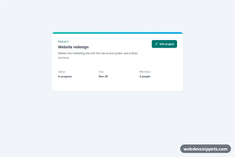
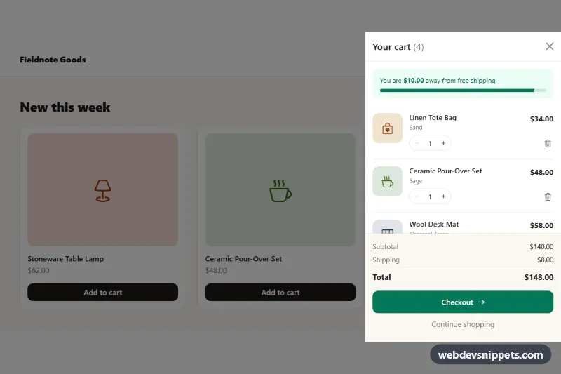
A right-side slide-over panel (drawer) built with Tailwind CSS and vanilla JavaScript, shown as an "Edit project" form with a colored header, a scrollable body and sticky footer actions. Use it for editing records, filters, settings or details views where a full page change or a centered modal would feel too heavy.
How it works
The root is .tso-drawer. It contains the page content with the data-tso-open trigger and the .tso-overlay, which starts with the hidden attribute. Inside the overlay are the dimmed .tso-backdrop and the #tso-panel element (.tso-panel), a full-height flex column with role="dialog": a bg-teal-700 header, a form whose middle area scrolls with overflow-y-auto, and a footer with Cancel and Save buttons that always stays visible.
On DOMContentLoaded the script initializes every .tso-drawer. Opening removes hidden, locks page scrolling, stores the focused element and moves focus to the field marked data-tso-autofocus. style.css plays the tso-slide and tso-fade keyframes on open; closing adds .tso-closing, which plays them in reverse before the overlay is hidden again. Escape, a backdrop click and every data-tso-close element close the panel, and a keydown listener keeps Tab inside it.
Submitting checks that the project name is not empty, shows "Saving…" on the data-tso-save button, waits 900 ms, writes the new name into data-tso-name-output and announces the result in data-tso-status. Closing without saving resets the form to the last saved values.
Customization
max-w-mdon.tso-panel: usemax-w-lgormax-w-2xlfor wider forms or detail views.right-0andpl-8 sm:pl-16on the panel wrapper: switch toleft-0withpr-8 sm:pr-16, and usetranslateX(-100%)in thetso-slidekeyframes, for a left drawer.bg-teal-700on the header and Save button: changetealto your brand color; the header subtitle usestext-teal-100.bg-slate-950/50on.tso-backdrop: lighten or darken the dimming, or addbackdrop-blur-sm.- The 900 ms
window.setTimeoutin the submit handler ofscript.js: replace it with afetch()call to your API and close the panel when it succeeds. animation: tso-slide 0.4sinstyle.css: tune the slide duration or easing.
Accessibility
The panel uses role="dialog", aria-modal="true", aria-labelledby="tso-title" and aria-describedby="tso-desc". The trigger has aria-haspopup="dialog", aria-controls and an aria-expanded state kept in sync by the script. Focus is trapped while the panel is open and returned to the trigger on close. The name field gets aria-invalid and an aria-describedby error message when left empty, the radio options are grouped in a fieldset with a legend, and the save result is read through a role="status" region. All controls have visible focus outlines, and the slide and fade animations are removed under prefers-reduced-motion.
Usage notes
For several drawers on one page, wrap each in its own .tso-drawer and give the panel, title and form fields unique id values.