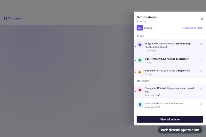
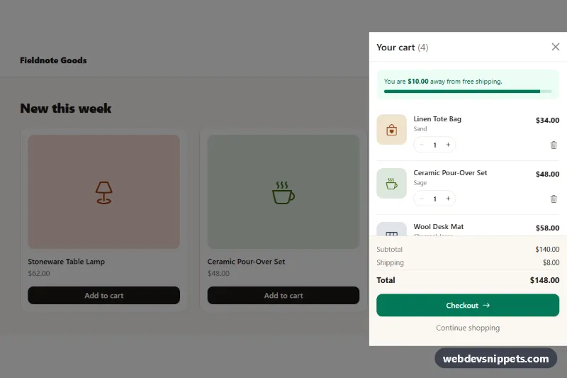
A Bootstrap 5 offcanvas drawer that lists notifications grouped by day, with an unread counter on the bell, an All/Unread filter, a "Mark all as read" action and per-item dismiss buttons. Use it in dashboards, SaaS apps and admin panels where users need a quick look at recent activity without leaving the page.
How it works
The wrapper .nd-root contains a small top bar and the drawer. The bell button .nd-bell opens the panel through data-bs-toggle="offcanvas" and data-bs-target="#nd-panel"; the red badge inside it carries data-nd-count. The drawer itself is an .offcanvas.offcanvas-end.nd-panel and starts with the show class, so Bootstrap opens it on page load with its backdrop and focus trap.
Inside .offcanvas-body, every day is a section.nd-group with a sticky h3.nd-day heading ("Today", "Yesterday", "Earlier this week") and a list of .nd-item rows. Each row has a colored .nd-icon, a .nd-text button with the message and .nd-time, and a .nd-dismiss button. Unread rows get .is-unread, which adds a tinted background and an accent dot.
The script initializes every .nd-root on DOMContentLoaded and uses one delegated click listener. Clicking [data-nd-read] removes .is-unread, [data-nd-dismiss] removes the row and moves focus to a neighbor, [data-nd-filter] switches between all and unread rows, and [data-nd-markall] clears every unread state. A render() function recounts unread items, updates the bell badge and the "4 unread" label, hides empty day groups and shows [data-nd-empty] when nothing is left.
Customization
--nd-accentand--nd-accent-softon.nd-rootinstyle.css: change the violet accent used by the bell, active filter, unread dot and links.--bs-offcanvas-widthon.nd-panel: set a wider or narrower drawer than the default 420px.offcanvas-endon the panel: useoffcanvas-startto slide the drawer in from the left.- Remove
showfrom.nd-panelso the drawer stays closed until the bell is clicked. .nd-icon--violet,.nd-icon--green,.nd-icon--amber,.nd-icon--roseand.nd-icon--sky: pick an icon color per notification type, or add your own modifier.- Add or remove
.is-unreadon an.nd-itemto set its initial state; the counters are calculated from the markup.
Accessibility
The panel uses aria-labelledby pointing to its title, and Bootstrap handles Escape, the focus trap and returning focus to the bell. Day groups are labelled sections, filter buttons expose aria-pressed, and the icon-only dismiss buttons have aria-label. Status changes are announced through a visually hidden aria-live="polite" paragraph. All controls have a visible :focus-visible outline, and transitions are disabled under prefers-reduced-motion.
Usage notes
Requires the Bootstrap 5.3 bundle and Bootstrap Icons. Notifications are static sample markup: render the rows from your API and call your endpoint inside the click handlers to persist read and dismissed states. When you use several drawers on one page, give each panel its own id and matching data-bs-target.