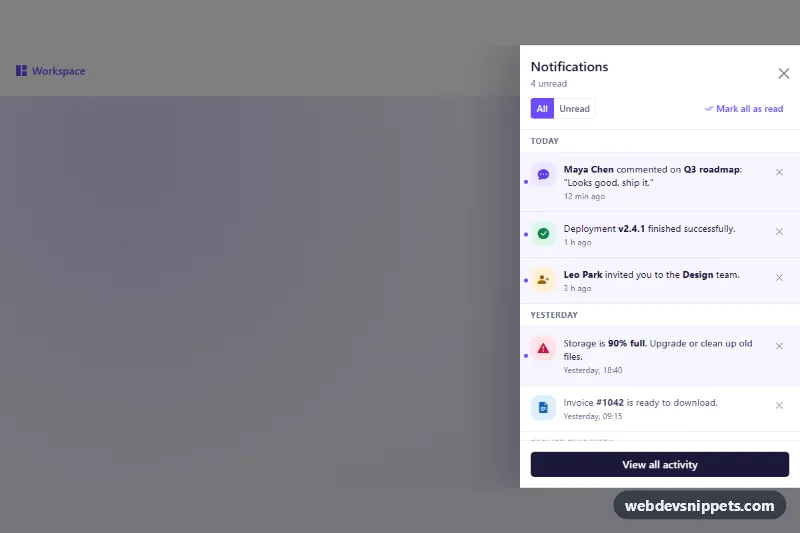
Notification Drawer Panel
Bootstrap 5 offcanvas notification drawer with notifications grouped by day, unread filter, mark all as read and dismiss buttons.
Off-canvas side panels.
3 component(s)
Bootstrap 5 offcanvas notification drawer with notifications grouped by day, unread filter, mark all as read and dismiss buttons.
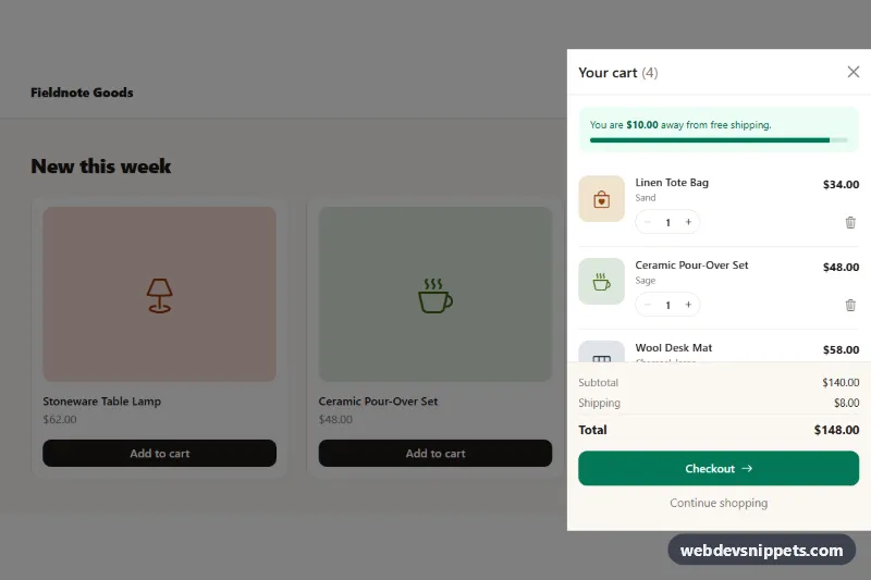
Bootstrap 5 offcanvas cart drawer with quantity steppers, remove buttons, free-shipping progress, live totals and an empty state.
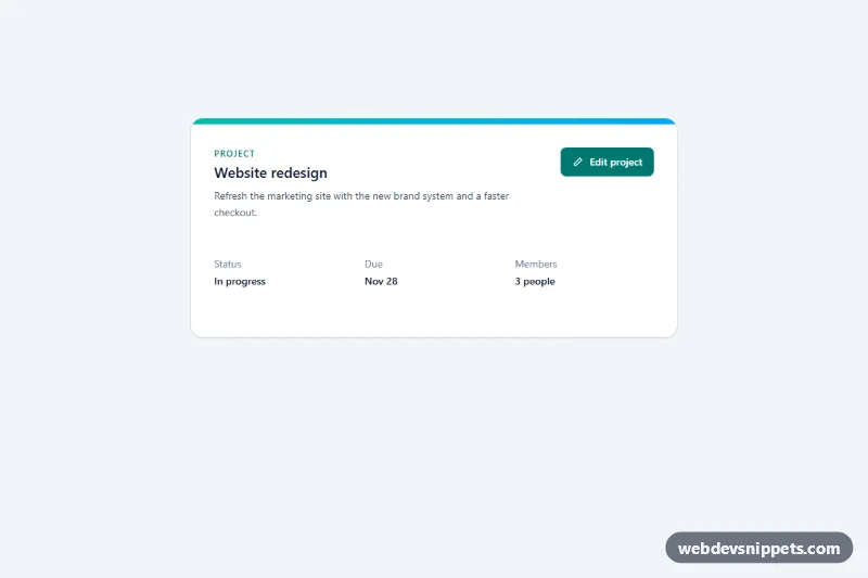
Tailwind CSS slide-over drawer from the right with header, scrollable form content, sticky footer actions, focus trap and Escape to close.
A drawer, also called an off-canvas panel, is a panel that slides in from the edge of the screen, usually left or right, sometimes from the bottom. Drawers hold content that is related to the current page but does not need permanent space: mobile navigation, filters on a product listing, a shopping cart, settings, notifications or the details of a selected item in a dashboard.
A modal drawer with a backdrop should behave like a dialog: role="dialog", aria-modal="true", a label via aria-labelledby, focus moved inside on open, focus kept inside while open, Escape to close and focus returned to the trigger afterwards. The trigger button should expose aria-expanded and aria-controls. Prevent the page behind from scrolling while the drawer is open. Animate with transform rather than left or width for smooth performance, and respect prefers-reduced-motion.
These bootstrap offcanvas examples and drawer HTML CSS snippets are available for Bootstrap 6, Bootstrap 5, Tailwind CSS and pure CSS. Bootstrap 5 versions use the offcanvas component; Bootstrap 6 versions build drawers on the native <dialog> element and the ES module build. Tailwind and pure CSS versions use <dialog> or a checkbox toggle with a small script. Open each drawer in the live preview, then copy the code from the code tabs or download it and fill it with your own content.