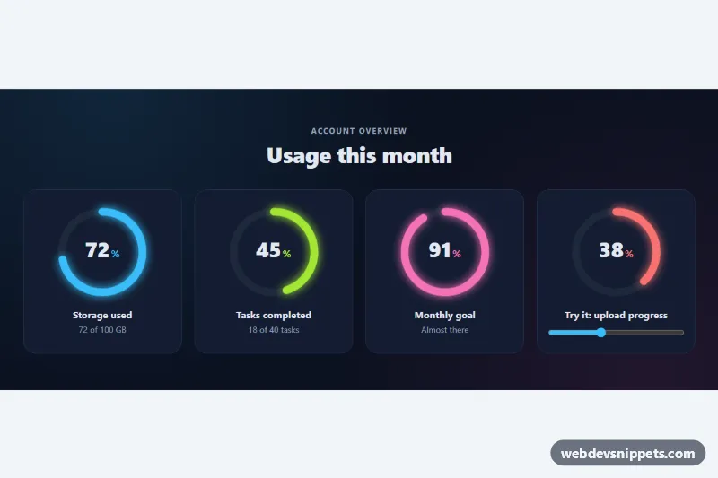
Circular Progress Indicator
SVG ring progress indicators with an animated fill, count-up percentage, glow colors and a slider-driven demo ring with color thresholds.
Dialogs, notifications and loading states.
21 component(s)
SVG ring progress indicators with an animated fill, count-up percentage, glow colors and a slider-driven demo ring with color thresholds.
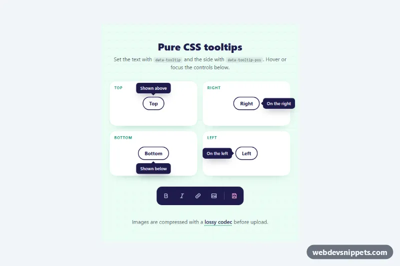
JavaScript-free tooltips driven by data attributes, with top, right, bottom and left placement, arrows, color tones and hover or focus triggers.

Accessible modal built on the native HTML dialog element with @starting-style enter and exit animation, blurred backdrop, mobile bottom sheet and an invite form.

Bootstrap 5 cookie consent banner with a preferences modal: category switches, collapsible cookie tables, accept, reject and save actions, stored safely in localStorage.
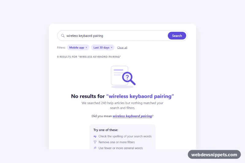
Bootstrap 5 empty search state with a spelling-aware "Did you mean" suggestion, removable filter chips, search tips, popular searches and a support link.
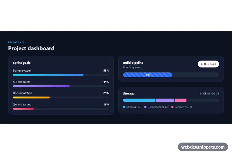
Bootstrap 5 dark dashboard with labelled bars that fill on scroll, a striped animated build progress bar and a stacked storage bar.
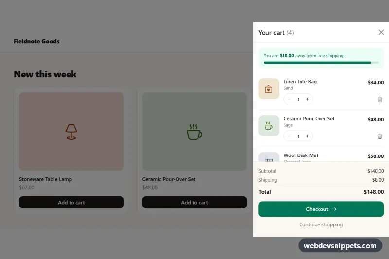
Bootstrap 5 offcanvas cart drawer with quantity steppers, remove buttons, free-shipping progress, live totals and an empty state.
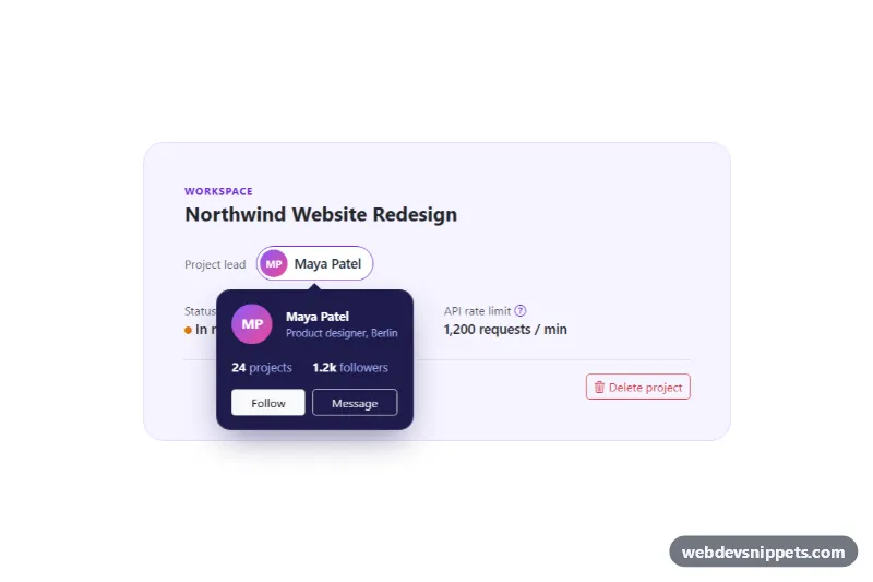
Bootstrap 5 popovers with HTML content: profile card with buttons, inline help with links and a delete confirmation, with focus handling.
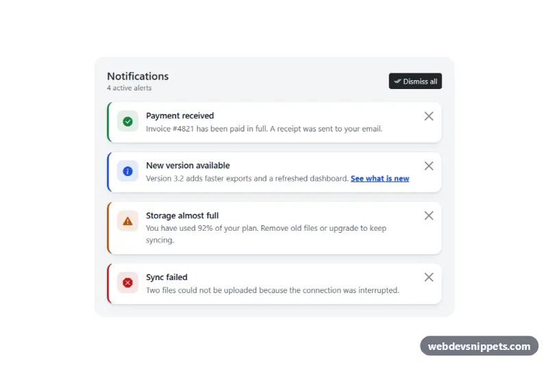
Bootstrap 5 dismissible alerts with icons, headings, per-alert close buttons, dismiss all, restore and screen reader announcements.
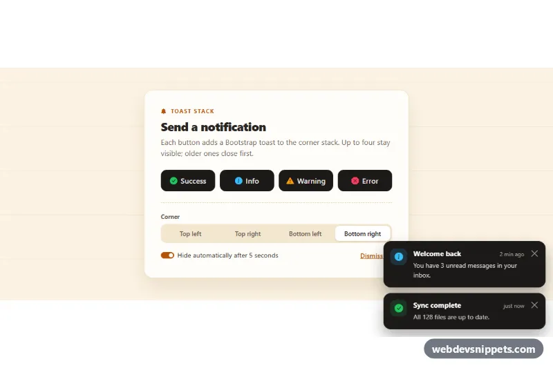
Bootstrap 5 toast notifications in a corner stack: success, info, warning and error buttons, selectable corner, auto-hide with a progress bar and a stack limit.
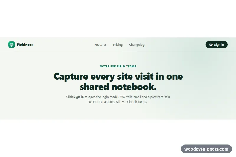
Bootstrap 5 login modal with social sign-in buttons, floating labels, a show/hide password toggle, client-side validation and a signed-in success view.
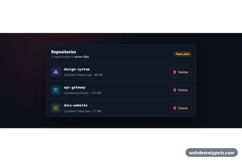
Dark Bootstrap 5 modal that confirms deleting an item by typing its exact name, with per-row triggers, a loading state and removal of the deleted row.
Tailwind CSS slide-over drawer from the right with header, scrollable form content, sticky footer actions, focus trap and Escape to close.
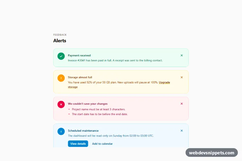
Tailwind CSS alerts collection with success, warning, error and info variants, icons, action links and accessible dismiss buttons.
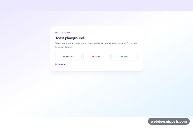
Stacking Tailwind CSS toast notifications for success, error and info with auto-dismiss countdown, pause on hover and accessible live region.
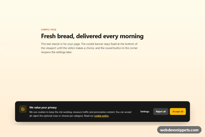
Tailwind CSS cookie consent banner with accept, reject and a settings dialog with category switches, saved to localStorage with a consent event.
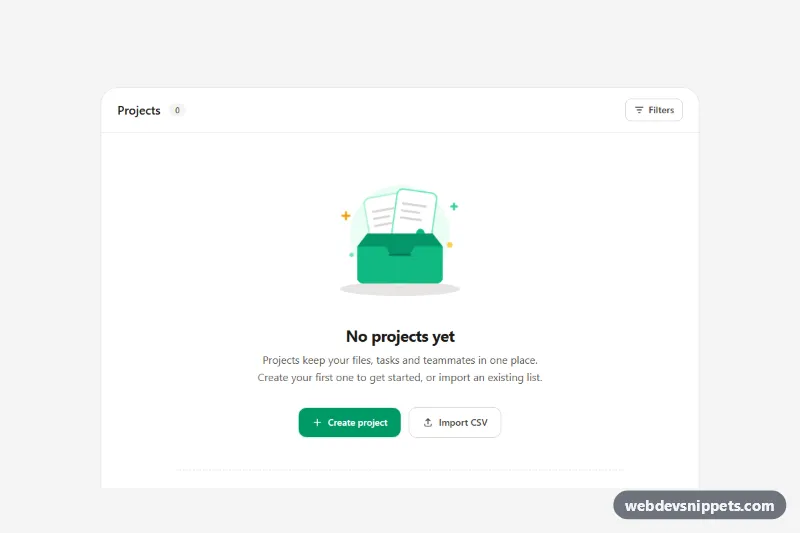
Tailwind CSS empty state with an animated inline SVG illustration, clear headline, primary and secondary call-to-action buttons and template shortcuts.
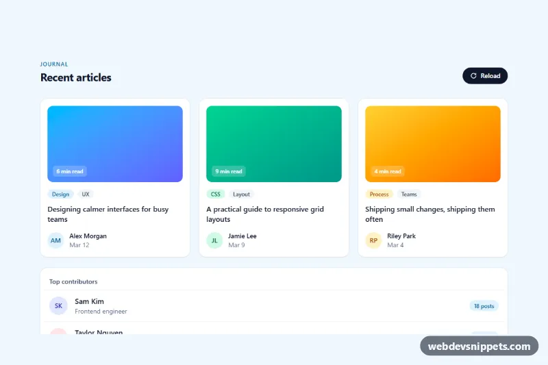
Tailwind CSS skeleton loaders for an article card grid and a list, with pulse or shimmer animation that swaps to real content once loaded.
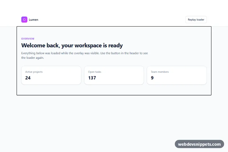
Tailwind CSS full-page loader overlay with a spinning gradient ring, progress bar and status messages that fades out once the page has loaded.
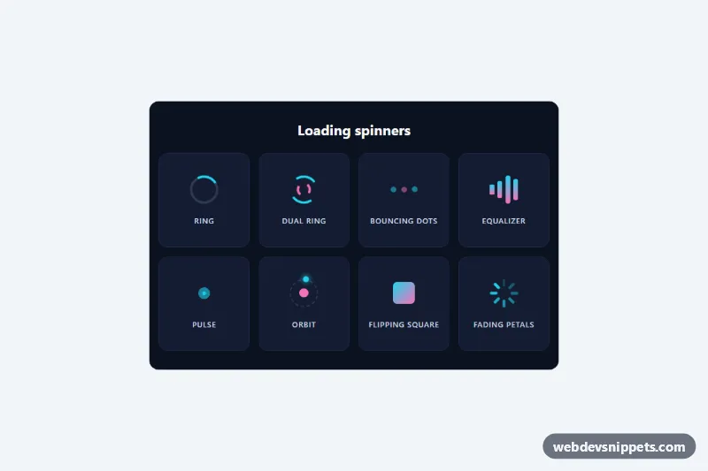
Eight lightweight pure CSS loading spinners in a labelled grid, each with role="status" and screen reader text, no JavaScript.
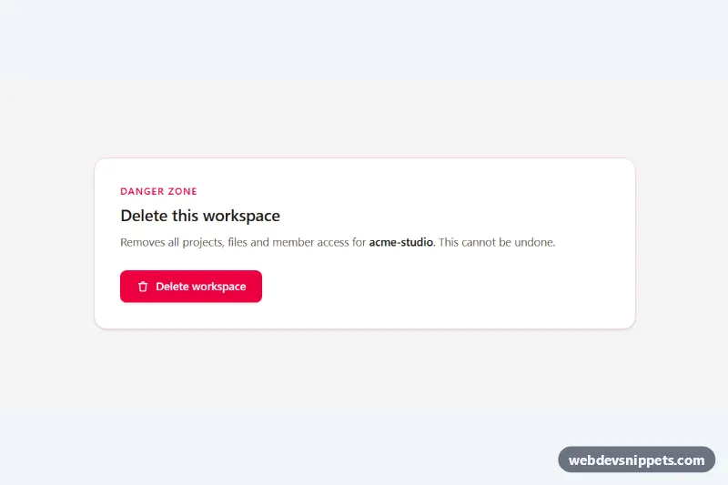
Accessible Tailwind CSS modal dialog with focus trap, Escape and backdrop close, scroll lock and a type-to-confirm delete action.