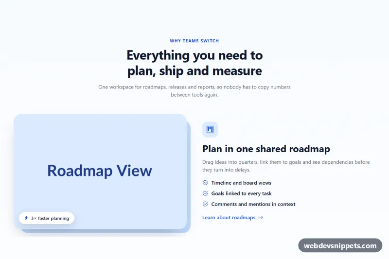
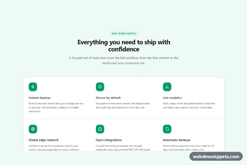
A Bootstrap 5 feature section with image and text rows that alternate sides: image left on the first row, right on the second, left again on the third. Each row has an icon, heading, short paragraph, checklist and a "learn more" link. It is a common pattern for SaaS landing pages, product tours and service overviews.
How it works
The root section.fa-features holds a centered .fa-head intro and three article.fa-row elements. Each row is a Bootstrap row with align-items-center and two col-lg-6 columns: one with the figure.fa-media image and one with the text.
The alternation is done with Bootstrap order utilities, not duplicate markup. In .fa-row--reverse the image column has order-lg-2 and the text column order-lg-1, so from the lg breakpoint the image moves to the right. Below lg both columns are full width and every row reads image first, then text, which keeps the order consistent on phones. The source order stays the same, so screen readers and keyboard users get a logical reading order.
Each .fa-media has a ::before pseudo-element: a light blue rounded block offset behind the image. In reverse rows the offset is mirrored so the shape always points outward. A white .fa-chip pill in the corner highlights one benefit. Rows are spaced by --fa-row-gap, which grows on large screens. No JavaScript is needed.
Customization
--fa-accentand--fa-accent-softin.fa-features: change the color of the kicker, icons, check marks, chip icons and links.--fa-shapein.fa-features: set the color of the offset block behind each image, or set it totransparentto hide it.--fa-radiusin.fa-features: round or square the image corners and the offset block together.--fa-row-gapin.fa-features: change the vertical space between rows (4rem on mobile, 6rem fromlg).- Add
fa-row--reverseand theorder-lg-2/order-lg-1classes to any row to flip its image to the right. aspect-ratio: 3 / 2in.fa-media img: use4 / 3or1 / 1for taller screenshots.- Remove the
.fa-chipfigcaption from a row if you do not need a highlight badge.
Accessibility
The section is labelled by its h2 through aria-labelledby, and each feature has an h3, so the heading outline stays correct. Every image has a descriptive alt. Decorative icons and the offset shape are hidden from assistive technology with aria-hidden="true" or a pseudo-element. The "learn more" links include visually hidden text so they are unique out of context, and they show a clear :focus-visible outline. The arrow nudge on hover is disabled with prefers-reduced-motion: reduce. Visual order changes only on large screens; DOM order always matches reading order.
Usage notes
Requires Bootstrap 5 (added automatically) and Bootstrap Icons. Replace the placehold.co images with your own screenshots at the same 3:2 ratio and update the alt text. Add or remove article.fa-row blocks freely.