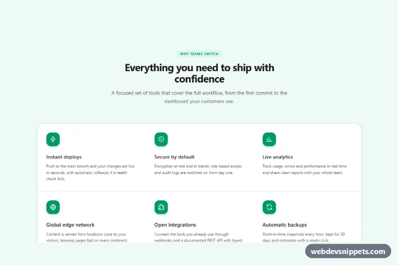
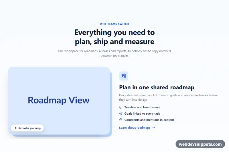
A six-item feature grid built with Tailwind CSS, where every feature has an inline SVG icon, a short title and one supporting sentence. It is a typical "Why choose us" block for SaaS landing pages, product tours and service websites.
How it works
The root is section.fg-features, labelled by the #fg-title heading. A centered header holds a small pill eyebrow, the heading and an intro paragraph. The features live in a ul with role="list": it stacks on phones, becomes two columns at sm:grid-cols-2 and three columns at lg:grid-cols-3.
The thin dividers between cells are not borders. The list uses gap-px on a tinted bg-emerald-900/10 background with overflow-hidden rounded-3xl, so the one-pixel gaps show through as clean hairlines and the outer corners stay rounded at every breakpoint.
Each cell is an li.fg-item with a white background, a span.fg-icon tile containing a 24×24 stroke icon, an h3 title and a paragraph. A small style.css adds what utilities cannot express neatly: a ::before accent bar on .fg-item that scales in along the top edge on hover, a light background tint, and a small lift and tilt of the .fg-icon tile. There is no JavaScript; the section works as plain HTML and CSS.
Customization
--fg-accenton.fg-featuresinstyle.css: changes the color of the hover accent bar at the top of each cell.--fg-hover-bgon.fg-featuresinstyle.css: sets the background tint a cell gets on hover; use#ffffffto switch it off.bg-emerald-600andshadow-emerald-600/30on each.fg-icon: replace with another Tailwind color such asbg-sky-600to recolor the icon tiles.lg:grid-cols-3on theul: uselg:grid-cols-2for a two-column layout, or addxl:grid-cols-4when you have eight features.rounded-3xlon theul: change torounded-xlorrounded-nonefor a sharper, more technical look.- Swap the
svginside any.fg-iconfor your own 24×24 icon; it inheritscurrentColor, sotext-whitecontrols its color. bg-emerald-50/60on the section: replace withbg-whiteorbg-stone-50to match the page background.
Accessibility
The section is a landmark labelled by aria-labelledby="fg-title", and features use a real h2 and h3 hierarchy, so screen reader users can jump between them. Icon tiles have aria-hidden="true" because the titles already carry the meaning. role="list" keeps list semantics in Safari, which drops them when list styles are removed. The "See all features" link has a visible focus-visible:outline-2 ring. Stone text on white meets WCAG AA contrast, and all hover transitions are switched off under prefers-reduced-motion: reduce.
Usage notes
Requires the Tailwind browser build (added automatically) plus the short style.css. Because there is no script and all custom selectors start with fg-, several copies can sit on one page; give each copy a unique heading id.