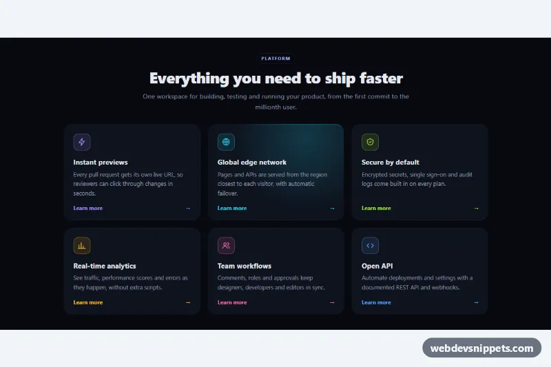
Feature Cards with Hover Glow
Dark pure CSS feature grid whose card borders and backgrounds light up with a colored glow that follows the mouse pointer.
Showcase product features and benefits.
3 component(s)
Dark pure CSS feature grid whose card borders and backgrounds light up with a colored glow that follows the mouse pointer.
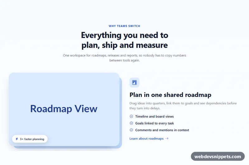
Bootstrap 5 feature section with image and text rows that alternate sides on desktop, with icons, checklists, highlight chips and offset image shapes.
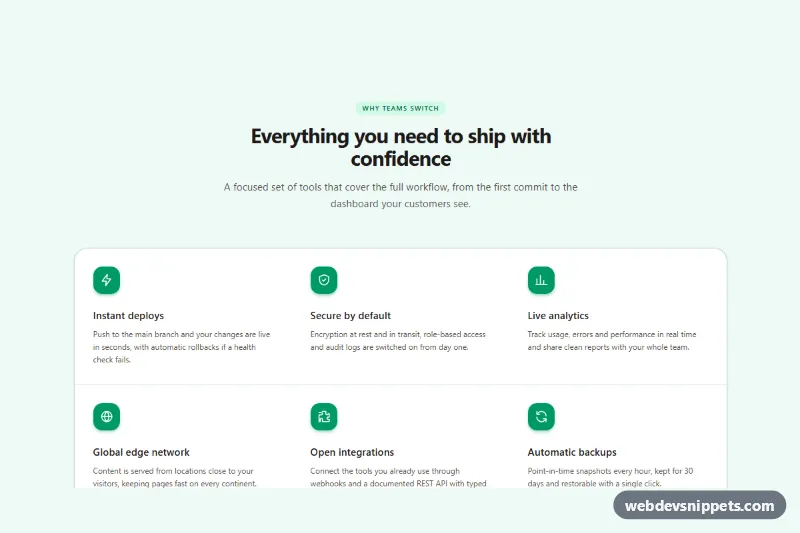
Responsive Tailwind CSS feature section with six features, inline SVG icons, hairline dividers and a subtle hover accent.
A feature section is the part of a landing page or product page that explains what a product does and why it matters. It usually combines a short heading, a supporting sentence and a set of feature items, each with an icon, a title and one or two lines of text. Common layouts include icon grids, alternating image-and-text rows, bento-style tiles and split sections with a screenshot on one side and a feature list on the other.
Use it right after the hero, once visitors know what the product is and want to understand the benefits. Keep each item focused on one benefit and write titles that make sense when skimmed on their own.
<section> and a heading, and use <h3> for each feature title so the outline stays logical.aria-hidden="true" unless they carry meaning not present in the text.width and height on images and lazy-load anything below the fold.The collection covers Bootstrap 6, Bootstrap 5, Tailwind CSS and pure CSS. Bootstrap versions build on the grid and utility classes, and Bootstrap 6 examples use the new theme-* colour roles, so icon backgrounds and accents follow your theme. Tailwind versions rely on utility classes only, and the pure CSS versions use CSS Grid with custom properties you can retune in one place. Use the framework filter to narrow the list, check each layout in the live preview, then open the code tabs and use the copy button or download the snippet. Replace the icons, text and images, and these responsive feature section examples are ready for your landing page.