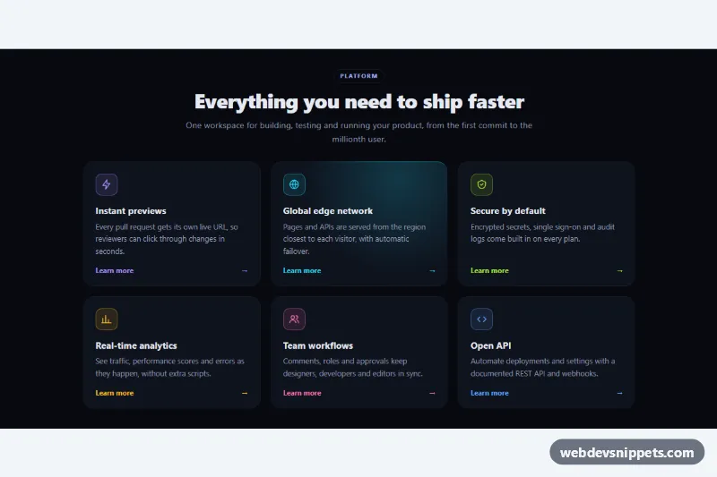
A dark feature section with six cards whose borders and backgrounds light up with a colored glow that follows the mouse. Built with pure CSS and a small vanilla JavaScript helper, it suits SaaS landing pages, product overviews and developer tool sites that want a modern, interactive feature grid.
How it works
The root section.fhg-section holds a centered .fhg-header and the .fhg-grid. Each article.fhg-card is a 1px frame around an inner .fhg-body, so the card background shows only as a thin border. Two pseudo-elements draw the glow, both as a radial-gradient positioned at the custom properties --fhg-x and --fhg-y: .fhg-card::before is the border glow in the full accent color, and .fhg-body::before is a soft inner glow mixed with color-mix() at 20 percent.
The script listens for pointermove on the grid and, once per animation frame, writes the pointer position relative to every card into --fhg-x and --fhg-y. While the pointer is anywhere over the grid, all borders glow, so neighboring cards catch the light near their edges, but only the hovered card shows the inner glow. On pointerleave the inline values are removed and the default state returns. On first load the second card carries .is-lit, so the section never looks flat, and focusin centers the glow on a card reached with the keyboard. Without JavaScript the hover glow still appears at the default position from CSS.
Customization
.fhg-card--violet,--cyan,--lime,--amber,--pinkand--blue: each sets--fhg-accentfor the glow, icon and link color of one card. Add your own modifier for another color.--fhg-glow-sizeand--fhg-border-glow-sizeon.fhg-section: radius of the inner and border glow; larger values give a softer, wider light.--fhg-bg,--fhg-card-bgand--fhg-border: section background, card background and the resting border color.- Move
.is-litto another card, or remove it, to change which card glows on page load. --fhg-radius: corner radius of the cards and the focus outline.grid-template-columnsin the.fhg-gridmedia queries: one column on phones, two from 640px and three from 960px.
Accessibility
The section is labelled by its heading, and every card is an article with an h3. The "Learn more" link stretches over the whole card through .fhg-link::after, and it includes visually hidden text such as "about analytics" so each link has a unique name. Keyboard users get the same glow through :focus-within plus a clear outline on the card. Icons are aria-hidden. Text colors on the dark background meet WCAG AA contrast. With prefers-reduced-motion: reduce the fade transitions and the arrow movement are turned off.
Usage notes
color-mix() needs a current browser. Several sections can share a page; each one tracks its own pointer.