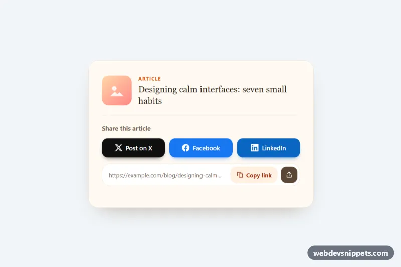
Social Share Buttons
Pure CSS social share card with brand-colored X, Facebook and LinkedIn buttons, a copy-link field with clipboard feedback and a native share fallback.
Components tagged with "buttons".
8 component(s)
Pure CSS social share card with brand-colored X, Facebook and LinkedIn buttons, a copy-link field with clipboard feedback and a native share fallback.
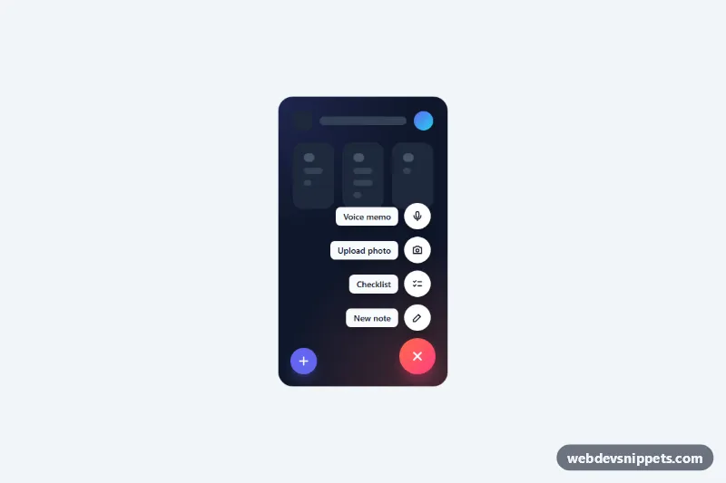
Pure CSS floating action button that expands into a staggered speed dial of labeled actions, with vertical and horizontal variants and keyboard support.
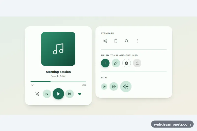
Round icon buttons with a Material-style ripple, toggle states and tooltips: standard, filled, tonal and outlined variants in three sizes.
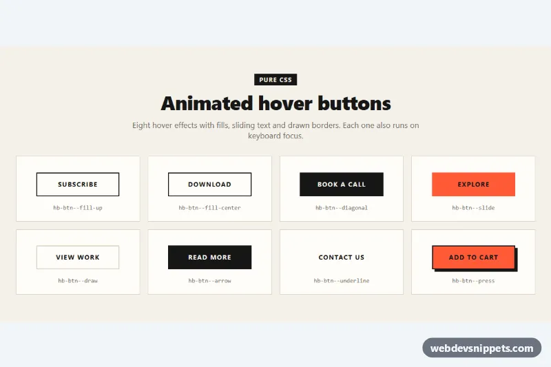
Eight pure CSS hover buttons with fill, diagonal, sliding text, border drawing, arrow, underline and press effects that also run on focus.
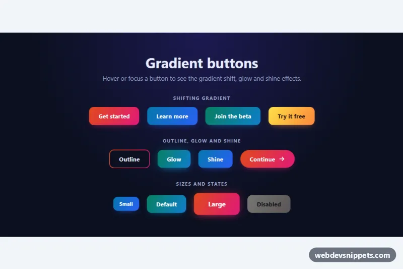
Pure CSS gradient buttons with shifting colors on hover, a gradient outline, glow and shine effects, sizes and a disabled state.

Dark Tailwind CSS social login buttons for Google, Apple and GitHub with full-width and icon-only variants and a loading spinner state.

Bold full-width Tailwind CSS call-to-action band with a gradient background, two buttons and reassurance points.
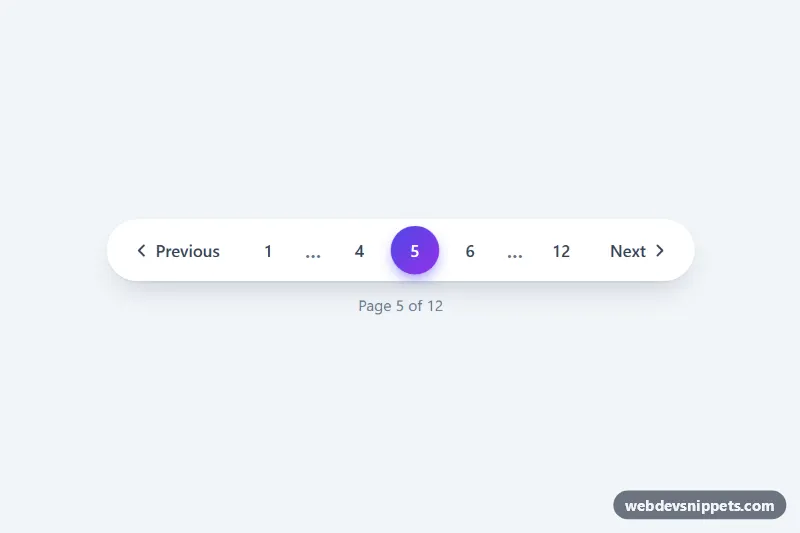
Pill-shaped pagination with ellipsis, previous/next buttons and a gradient active page, made interactive with a few lines of vanilla JS.