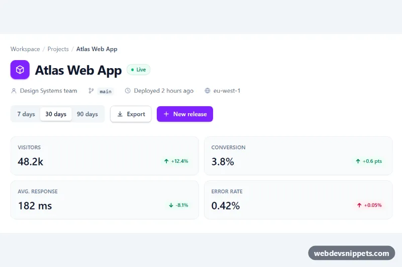
A dashboard page header built with Tailwind CSS that combines a breadcrumb, the page title with a status pill, project meta information, action buttons and a row of four stat chips with trend indicators. A date range switch updates every metric in place, which makes it a good top section for analytics, project or admin pages.
How it works
The root is header.tph-header. It starts with a breadcrumb nav whose last item carries aria-current="page". Below it, the title row holds an icon tile, the h1#tph-title and a green "Live" pill. Project details sit in a dl where each dt is an icon plus a screen-reader-only label (Owner, Branch, Last deploy, Region) and each dd is the visible value.
On the right, .tph-range is a segmented control of three buttons with data-tph-range="7d", "30d" and "90d". The pressed button is styled through Tailwind's aria-pressed: variant, so the look always matches the ARIA state.
The stat row is a ul grid that goes from one column to two at sm and four at lg. Every chip contains a value element with data-tph-value and a trend pill with data-tph-trend. Both store their numbers per range in data-7d, data-30d and data-90d; the trend pill also has data-tone-7d, data-tone-30d and data-tone-90d set to good or bad.
On DOMContentLoaded the script initializes every .tph-header. A click on a range button updates aria-pressed, swaps the values and trend texts, rotates .tph-arrow with rotate-180 when the text starts with a minus sign, and switches the pill between emerald and rose colors from the TONES map. Without JavaScript the 30-day figures stay visible.
Customization
data-7d,data-30d,data-90don each[data-tph-value]and[data-tph-trend]: put in your real metrics; they can be filled from your API before render.data-tone-*on[data-tph-trend]: mark a change asgoodorbad, so a falling response time can be shown in green.TONESinscript.js: replacebg-emerald-50/text-emerald-700andbg-rose-50/text-rose-700to change the trend colors.LABELSinscript.js: rename the ranges announced to screen readers, or add a new one together with a fourthdata-tph-rangebutton.bg-violet-600on the icon tile and "New release" button: swap for another Tailwind color to rebrand the header.lg:grid-cols-4on the stat list: uselg:grid-cols-3when you show three metrics.
Accessibility
The breadcrumb is a labelled nav with aria-current="page". The meta list keeps its labels for assistive technology through sr-only dt text while the icons are aria-hidden. The range control is a role="group" with aria-label="Date range" and toggle buttons using aria-pressed. A role="status" region announces the selected range, and each trend has hidden "versus previous period" text so the number is not read out of context. All buttons and links show a violet focus-visible outline, and transitions are disabled with motion-reduce:transition-none.
Usage notes
No style.css is needed. Several headers can share a page because the script queries inside each .tph-header; just give each title a unique id.