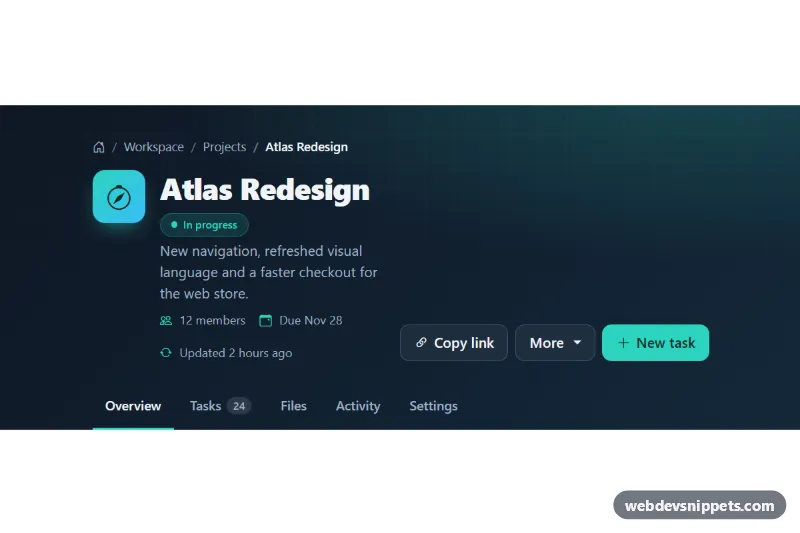
A Bootstrap 5 page header with a breadcrumb trail, project title, status badge, meta details, action buttons and a row of section tabs on a dark grid background. Use it at the top of dashboard, project or admin pages.
How it works
The root is header.phb-header. Its background combines a teal radial-gradient glow with a dark diagonal linear-gradient, and a ::before layer draws a faint 32px grid that fades out toward the bottom through mask-image. All colors are custom properties on the root.
At the top, a standard Bootstrap breadcrumb sits inside a nav labelled "Breadcrumb". The .phb-breadcrumb class restyles it for the dark background by overriding Bootstrap's own --bs-breadcrumb-divider, --bs-breadcrumb-divider-color and --bs-breadcrumb-item-active-color variables. The first item is a house icon with visually hidden "Home" text.
The main row is a flex container that stacks on phones and lines up horizontally from the md breakpoint. On the left, the gradient .phb-mark tile sits next to the h1.phb-title, the .phb-status pill, a .phb-subtitle and the .phb-meta list. On the right, .phb-actions holds a "Copy link" button, a Bootstrap dropdown opened with data-bs-toggle="dropdown" and a primary "New task" button. At the bottom, .phb-tabs is a horizontally scrollable row of .phb-tab links; the current one has aria-current="page" and an accent underline.
The script runs on DOMContentLoaded for every .phb-header. Buttons with data-phb-share copy the value of that attribute, or the current page URL when it is empty, using navigator.clipboard.writeText() with an execCommand('copy') fallback. The label changes to "Copied" for two seconds and .phb-toast shows the result.
Customization
--phb-accentand--phb-accent-inkin.phb-header: change the accent used by the primary button, status pill, active tab and meta icons, and the text color on top of it.--phb-bgand--phb-bg-2in.phb-header: set the two colors of the background gradient.background-size: 32px 32pxin.phb-header::before: make the grid finer or coarser, or setopacity: 0to hide it.--bs-breadcrumb-dividerin.phb-breadcrumb: switch the separator to"›"or"·".data-phb-shareon.phb-share: put a fixed URL in the attribute to copy a canonical link instead of the current address.- Move
aria-current="page"to another.phb-tabto mark a different section as active. - Change
In progressand the.phb-statuscolors to show other states such as "Draft" or "Done".
Accessibility
The breadcrumb is a labelled nav with an ordered list and aria-current="page" on the last item; the section tabs are a second nav labelled "Project sections". Decorative icons are aria-hidden, and the home link keeps readable text through visually-hidden. The dropdown relies on Bootstrap's keyboard handling and aria-expanded. .phb-toast is a role="status" live region, so the copy result is announced. All links and buttons get a teal :focus-visible outline that stands out against the dark background.
Usage notes
Requires Bootstrap 5 with its JavaScript bundle (both added automatically) and Bootstrap Icons. Avoid overflow: hidden on the header, because it would clip the dropdown menu.