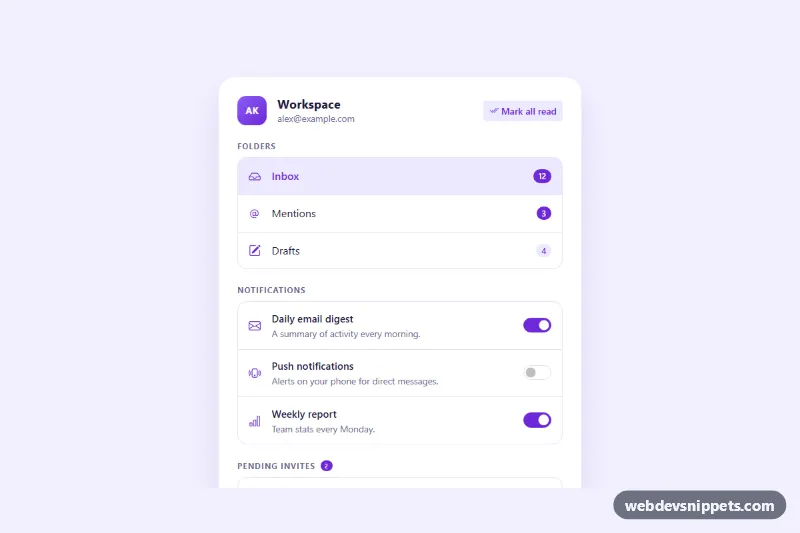
An actionable Bootstrap 5 list group panel that combines three common patterns: navigation rows with unread badges, settings rows with toggle switches, and invite rows with Accept and Decline buttons. It fits account menus, notification settings, inbox sidebars and team dashboards.
How it works
The panel is section.lga-panel inside the .lga-wrap background. A header shows an avatar, the workspace name and the .lga-mark-read button. Below it are three groups, each introduced by an h3.lga-label and wired to it with aria-labelledby.
The Folders group is a div.list-group of list-group-item-action links. Each row has an icon, a label and a pill badge; badges with a data-lga-unread attribute count as unread. The Notifications group is a ul.list-group where every row holds a title label, a short description and a Bootstrap form-switch with role="switch". The Pending invites group lists .lga-invite rows with an avatar, the workspace name and two buttons carrying data-lga-action="accept" or data-lga-action="decline", plus a hidden .lga-empty row.
The script initializes every .lga-panel on DOMContentLoaded. "Mark all read" sums and hides every data-lga-unread badge, then sets aria-disabled on itself. Each .lga-switch announces "turned on" or "turned off" on change. A delegated click listener on .lga-invite-list handles invite buttons: it adds .lga-leaving for a short slide-out, removes the row, updates .lga-invite-count, shows .lga-empty when nothing is left and moves focus to the next invite. Without JavaScript the links and switches still work as normal controls.
Customization
--lga-accentand--lga-accent-softin.lga-wrap: recolor icons, badges, switches, buttons and the current folder row.--lga-radiusin.lga-wrap: feeds--bs-list-group-border-radiuson.lga-listto round or square the groups.data-lga-unreadon a badge: set the unread count; remove the attribute to keep a badge visible after "Mark all read", like the Drafts badge.max-width: 34remin.lga-panel: widen the panel for dashboards or narrow it for sidebars.- The
checkedattribute on each.lga-switch: sets the default state of a notification setting. .lga-avatar--tealand.lga-avatar--amber: add more modifier classes with new gradients for other invite avatars.- The
finish()function inscript.js: add afetch()call there to send accept or decline to your server.
Accessibility
Each group is labelled by its visible heading. The current folder uses aria-current="true", and badges include visually hidden words such as "unread" so screen readers hear "12 unread". Switches are native checkboxes with role="switch", a label and an aria-describedby description. Invite button pairs are a role="group" named after the workspace. A hidden role="status" region announces every change, focus moves to the next invite or the empty message when a row is removed, all controls show a violet :focus-visible outline, and the slide-out is skipped for prefers-reduced-motion.
Usage notes
Requires Bootstrap 5 (loaded automatically) and Bootstrap Icons. Change the switch ids when you place several panels on one page.