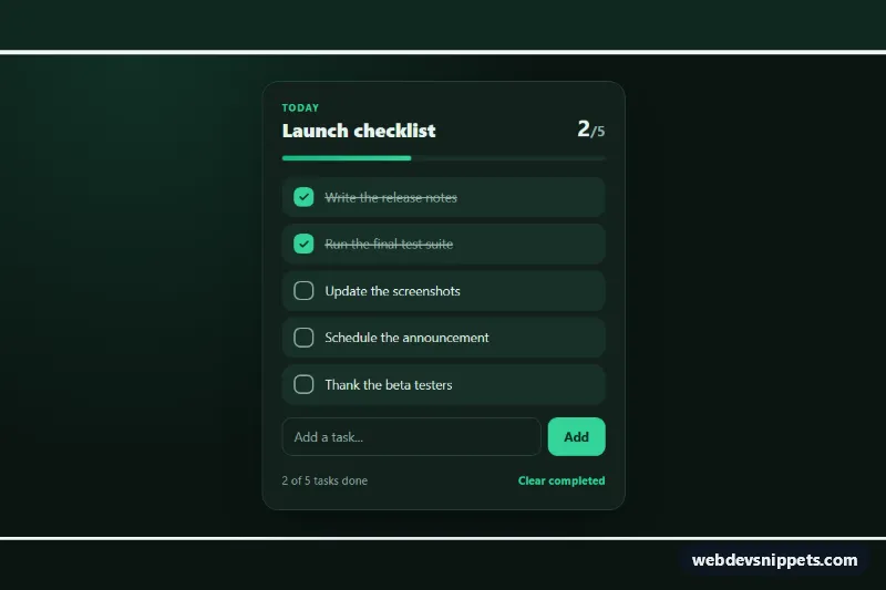
Animated To-Do Checklist
Dark to-do checklist in pure CSS with self-drawing check marks, an animated strike-through, a progress bar and vanilla JS to add and clear tasks.
Simple and rich list layouts.
3 components
Dark to-do checklist in pure CSS with self-drawing check marks, an animated strike-through, a progress bar and vanilla JS to add and clear tasks.
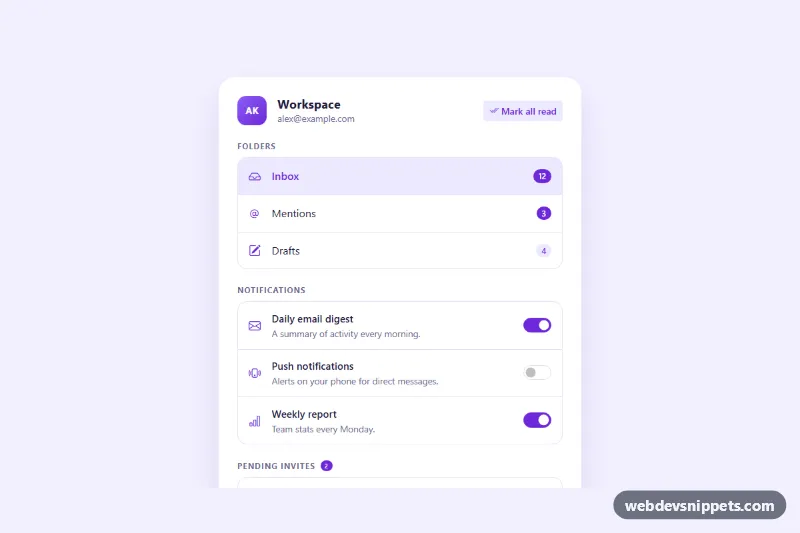
Bootstrap 5 list group panel with unread badges, notification toggle switches and invite rows with accept and decline buttons.
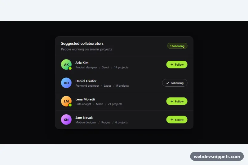
Dark Tailwind CSS user list with initials avatars, online status, meta details and accessible Follow toggle buttons with a live counter.
A list component displays a series of related items in a vertical or horizontal arrangement. It can be as simple as a styled bullet list or as rich as a list group with avatars, metadata, badges and actions on each row. Lists are used for settings menus, contact lists, notifications, file lists, feature checklists, task lists and navigation in apps and dashboards.
Use a list when items share the same structure and are read one after another. If users need to compare several columns of data, a table is the better choice; if items are visual and browsable, consider cards.
<ul> for unordered items, <ol> for sequences and <dl> for term-value pairs.list-style: none, some screen readers may stop announcing the list in Safari; adding role="list" restores it.aria-current, aria-selected or checkboxes, not only colour.The list examples are available for Bootstrap 6, Bootstrap 5, Tailwind CSS and pure CSS. Bootstrap versions use the list group component with flex utilities, and Bootstrap 6 variants use the theme-* colour roles for active and hover states. Tailwind CSS versions rely on utility classes, and pure CSS versions style semantic list markup with custom properties. Filter by framework, check each list in the live preview, then copy the HTML and CSS from the code tabs or download them. Replace the placeholder items with your data or render the markup in a loop from your template.