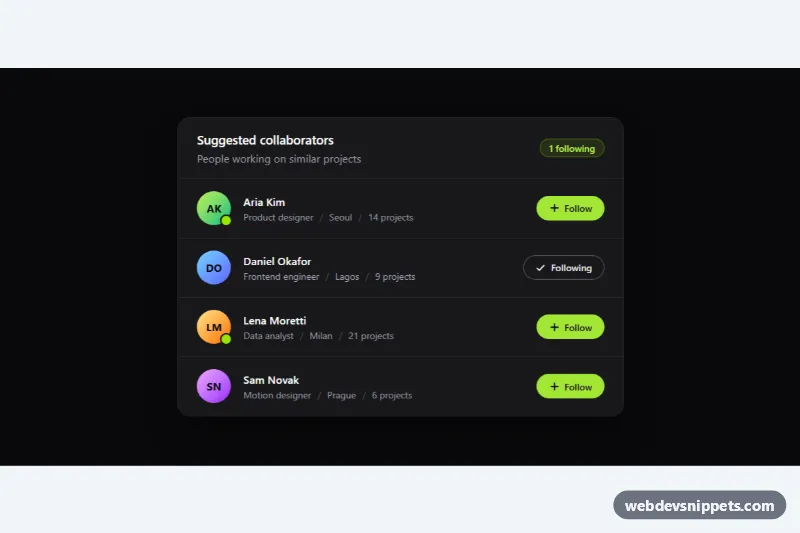
A dark user list built with Tailwind CSS where every row shows a gradient initials avatar with an online indicator, the person's name, a line of meta information and a Follow toggle button. A small vanilla JavaScript controller keeps the button states and a live "following" counter in sync. It fits "suggested people" panels, team directories, community sidebars and admin member lists.
How it works
The root is .tla-list, a section labelled by its heading. Inside a rounded zinc-900 panel the header holds the title and a data-tla-count badge, and a ul with divide-y divide-zinc-800 holds one li per person. Each row is a flex line: the avatar (h-11 w-11 initials circle plus an optional bg-lime-400 presence dot), a min-w-0 flex-1 text block whose name uses truncate so long names never push the button out, and the action button.
Each button carries data-tla-follow, the .tla-btn class and aria-pressed. style.css styles the two states from that attribute alone: a solid lime pill for "Follow" and an outlined pill with a check icon for "Following" (.tla-icon-add and .tla-icon-check swap with display). On click, script.js flips aria-pressed, rewrites the visible data-tla-label text, replays the short tla-pop press animation through the .tla-btn--pop class and recounts all pressed buttons to update the badge. Every .tla-list on the page is initialized separately on DOMContentLoaded.
Customization
--tla-accentin.tla-btn(style.css): change the solid Follow button color; also updatefocus-visible:outline-lime-400in the markup to match.aria-pressed="true"on a button: render that person as already followed on page load; the counter picks it up automatically.- Remove the
spanwithbg-lime-400 ring-2 ring-zinc-900(and the(online)sr-onlytext) for people who are offline. from-lime-300 to-emerald-500on an avatar: pick another gradient, or replace the initialsspanwith animgusingh-11 w-11 rounded-full object-cover.max-w-xlon the panel: widen tomax-w-2xlfor more meta text, or remove it to fill a sidebar column.counter.textContentinupdateCount()(script.js): change the badge wording, for example to "3 selected" for an invite picker.- In the click handler in
script.js, replace the comment with afetch()call to save the follow state on your server.
Accessibility
The list uses role="list" so Safari keeps list semantics after Tailwind's reset. Buttons are real button elements with aria-pressed, so screen readers announce them as toggle buttons with their on/off state. A visually hidden name after the label (for example "Follow Aria Kim") makes each button's accessible name unique. The counter is a role="status" live region, so changes are announced politely. Avatars and separators are aria-hidden, and the online dot has a text equivalent. Buttons show a lime focus-visible outline, and the press animation is removed under prefers-reduced-motion: reduce.