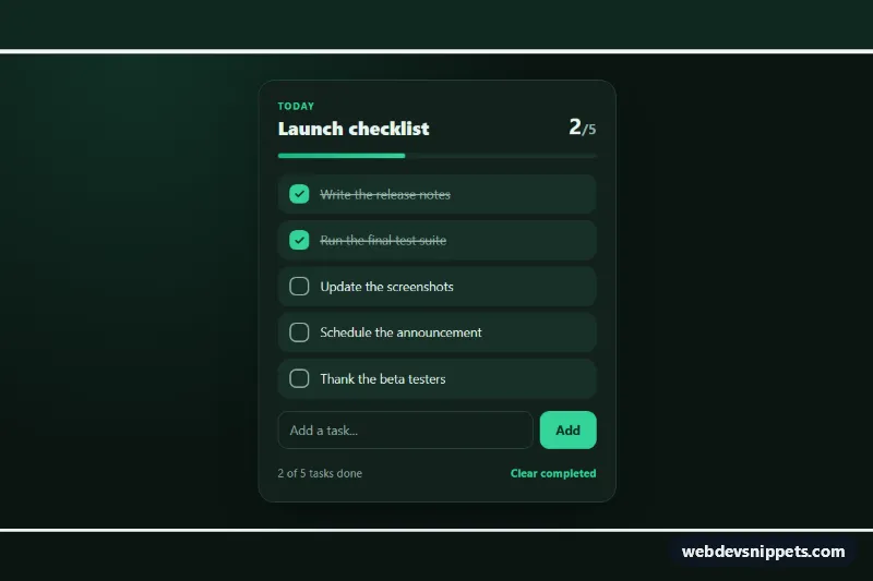
An animated to-do checklist built with pure CSS and a small vanilla JavaScript helper. Ticking a task draws a check mark inside a rounded box and strikes the text through from left to right, while a progress bar and counter keep track of what is done. Use it for onboarding steps, launch plans or task widgets.
How it works
The wrapper section.ck-wrap paints the dark background, and .ck-card (marked with data-ck-checklist) holds the header, the .ck-bar progress bar, the ul.ck-items list, the .ck-add form and the .ck-foot row. Every task is a label.ck-label that wraps a real checkbox .ck-input, a decorative .ck-box with an SVG check mark and the .ck-text.
The animation is pure CSS. The checkbox is visually hidden, and the :checked state drives its siblings. The check path uses stroke-dasharray and stroke-dashoffset; when the box is checked the offset goes to 0, so the mark draws itself, and the box fills with the accent color through the short ck-pop keyframes. The strike-through is a 2px linear-gradient background on .ck-text whose background-size grows from 0 to 100%, which works across wrapped lines.
The script initializes every [data-ck-checklist] element. A change listener on the list updates the .ck-done and .ck-total counter, the width of .ck-bar-fill, the aria-valuenow of the progress bar and the .ck-status text. Submitting .ck-add calls preventDefault() and appends a new task built with createItem(). The .ck-clear button slides out checked tasks with the is-leaving class and removes them. Without JavaScript the checkboxes and their animations still work.
Customization
--ck-accenton.ck-wrap: the color of checked boxes, the eyebrow text, the Add button and the focus outlines.--ck-speed: the duration of the check, strike-through and fade animations, e.g.0.6sfor a slower effect.--ck-page,--ck-cardand--ck-row: the page, card and task row backgrounds; switch them to light values for a light theme.stroke-dasharray: 22in.ck-box svg: keep it equal to the path length if you replace the check mark with your own icon.background-position: 0 55%in.ck-text: moves the strike-through line up or down.max-width: 28remin.ck-card: makes the card wider or narrower.- Remove the
checkedattribute from the sample inputs to start with an empty list of completed tasks.
Accessibility
Each task is a native checkbox inside its label, so it is reachable with Tab, toggled with Space and announced with its text. The decorative box is aria-hidden, and a :focus-visible outline is drawn around it when the hidden input has keyboard focus. The progress bar uses role="progressbar" with aria-valuemin, aria-valuemax and aria-valuenow, and .ck-status is an aria-live="polite" region that announces "3 of 5 tasks done". The new task field has an aria-label. With prefers-reduced-motion: reduce all animations and transitions are disabled.
Usage notes
Several checklists can share a page. Tasks are not saved; add your own storage or fetch() call in the submit and change handlers if they should persist.