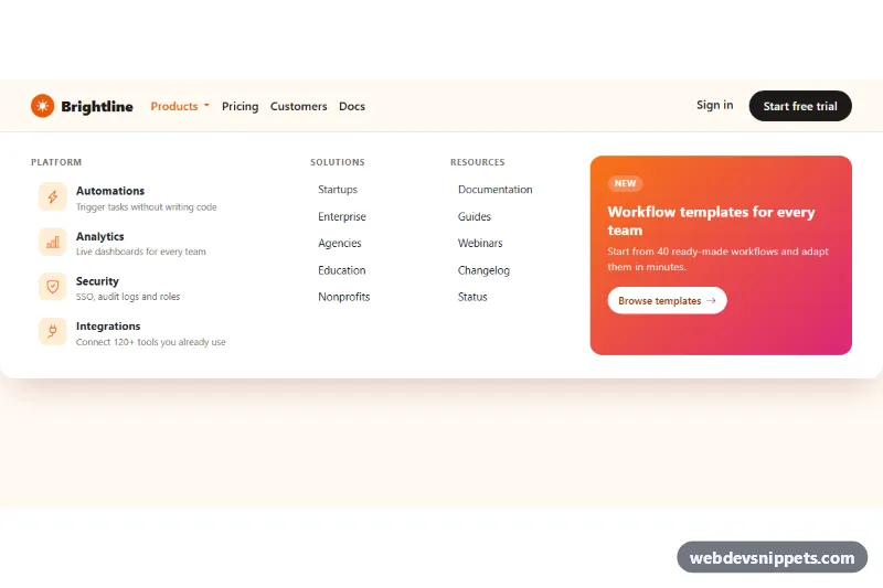
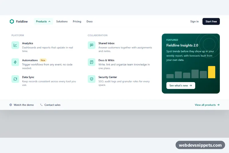
A full-width Bootstrap 5 mega menu: a navbar dropdown that opens into a wide panel with icon feature links, two plain link columns and a gradient promo block. It fits SaaS marketing sites, online stores and any header with more links than a normal dropdown can hold.
How it works
The header .mgm-root contains a standard navbar navbar-expand-lg with a brand, a collapse toggler and the #mgm-collapse area. The Products item is a li.dropdown.mgm-static whose button.mgm-toggle uses data-bs-toggle="dropdown" and data-bs-auto-close="outside", so clicks inside the panel do not close it, while clicks elsewhere and the Escape key do.
The .dropdown-menu.mgm-panel holds a Bootstrap container with a row. On screens from 992px the CSS gives .mgm-static position: static, so the absolutely positioned panel is placed against the navbar and stretches from edge to edge with left: 0 and right: 0. The columns are a Platform list of .mgm-feature links with .mgm-icon tiles, Solutions and Resources lists of .mgm-link items and the .mgm-promo card with a call-to-action. Below 992px the panel sits inside the collapsed navbar and the columns stack.
All links carry Bootstrap's dropdown-item class, so the Dropdown plugin's arrow-key navigation works across the whole panel. The script creates the dropdown with bootstrap.Dropdown.getOrCreateInstance(), opens it on load when the root has data-mgm-open-on-load and the screen is wide, and closes it with hide() when the window shrinks to the mobile layout. A .mgm-hero block below the navbar stands in for page content.
Customization
--mgm-accenton.mgm-rootinstyle.css: changes the hover color, icon tiles, focus outlines and logo.--mgm-bgand--mgm-panel-bg: set the navbar background and the background of the open panel.--mgm-radius: rounds the bottom corners of the panel more or less.- Remove
data-mgm-open-on-loadfrom.mgm-rootso the menu starts closed; it is only there to show the panel in the preview. - The
linear-gradientin.mgm-promo: replace it with your brand colors or an image for the promo block. - Change the column classes (
col-lg-4,col-lg-2) to rebalance the panel, for example four equalcol-lg-3columns. - Change
data-bs-auto-close="outside"on.mgm-toggletotrueto close the panel after any click inside it.
Accessibility
The navbar is a nav with aria-label="Primary". The Products toggle is a real button; Bootstrap updates its aria-expanded state, and the panel is linked to it with aria-labelledby. Each column list is labelled by its heading through aria-labelledby. Arrow keys move between items, Escape closes the panel and returns focus to the toggle. Icons are aria-hidden. Links and buttons show a 2px accent outline on :focus-visible, and transitions are removed under prefers-reduced-motion.
Usage notes
Requires Bootstrap 5.3 with its JS bundle (added automatically) and Bootstrap Icons. If you need two mega menus, repeat the li.dropdown.mgm-static block with a new toggle id and update its aria-labelledby.