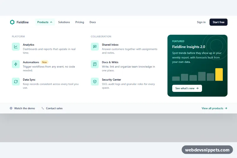
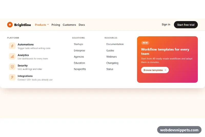
A products mega menu built with Tailwind CSS: a clean white navbar whose "Products" button opens a full-width panel with two columns of icon links, short descriptions, a dark featured card and a footer strip of secondary links. It suits SaaS marketing sites and product companies with more offerings than a simple dropdown can hold.
How it works
The root .tmm-root wraps a header with the nav and the panel #tmm-panel (data-tmm-panel), which sits directly below the bar with absolute inset-x-0 top-full and starts hidden. The panel grid is one column on phones, two from md and lg:grid-cols-[1fr_1fr_19rem] on desktops, where the featured card takes the third column. A max-h-[calc(100dvh-4rem)] overflow-y-auto limit keeps the panel scrollable on short screens. A .tmm-scrim layer (data-tmm-scrim) dims the page while the menu is open.
script.js initializes every .tmm-root on DOMContentLoaded. The data-tmm-trigger button toggles the panel and its aria-expanded state; the aria-expanded: variants tint the button and the group-aria-expanded:rotate-180 chevron flips. Arrow Down on the trigger opens the panel and focuses the first link; inside the panel Arrow Up, Arrow Down, Home and End move between links. Escape closes the panel and returns focus to the trigger, and the menu also closes when focus leaves the header or the user clicks anywhere outside it. style.css adds the tmm-drop and tmm-fade entrance animations.
Customization
- Remove
data-tmm-start-openfrom.tmm-rootso the menu starts closed; it is only there so the demo shows the open panel. bg-teal-100 text-teal-700andgroup-hover:bg-teal-600on the icon boxes: change the accent color of every product icon.from-teal-800 to-emerald-950on the featured card: restyle the promo block, or delete the card and uselg:grid-cols-2on the panel grid.lg:grid-cols-[1fr_1fr_19rem]on the panel grid: add a third link column withlg:grid-cols-[1fr_1fr_1fr_19rem].bg-slate-900/20on.tmm-scrim: make the page dimming stronger or remove the scrim element entirely.animation: tmm-drop 0.22sinstyle.css: tune or remove the slide-down motion.- The "New" pill (
bg-amber-100 text-amber-800): move it to any other product title.
Accessibility
The trigger is a real button with aria-controls="tmm-panel" and an aria-expanded state kept in sync by the script. Each column is a section labelled by its heading through aria-labelledby, links have descriptive text and decorative SVGs are aria-hidden. The menu is fully keyboard operable with Tab, the arrow keys, Home, End and Escape, and focus returns to the trigger after Escape. All controls show a teal focus outline, and the entrance animations are disabled under prefers-reduced-motion: reduce.
Usage notes
The panel opens on click rather than hover, which works the same on touch screens and avoids accidental openings. Use unique id values when placing several menus on one page.