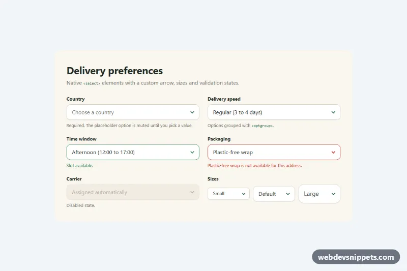
Styled Native Select
Pure CSS restyle of the native select element with a custom arrow, focus ring, error, success and disabled states, and three sizes.
Components tagged with "dropdown".
13 component(s)
Pure CSS restyle of the native select element with a custom arrow, focus ring, error, success and disabled states, and three sizes.
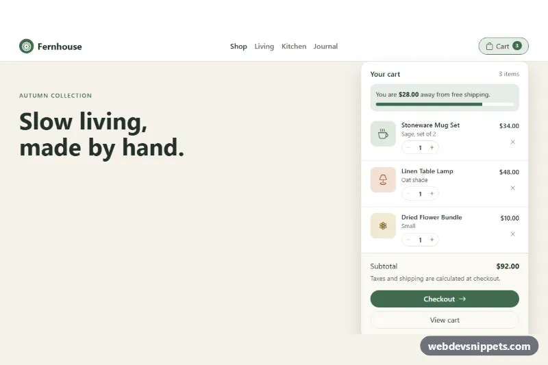
Bootstrap 5 navbar mini cart dropdown with quantity steppers, remove buttons, free-shipping progress, live subtotal and checkout button.
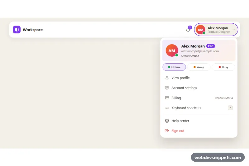
Bootstrap 5 avatar dropdown with profile header, plan badge, online/away/busy status picker and account menu links for app headers.
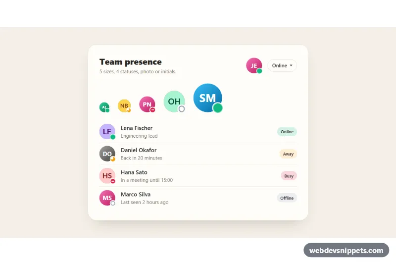
Bootstrap 5 avatars in five sizes with online, away, busy and offline status dots, initials fallback for missing photos and a status picker.
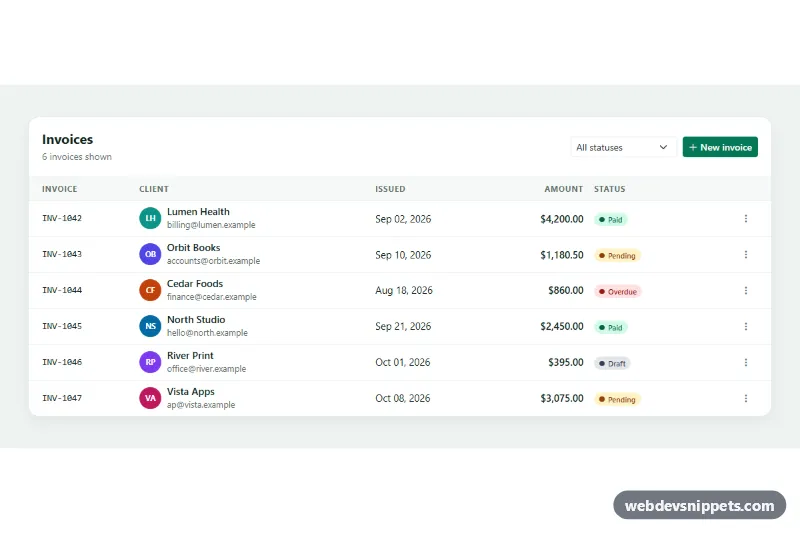
Responsive Bootstrap 5 invoice table with status badges, a status filter and row action dropdowns to mark as paid, remind or delete.
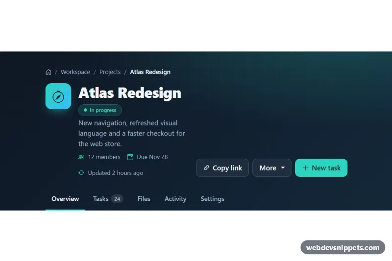
Dark Bootstrap 5 page header with breadcrumb, title and status badge, copy-link and dropdown actions, and section tabs.
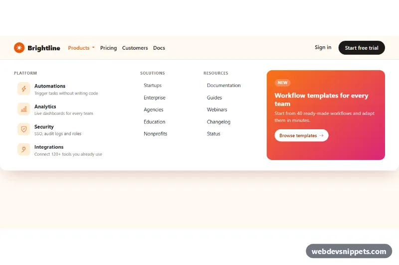
Full-width Bootstrap 5 mega menu with icon feature links, link columns and a gradient promo block, keyboard friendly and stacked on mobile.
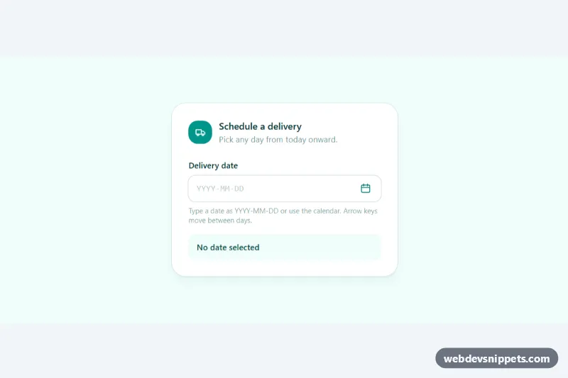
Accessible Tailwind CSS date picker: a text input with a calendar popup, keyboard grid navigation, locale-aware labels and min/max dates.
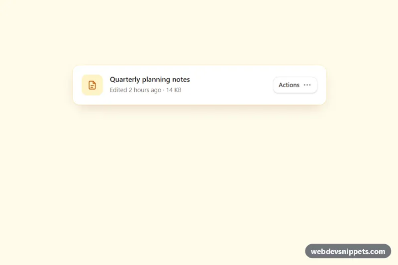
Accessible Tailwind CSS menu button with icons, grouped items, dividers, shortcut hints, typeahead and full arrow-key navigation.
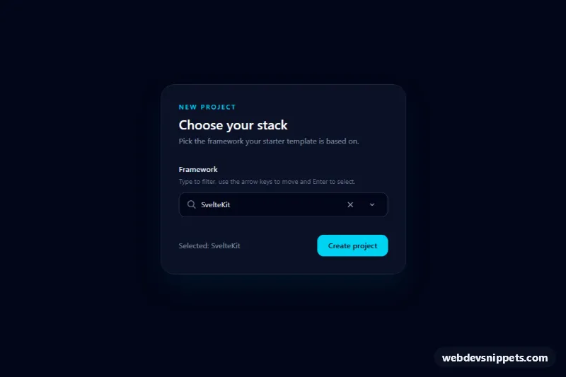
Accessible Tailwind CSS combobox that filters options as you type, highlights matches and supports full keyboard navigation.
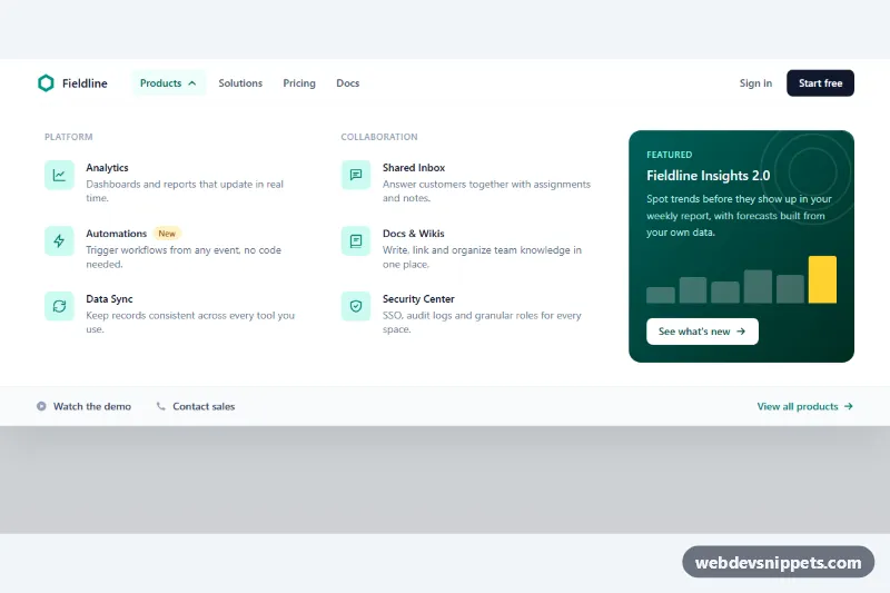
Tailwind CSS mega menu with two columns of product links, icons and descriptions, a featured promo card and full keyboard support.
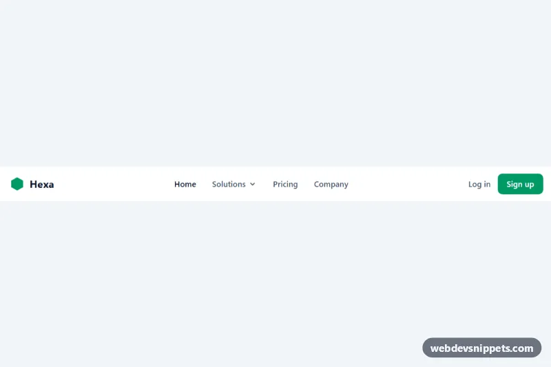
Tailwind CSS navbar with an accessible dropdown, call-to-action buttons and a collapsible mobile menu.
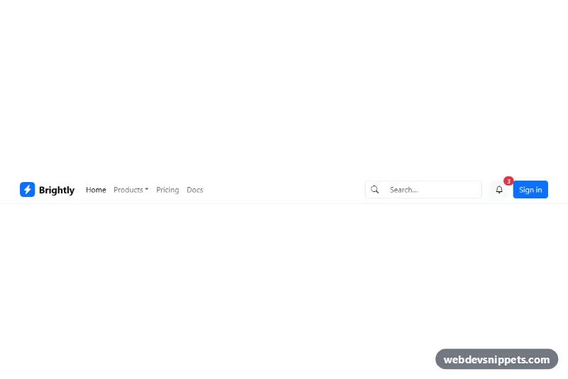
Responsive Bootstrap 5 navbar with brand, dropdown menu, search form and user actions.