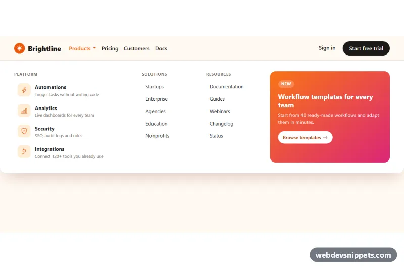
Bootstrap Mega Menu Dropdown
Full-width Bootstrap 5 mega menu with icon feature links, link columns and a gradient promo block, keyboard friendly and stacked on mobile.
Large multi-column dropdown menus.
2 component(s)
Full-width Bootstrap 5 mega menu with icon feature links, link columns and a gradient promo block, keyboard friendly and stacked on mobile.
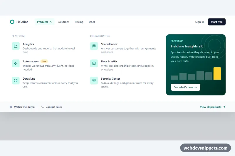
Tailwind CSS mega menu with two columns of product links, icons and descriptions, a featured promo card and full keyboard support.
A mega menu is a large dropdown panel that opens from a navbar item and shows many links at once, arranged in several columns. It can include headings, icons, short descriptions, featured images or a promotional block. Mega menus are common on e-commerce stores, news sites, universities and SaaS companies with many products or resources.
Use one when a top-level section has too many destinations for a normal dropdown, and when grouping them visually helps people find the right page. If a section only has a handful of links, a simple dropdown is clearer. Keep the number of top-level triggers small and the groups inside each panel logical, with clear headings.
<button> triggers with aria-expanded and aria-controls for each panel; avoid opening menus on hover alone.The mega menu examples here come in Bootstrap 6, Bootstrap 5, Tailwind CSS and pure CSS versions. Bootstrap 5 mega menus build on the dropdown plugin with grid columns inside the menu; Bootstrap 6 alpha versions use its ES module JavaScript and theme-* colour roles. Tailwind and pure CSS versions show a responsive mega menu in plain HTML and CSS with a small script. Filter by framework, open the live preview to test desktop and mobile behaviour, then copy the code or download it and fill in your own categories.