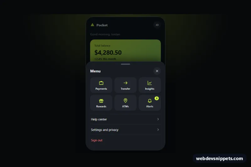
A dark mobile navigation menu that slides up from the bottom of the screen as a rounded sheet, built with pure CSS and vanilla JavaScript. A lime menu button in the tab bar opens the sheet with a drag handle, a grid of quick action tiles and a short list of secondary links. It suits banking, delivery and other app-like mobile web interfaces where a thumb-friendly menu works better than a top hamburger drawer.
How it works
The demo wrapper .bsm-demo centers a phone-sized .bsm-app shell that contains a .bsm-topbar, scrollable .bsm-content, the .bsm-tabbar with the .bsm-trigger button, a .bsm-scrim and the .bsm-sheet dialog. The sheet is positioned at the bottom of the shell and moved out of view with transform: translateY(100%). When .bsm-app has the class is-open, the sheet slides to translateY(0) and the scrim fades in. visibility is switched after the transition, so a closed sheet cannot receive focus.
Inside the sheet, .bsm-grabber is a sticky header with the .bsm-handle bar and the title. The .bsm-grid holds six .bsm-tile links with inline SVG icons (one with a .bsm-badge), followed by .bsm-links rows.
The script works per .bsm-app. Clicking the trigger opens the sheet and focuses the first control; anything with data-bsm-close (the scrim and the close button) closes it, and Escape does the same. Tab and Shift+Tab are kept inside the sheet, the rest of the shell is made inert, and focus returns to the trigger on close. Pointer events on .bsm-grabber let you drag the sheet down; releasing past 30 percent of its height (CLOSE_DISTANCE) closes it, otherwise it snaps back.
Customization
--bsm-accentand--bsm-accent-inkon.bsm-demo: the lime color of the menu button, icons and badge, and the text drawn on top of it.--bsm-surfaceand--bsm-surface-2: background of the sheet and of the tiles.--bsm-speed: slide and fade duration, e.g.0.25sfor a snappier sheet.--bsm-radius: the top corner radius of the sheet.--bsm-scrim: color and opacity of the dimmed backdrop.- Remove
is-openfrom.bsm-appand setaria-expanded="false"on.bsm-triggerso the menu starts closed. grid-template-columnsin.bsm-grid: userepeat(4, 1fr)for a denser tile grid.CLOSE_DISTANCEinscript.js: how far the sheet must be dragged before it dismisses.
Accessibility
The sheet has role="dialog", aria-modal="true" and aria-labelledby pointing to its heading. The trigger exposes aria-expanded and aria-controls, and has a visually hidden label. Focus is moved into the sheet, trapped there while it is open and returned to the trigger afterwards; Escape closes it. The current tab uses aria-current="page", and every link and button gets a lime focus outline. With prefers-reduced-motion: reduce the sheet and scrim appear without animation.
Usage notes
The demo starts open so the sheet is visible in the preview. In a real app make .bsm-app your full-height layout wrapper (for example --bsm-app-height: 100dvh); below 420px the phone frame is removed automatically. Without JavaScript the sheet stays in its markup state, so ship the script with it.