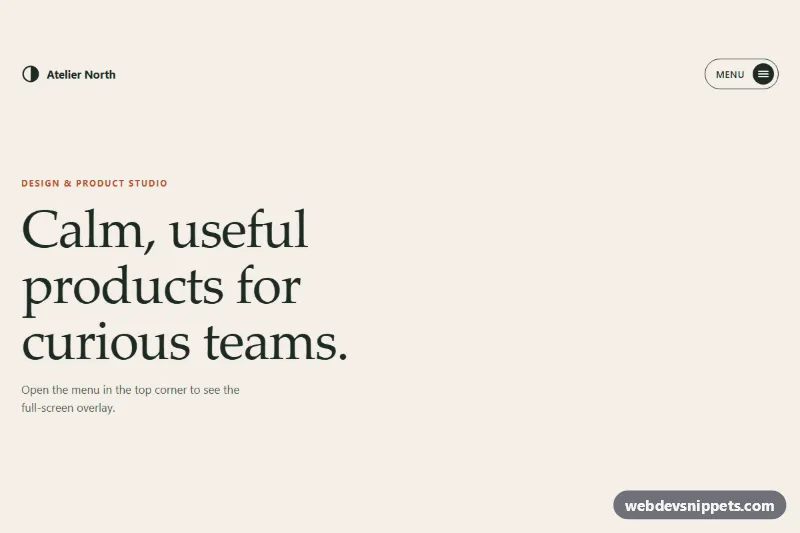
A full-screen overlay menu in pure CSS and vanilla JavaScript: a pill-shaped hamburger button opens a deep green panel that grows as a circle from the button, then large serif links slide up one after another. It suits portfolios, studio sites, restaurants and other mobile-first sites.
How it works
The root .fm-root contains a sticky .fm-header with the .fm-logo and the .fm-toggle button, the .fm-overlay dialog, and a .fm-demo intro section that only exists for the preview. The toggle holds two stacked labels (.fm-toggle-open and .fm-toggle-close) and a round .fm-burger whose three .fm-line bars rotate into an X.
The overlay is position: fixed and hidden by clip-path: circle(0 at var(--fm-ox) var(--fm-oy)) plus visibility: hidden. When the script adds .is-open to the root, the circle expands to 150% and the header turns transparent so the toggle stays on top as the close button. Each .fm-item clips its .fm-link, which starts pushed down and slides into place; nth-child rules add a growing transition-delay for the stagger. The .fm-aside block with the email address and .fm-social pills fades in last.
On DOMContentLoaded the script initializes every .fm-root. On open, setOrigin() measures the toggle with getBoundingClientRect() and writes --fm-ox and --fm-oy, so the circle always starts at the button. It also adds .fm-lock to html to stop page scrolling. The root listens to keydown for Escape and for Tab to keep focus inside, and a click on any .fm-link marks it as current and closes the menu. Each change fires an fm:toggle event with detail.open.
Customization
--fm-overlay,--fm-overlay-textand--fm-accenton.fm-root: the overlay color, its text color and the coral underline, hover and active color.--fm-durationand--fm-ease: speed and easing of the circular reveal.--fm-stagger: delay between links; set it to0msto show all links at once.font-size: clamp(2.25rem, 9vw, 4.75rem)on.fm-label: the size of the menu links on phones and desktops.- Add a sixth
.fm-item; the stagger rules already cover up to six links. - Delete the
.fm-demosection and its CSS rules and place the component above your own page content. - Remove
.fm-asideif you only need the link list, and drop thegrid-template-columnsline of.fm-overlay-innerso the links use the full width.
Accessibility
The toggle is a real button with aria-controls, aria-label="Main menu" and an aria-expanded value that the script keeps in sync. The overlay has role="dialog", aria-modal="true" and a nav landmark with an ordered list. While closed it uses visibility: hidden, so its links are out of the tab order. On open, focus moves to the current link; Tab and Shift+Tab cycle between the links and the close button, and Escape closes the menu and returns focus to the toggle. All controls have a coral :focus-visible outline. With prefers-reduced-motion: reduce the circle and stagger animations are replaced by a short fade.
Usage notes
For several instances on one page give each .fm-overlay a unique id and point the matching aria-controls at it.