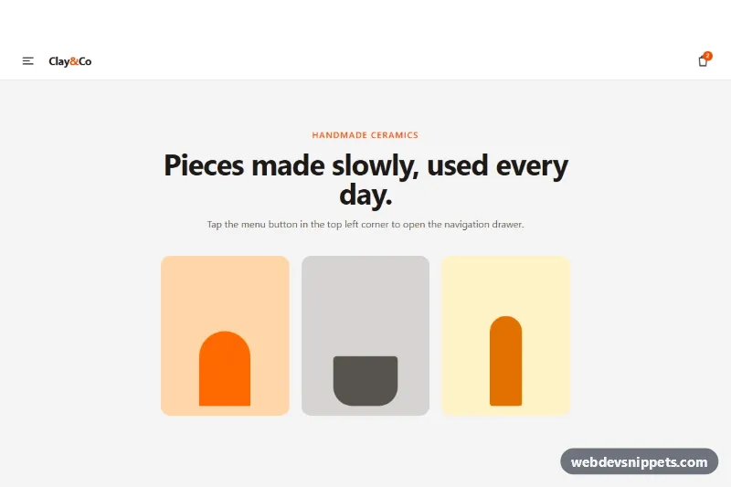
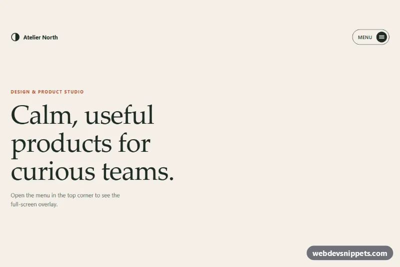
An off-canvas mobile menu built with Tailwind CSS that slides in from the left over a blurred backdrop. The drawer has a search field, icon links, an expandable submenu, account links and a sign-in button, and it behaves like a proper modal with a focus trap, Escape to close and scroll locking. It fits online shops, blogs and any site that needs a compact navigation on phones.
How it works
The root .tsm-root contains the top bar with the data-tsm-open hamburger button and a fixed layer marked data-tsm-layer, which starts with hidden and data-open="false". The layer is a named Tailwind group (group/layer): the drawer #tsm-drawer sits at -translate-x-full and moves to translate-x-0 through group-data-[open=true]/layer:, while the backdrop fades from opacity-0 to opacity-100 the same way.
script.js initializes every .tsm-root on DOMContentLoaded. Opening removes hidden, forces a reflow so the slide transition runs, sets data-open="true", locks page scrolling on the html element and moves focus to the close button. A keydown listener closes on Escape and keeps Tab and Shift+Tab inside the drawer, and a focusin listener pulls stray focus back. Clicking the backdrop, the close button (both data-tsm-close) or any link closes the drawer; the layer is hidden again after TRANSITION_MS and focus returns to the hamburger. Buttons with data-tsm-sub toggle their submenu through aria-controls and aria-expanded.
Customization
w-[86%] max-w-xson#tsm-drawer: make the drawer wider (max-w-sm) or narrower.left-0,-translate-x-fullandrounded-r-3xlon#tsm-drawer: switch toright-0,translate-x-fullandrounded-l-3xlto slide in from the right.bg-orange-600,aria-[current=page]:bg-orange-50andfocus-visible:outline-orange-600: replaceorangewith your brand color.bg-stone-950/50 backdrop-blur-[2px]on the backdrop: adjust the dimming or remove the blur.duration-300on the drawer and backdrop: change the slide speed and updateTRANSITION_MSinscript.jsto match.- Add
lg:hiddento thedata-tsm-openbutton and show an inline link list fromlgup for a classic responsive header. data-tsm-search: the demo form only prevents submission; send the query to your search page in itssubmithandler.
Accessibility
The drawer uses role="dialog", aria-modal="true" and aria-labelledby="tsm-drawer-title". The hamburger has aria-haspopup="dialog", aria-controls and an aria-expanded state, plus a visually hidden "Open menu" label; the cart link and close button have text labels too. The current page is marked with aria-current="page", the search form has role="search" and a hidden label, and focus is trapped while open and restored on close. Every control shows an orange focus outline, and transitions are turned off with motion-reduce:transition-none.
Usage notes
For several menus on one page, give each drawer, title and submenu unique id values.