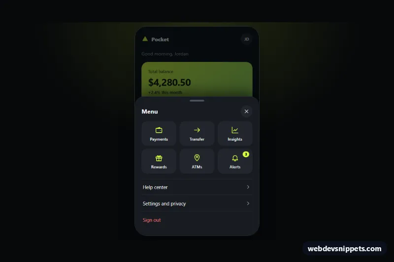
Bottom Sheet Mobile Menu
Dark mobile app menu that slides up from the bottom as a rounded sheet with a drag handle, quick action tiles, scrim, focus trap and swipe to close.
Off-canvas, full-screen and hamburger menus for small screens.
3 component(s)
Dark mobile app menu that slides up from the bottom as a rounded sheet with a drag handle, quick action tiles, scrim, focus trap and swipe to close.
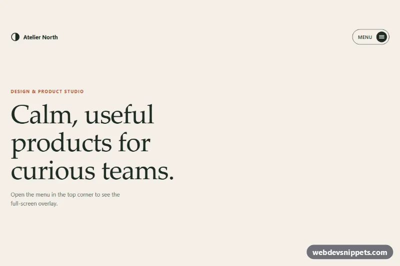
Hamburger button that opens a full-screen menu with a circular clip-path reveal, staggered serif links, focus trap and Escape to close, in pure CSS and vanilla JS.
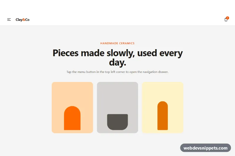
Tailwind CSS off-canvas mobile menu that slides in from the left with a backdrop, focus trap, Escape to close and an expandable submenu.
A mobile menu is the navigation pattern used on small screens, where a full navbar does not fit. Common variants include the hamburger menu that expands below the header, the off-canvas drawer that slides in from the side, full-screen overlay menus and multi-level menus that drill down into sub-pages. A good mobile menu is quick to open, easy to scan and simple to close.
If your site has only three or four main links, consider showing them directly or using a bottom navigation bar instead of hiding them.
<button> with an accessible label like "Open menu" and aria-expanded.prefers-reduced-motion.Mobile menu snippets are available for Bootstrap 6, Bootstrap 5, Tailwind CSS and pure CSS. Bootstrap 5 versions use the collapse and offcanvas components, while the Bootstrap 6 alpha uses <dialog>-based off-canvas menus that bring native focus handling and Escape support, plus theme-* colour roles. Tailwind and pure CSS hamburger menus use a small toggle script. Use the framework filter, resize the live preview to phone width, then copy the HTML, CSS and JS from the code tabs or download the snippet.