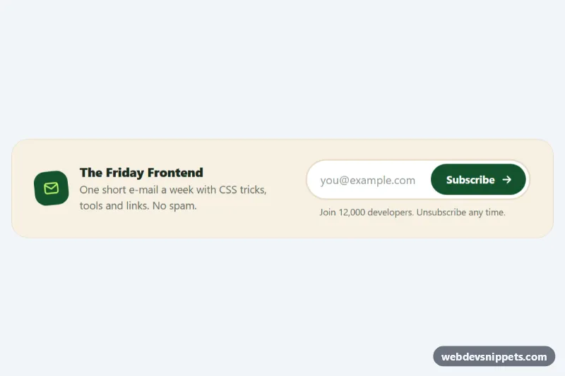
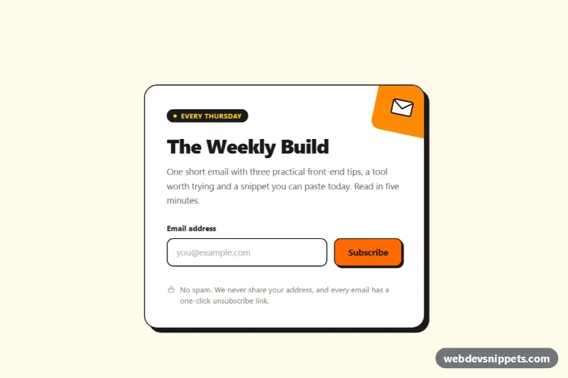
A compact inline newsletter signup in pure CSS and vanilla JavaScript: a cream band with an envelope icon and short pitch on the left, and a pill-shaped email field with an animated Subscribe button on the right. It fits blog sidebars, article footers, landing pages and documentation sites where a full newsletter section would be too large.
How it works
The root section.nli-band is a flex container that stacks on phones and becomes a single row from 720px. .nli-copy holds the .nli-icon, .nli-title and .nli-text. The form.nli-form contains .nli-field, a white pill that wraps the .nli-input and the .nli-btn, plus a .nli-msg line below it.
The button is animated in CSS. On hover or keyboard focus, a lime layer drawn by .nli-btn::before sweeps in from the left with transform: scaleX(), the text turns dark green and the .nli-btn-arrow slides forward. The button also contains a .nli-spinner and a .nli-check icon that only appear in later states.
The script listens for submit, calls preventDefault() and validates the address. The visual state is stored in data-state on the form: idle, error, loading or success. An empty or invalid address sets error, which turns the pill border red and shakes it. A valid one sets loading (the label fades out and the spinner turns), and after a simulated 1.2 second request the state switches to success: the button becomes lime, its label changes to "Subscribed" and the check mark is drawn with a stroke-dashoffset animation. Typing in the field again returns the form to idle.
Customization
--nli-accentand--nli-highlighton.nli-band: the dark green of the button and icon, and the lime color of the hover sweep and success state.--nli-bgand--nli-border: background and border of the band and the input pill.--nli-radius: set0.75remfor a squarer field and button instead of the full pill.--nli-error: color of the error border and message.- Replace the
window.setTimeoutcall inscript.jswithfetch()to your newsletter provider and callsetState('error', …)if the request fails. - Edit the text of
.nli-msginindex.html; the script restores this default text whenever the form resets.
Accessibility
The input has a real label (visually hidden with .nli-sr), autocomplete="email" and aria-describedby pointing to .nli-msg. The message is a role="status" live region, so validation errors, "Subscribing…" and the success text are announced. Invalid input sets aria-invalid="true" and keeps focus in the field, and the button gets aria-busy while loading. The pill shows a focus ring through :focus-within, and the button has its own :focus-visible outline. With prefers-reduced-motion: reduce the sweep, shake and check animations are switched off and the spinner turns slowly.
Usage notes
The section uses fixed id values for the label and message; give each copy unique ids when you place several forms on one page. The form never sends data until you add your own request.