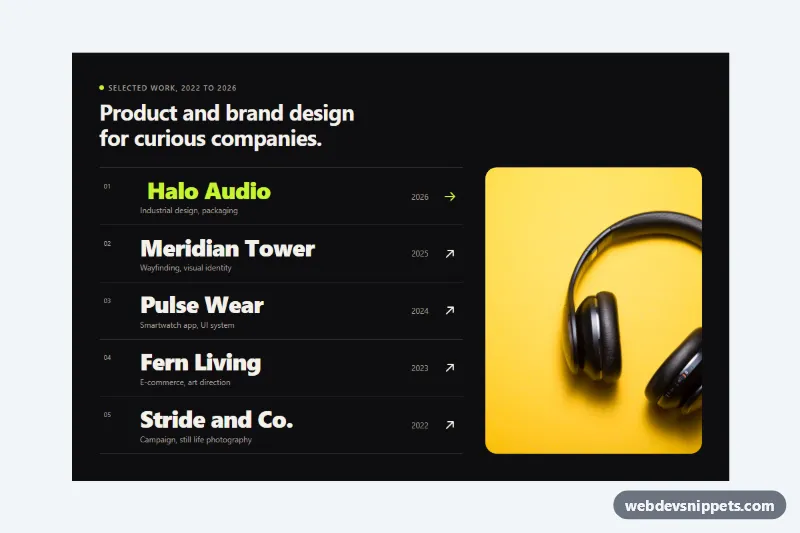
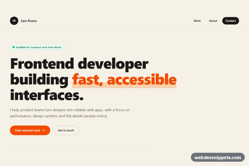
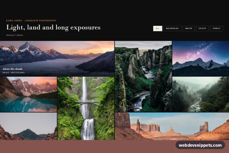
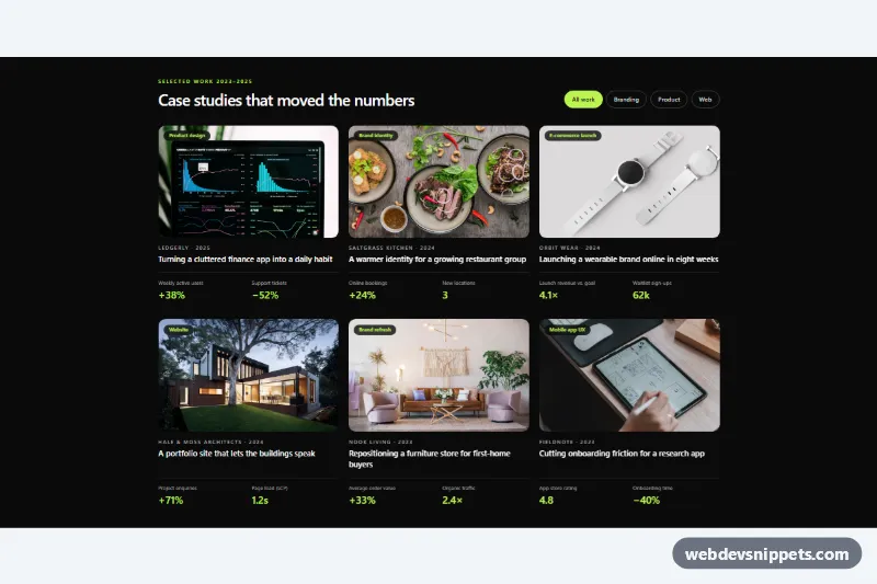
A dark designer portfolio section built with pure CSS: a numbered list of projects in large type, where hovering or focusing a row reveals that project's photo in a tall image stage on the right. It suits personal portfolios, studio websites and case study indexes. No JavaScript is needed.
How it works
The root section.pph-portfolio holds a .pph-head with an eyebrow and title, followed by .pph-body, which wraps an ordered list .pph-list. Each li.pph-item contains one a.pph-link with a .pph-num, a .pph-text block (.pph-name and .pph-tags), a .pph-year, an arrow icon .pph-arrow and the project photo inside .pph-media.
On wide screens with a mouse (min-width: 860px and hover: hover), .pph-list reserves space on the right with margin-right, and every .pph-media is absolutely positioned against .pph-body, so all photos stack in the same stage. They are hidden with clip-path: inset(100% 0 0 0). When a link is hovered or receives keyboard focus, its photo is revealed with clip-path: inset(0) while the image scales from 1.18 down to 1, giving a wipe-and-settle effect. The project name turns to the accent color and slides right, the arrow rotates, and the other names are dimmed through :has().
When nothing is hovered or focused, .pph-list:not(:has(.pph-link:hover, .pph-link:focus-visible)) keeps the first project active, so the section never shows an empty stage. On phones and touch devices the stage is not used; each row simply shows its photo as a small rounded thumbnail.
Customization
--pph-accenton.pph-portfolio: color of the active project name, the arrow, the eyebrow dot and the focus ring.--pph-bg,--pph-textand--pph-muted: background, main text and secondary text colors. Swap them for a light portfolio.--pph-media-width: width of the image stage on desktop, for example45%for bigger photos.--pph-speed: duration of the reveal, the name slide and the arrow rotation.--pph-radius: corner radius of the image stage.- Change the
clip-pathstart value in the desktop.pph-mediarule, for exampleinset(0 100% 0 0), to wipe the photo in from the left instead of from below. - Add or remove
li.pph-itemrows; the stage height follows the height of the list.
Use cases
- Personal portfolios: large project names reveal a photo in a tall stage on the right on hover
- Design studios: a numbered list with tags and years works as a case study index
- Keyboard users: focusing a row triggers the same photo reveal as hovering
- Touch devices: each row shows its photo as a small thumbnail instead
- Dark sites: the first project stays active so the stage is never empty
Accessibility
The projects are an ordered list of real links, so they are reachable with Tab and announced with their name, tags and year. Each photo has a descriptive alt text. :focus-visible triggers the same reveal as hover and draws an outline in the accent color, so keyboard users get the full effect. The decorative numbers and arrows are aria-hidden. Text colors meet WCAG AA contrast on the dark background. With prefers-reduced-motion: reduce all transitions are removed and photos switch instantly.
Usage notes
The photos come from Unsplash and should be replaced with your own project images; keep a portrait crop (about 720 by 880) so they fill the stage. The default-active first row relies on :has(); in older browsers the stage is simply empty until a row is hovered.