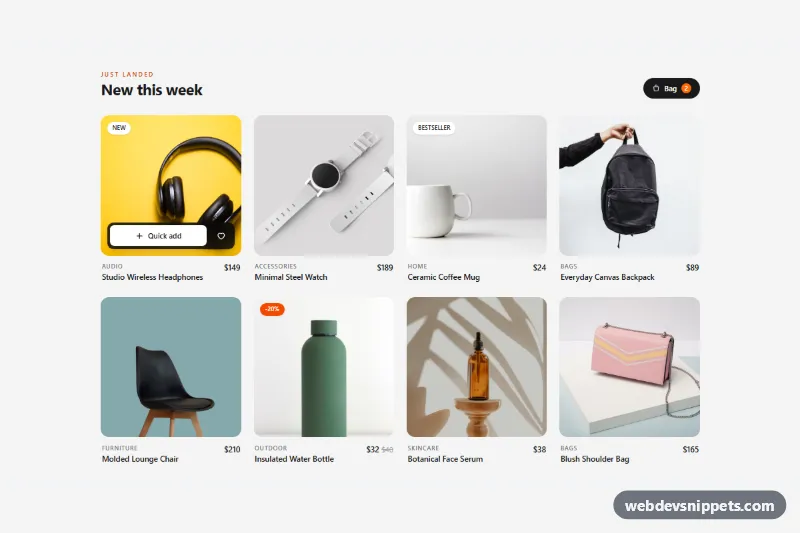
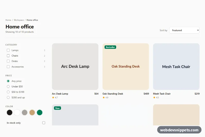
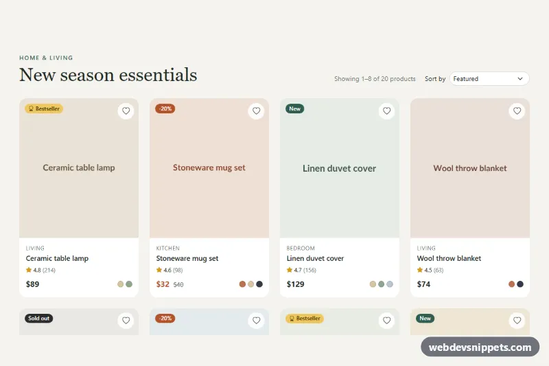
A responsive product grid built with Tailwind CSS where a dark quick add bar slides up over the product photo when a shopper hovers or tabs into a card. It suits shop home pages, "new arrivals" rows and category pages where customers should add an item to the bag without opening the product page.
How it works
The root is section.tqa-grid. A header holds the title and a "Bag" link with the .tqa-count badge. Below it, a ul grid with two columns on phones and four from the lg breakpoint lists eight li.tqa-card items. Each card has a square photo with object-cover, an optional badge such as "New" or "-20%", the category, the product name and the price. The product name link uses an after:absolute after:inset-0 overlay, so the whole card is clickable.
Inside the photo sits .tqa-bar with two buttons: .tqa-add ("Quick add") and the heart .tqa-save. style.css keeps the bar below the photo with opacity: 0 and a translateY offset, and reveals it on .tqa-card:hover, :focus-within and .is-active. The first card carries is-active so the effect is visible on load; the script removes it on the first pointerenter or focusin. On touch screens, @media (hover: none) keeps every bar visible.
The script initializes each .tqa-grid on DOMContentLoaded. A click on .tqa-add increases the bag count, plays the tqa-bump animation on the badge and switches the label to "Added" with a check icon for ADDED_MS milliseconds. .tqa-save toggles aria-pressed, which fills the heart through CSS.
Customization
ADDED_MSinscript.js: change how long the "Added" confirmation stays on the button (1600 ms by default).- The
.tqa-addclick handler inscript.js: replace the comment with afetch()call to your cart API and update the count from its response. lg:grid-cols-4on theul: uselg:grid-cols-3for larger photos orxl:grid-cols-5for dense catalogs.aspect-squareon the photo wrapper: switch toaspect-[4/5]for fashion photography.bg-zinc-950/85on.tqa-bar: usebg-white/90with dark text for a light bar.transform: translateY(calc(100% + 0.75rem))in.tqa-bar: set it tononeto keep only the fade.- Remove
is-activefrom the first.tqa-cardif no bar should be shown before the user interacts. orange-500andorange-600on the count badge and the "-20%" badge: swap for your brand color.
Use cases
- Shop home pages: a quick add bar slides up over each photo on hover or keyboard focus
- New arrivals rows: badges such as New or -20% mark products
- Category pages: customers add items to the bag without opening the product page
- Fashion stores: the header shows a live bag counter that bumps on each add
- Wishlist features: a heart button toggles a saved state on each card
Accessibility
The list uses role="list", and every quick add button is linked to its product name through aria-describedby. The heart buttons have an aria-label with the product name and an aria-pressed state. Keyboard users reveal the bar through :focus-within, and every control shows a visible focus ring. A role="status" region announces additions and wishlist changes, and the count badge includes a visually hidden .tqa-unit text, so it reads as "2 items". Old prices include a visually hidden "was". Motion is reduced under prefers-reduced-motion.
Usage notes
The photos come from Unsplash; replace them with your own product images and keep the width, height and alt attributes.