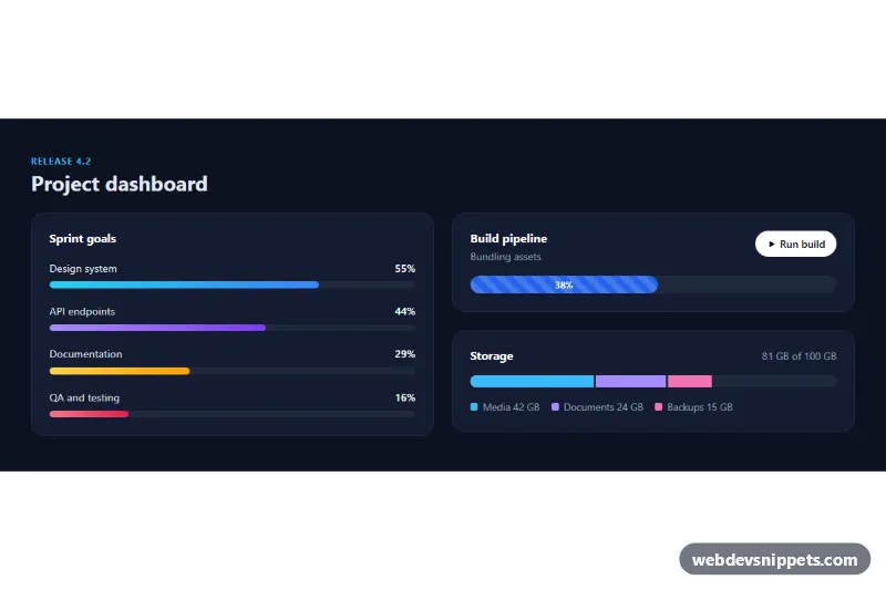
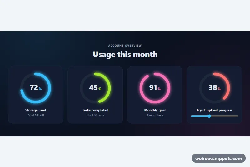
A dark Bootstrap 5 dashboard section that shows three kinds of progress bars: labelled gradient bars that fill when they scroll into view, a striped animated bar driven by a simulated build, and a stacked storage bar with a legend. Use it on project dashboards, admin panels, upload screens or account pages.
How it works
The root .ap-root contains .ap-card panels. Every bar is a Bootstrap .progress element with role="progressbar" and a target value in data-ap-value. In the "Sprint goals" card each .ap-item has a head row with the label and an .ap-pct counter, followed by a slim .ap-track holding an .ap-bar with a gradient modifier such as .ap-bar--violet. The storage card uses Bootstrap's .progress-stacked wrapper, where each segment is its own .progress coloured with .ap-seg--media, .ap-seg--docs or .ap-seg--backup.
The script runs on DOMContentLoaded for every .ap-root. Bars start at zero width; those already on screen fill at once and the rest are filled by an IntersectionObserver the first time they become visible. Filling sets the width, updates aria-valuenow and counts the .ap-pct number up with requestAnimationFrame. The width change is animated by the CSS transition on .ap-bar, controlled by --ap-duration.
In .ap-build, the .ap-run button restarts the striped bar from 0 and raises it in random steps every 280 ms. The step label in .ap-build__step moves through the stages in the STEPS array. At 100% the stripes are removed, .ap-bar--done turns the bar green and the button changes to "Run again".
Customization
--ap-heighton.ap-rootinstyle.css: makes the slim sprint bars thicker or thinner.--ap-durationon.ap-root: speeds up or slows down the fill animation.data-ap-valueon any.progress: sets the target percentage (0–100)..ap-bar--cyan,.ap-bar--violet,.ap-bar--amberand.ap-bar--rose: swap or edit these gradients to recolour individual bars.--bs-progress-bar-bgin.ap-bar--striped: changes the colour of the build bar while it runs.- The
STEPSarray at the top ofscript.js: rename the build stages or change the percentages where they switch. --ap-bgand--ap-cardon.ap-root: change the section and card backgrounds.
Accessibility
Every bar keeps role="progressbar" with aria-valuemin, aria-valuemax and an aria-valuenow that the script updates. Sprint bars are named through aria-labelledby, stacked segments have an aria-label such as "Media, 42 GB", and the build bar exposes its stage in aria-valuetext. The visual .ap-pct counters are aria-hidden to avoid duplicate announcements, while .ap-build__step is a role="status" region that announces each stage change. With prefers-reduced-motion the fill transition, stripe animation and count-up are all switched off.
Usage notes
Requires Bootstrap 5 (added automatically) and Bootstrap Icons. Bars stay empty without JavaScript; add inline widths if you need a no-script fallback. Replace the build simulation with real upload progress events in your own code.