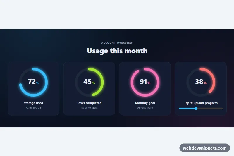
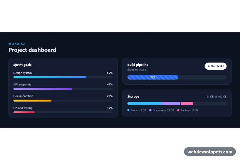
A set of circular progress indicators built with an inline SVG ring, pure CSS and a small vanilla JavaScript helper. Each ring shows a percentage in the middle and fills with a glowing stroke, which makes it a good fit for dashboards, storage meters, goal trackers, upload screens and course progress.
How it works
The root section.cpr-root holds a .cpr-grid of .cpr-item cards. Every card contains a .cpr-ring with role="progressbar", an svg.cpr-svg with two circles and a .cpr-value label. Both circles use pathLength="100", so the SVG treats the circumference as 100 units no matter how large the ring is drawn. .cpr-track is the faint background ring, and .cpr-bar uses stroke-dasharray="100" with stroke-dashoffset set to 100 - value. The SVG is rotated by -90 degrees so the bar starts at twelve o'clock, and stroke-linecap: round gives it soft ends.
On DOMContentLoaded the script reads data-value from every .cpr-ring, resets the bar to empty and then sets the real offset, so the CSS transition on stroke-dashoffset animates the fill. At the same time .cpr-num counts up from 0. The last card links a .cpr-range slider to its ring: every input event updates the stroke, the number and the ARIA values. Without JavaScript the rings still show the correct value, because the offset is written directly in the markup.
Customization
data-valueon.cpr-ring: the percentage from 0 to 100. Also updatearia-valuenowand thestroke-dashoffsetattribute (100 minus the value) for the no-JavaScript fallback..cpr-item--cyan,.cpr-item--limeand.cpr-item--pink: each sets--cpr-color, the color of the bar, its glow and the percent sign. Add your own modifier for another color.data-thresholds="40,75"on a ring inside.cpr-item--interactive: below the first number the bar is red, from the first number it gets.is-mid(amber), from the second.is-high(green).--cpr-sizeon.cpr-root: the maximum diameter of the rings.--cpr-thickness: the stroke width, for example6pxfor a thin ring or14pxfor a chunky one.--cpr-speedinstyle.cssandDURATIONinscript.js: the fill and count-up duration; keep both in sync.grid-template-columnsin.cpr-grid: two columns on phones and four from 860px.
Accessibility
Each .cpr-ring has role="progressbar", an aria-label, aria-valuemin, aria-valuemax and aria-valuenow, and the script adds aria-valuetext such as "72 percent". The SVG and the visible number are aria-hidden so screen readers do not read the value twice. The range input is wrapped in its own label and shows a clear outline on :focus-visible. With prefers-reduced-motion: reduce the bar does not animate and the number appears at its final value.
Usage notes
Several .cpr-root sections can share a page; the script handles each one separately. To update a ring from your own code, change its data-value and dispatch an input event on a linked .cpr-range, or reuse the same logic in your app.