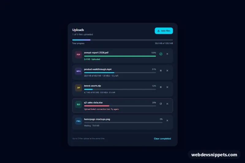
Upload Progress List
Dark Tailwind CSS upload list with per-file progress bars, speed and time left, pause, resume, retry and remove actions, a queue and total progress.
Linear and circular progress indicators.
3 component(s)
Dark Tailwind CSS upload list with per-file progress bars, speed and time left, pause, resume, retry and remove actions, a queue and total progress.
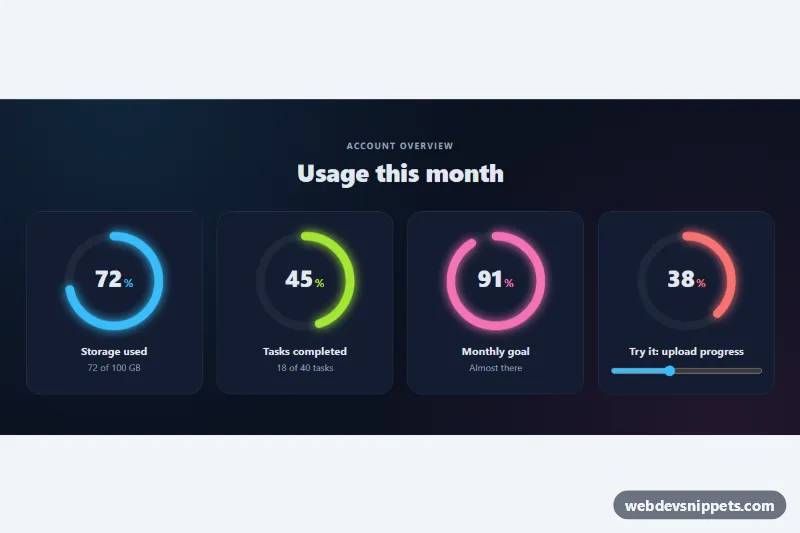
SVG ring progress indicators with an animated fill, count-up percentage, glow colors and a slider-driven demo ring with color thresholds.
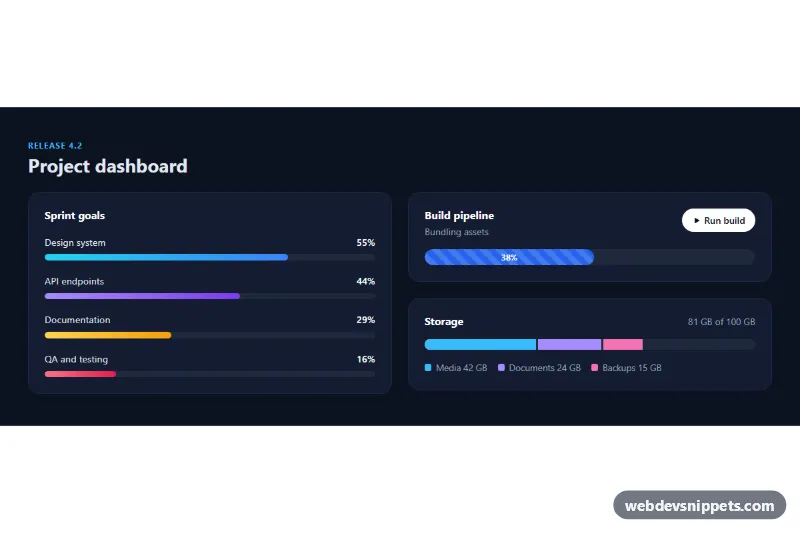
Bootstrap 5 dark dashboard with labelled bars that fill on scroll, a striped animated build progress bar and a stacked storage bar.
A progress bar shows how far a task has advanced. Linear bars fill from left to right, circular indicators fill a ring, and both can display a percentage. They are used for file uploads, installations, profile completion, course progress, quotas and storage usage. When the duration is unknown, an indeterminate bar with a moving stripe tells the user that work is still happening.
The native <progress> element has built-in semantics and is the simplest accessible choice. For custom bars, use role="progressbar" with aria-valuenow, aria-valuemin, aria-valuemax and an aria-label or aria-labelledby that names the task. Leave out aria-valuenow for indeterminate states. Do not announce every percentage change; a polite status message at meaningful milestones is enough. Make sure the filled part contrasts with the track, and soften striped or pulsing animations under prefers-reduced-motion.
These bootstrap progress bar examples and circular progress bar CSS snippets come in Bootstrap 6, Bootstrap 5, Tailwind CSS and pure CSS. Bootstrap 5 versions use the progress and progress-bar classes; Bootstrap 6 versions use the theme-* colour roles for the fill. Circular versions are built with SVG strokes or conic-gradient, so they need no images. Check them in the live preview, then copy the HTML and CSS from the code tabs or download them and set the value from your own script.