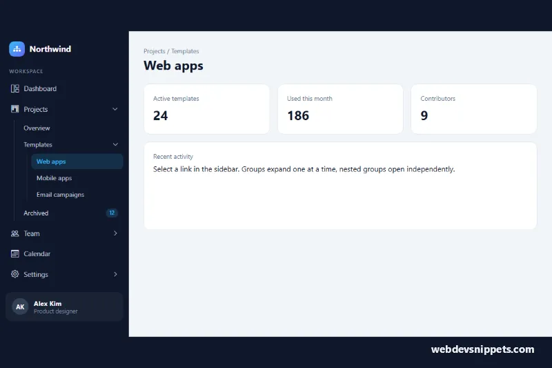
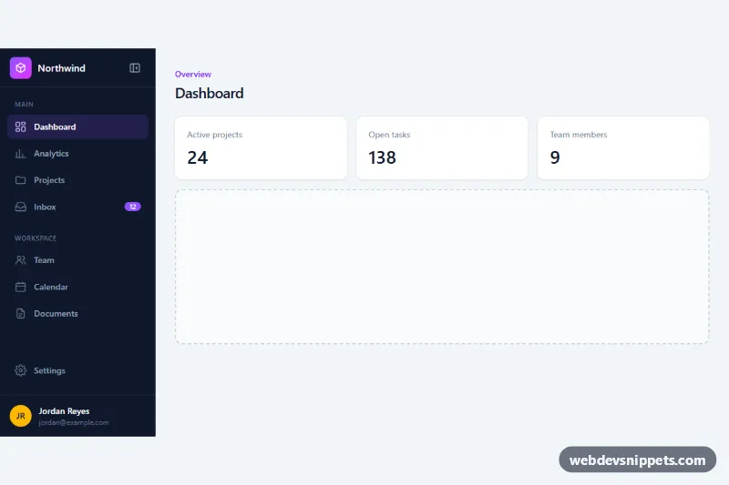
A dark, multi-level Bootstrap 5 sidebar where menu groups open and close with the Collapse plugin, up to three levels deep. It suits admin dashboards, SaaS apps, documentation sites and any layout that needs a long, grouped navigation.
How it works
The wrapper .snm-shell is a flex row with two children: .snm-rail and the .snm-main content area. Inside the rail sits aside.snm-sidebar, which uses Bootstrap's responsive offcanvas-lg class. From 992px up it is a normal, sticky column; below that it becomes an off-canvas panel that slides in from the left when the .snm-open hamburger button is pressed, with its own header and close button.
The menu is a list with the id snm-menu. Every item that has children is a button.snm-link with data-bs-toggle="collapse" pointing to a .collapse block that holds a nested ul.snm-sub. Top-level groups carry data-bs-parent="#snm-menu", so opening Projects closes Team or Settings, like an accordion. Deeper groups such as Templates and Billing have no parent, so they open independently. Bootstrap keeps aria-expanded up to date and the CSS rotates the .snm-caret chevron by -90 degrees when a group is closed. Each nested level is indented with margin-left and a thin left border.
The small script listens for clicks on a.snm-link, moves aria-current="page" to the clicked link (which the CSS highlights in the accent color) and closes the off-canvas panel on small screens through bootstrap.Offcanvas.getInstance(). Without the script the collapse groups still work, only the active link no longer moves.
Customization
--snm-bgon.snm-shellinstyle.css: changes the sidebar background on desktop and in the off-canvas panel.--snm-accent: recolors the current link, badges, focus outline and the logo gradient.--snm-width: makes the desktop rail and the mobile panel wider or narrower (default17.5rem).--snm-indent: controls how far each nested.snm-sublevel is shifted to the right.- Remove
data-bs-parent="#snm-menu"from the top-level.collapseblocks to let several groups stay open at the same time. - Add or remove
showon a.collapseand setaria-expandedon its button to choose which groups are open on load. - Replace
offcanvas-lgwithoffcanvas-md(andd-lg-noneon.snm-openwithd-md-none) to show the fixed sidebar from 768px.
Accessibility
The menu is a nav with aria-label="Main navigation". Group toggles are real button elements with aria-controls and aria-expanded, so screen readers announce whether a group is open; Enter and Space work natively. The current page is marked with aria-current="page" rather than color alone. Icons are aria-hidden. Every link and button shows a 2px outline on :focus-visible. The mobile panel uses aria-labelledby for its title, and Bootstrap traps focus inside it and closes it with Escape. Chevron and hover transitions are disabled under prefers-reduced-motion.
Usage notes
Requires Bootstrap 5.3 (added automatically) and Bootstrap Icons. The ids (snm-sidebar, snm-menu, snm-projects and so on) must be unique, so rename them if you place two sidebars on one page. Remove the preventDefault() call in script.js once the links have real URLs.