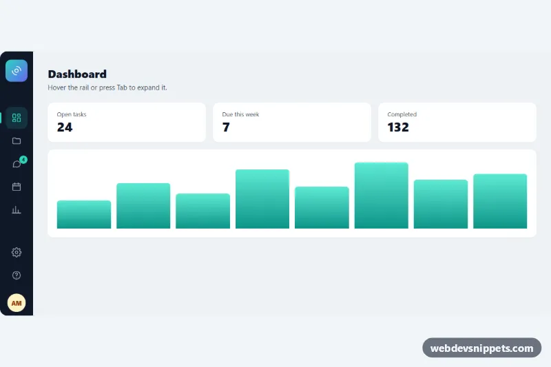
Icon Sidebar that Expands on Hover
Pure CSS icon rail that widens to reveal labels, section headings and a profile on hover or keyboard focus, with an active link and badge.
Vertical side navigation for apps and dashboards.
3 component(s)
Pure CSS icon rail that widens to reveal labels, section headings and a profile on hover or keyboard focus, with an active link and badge.
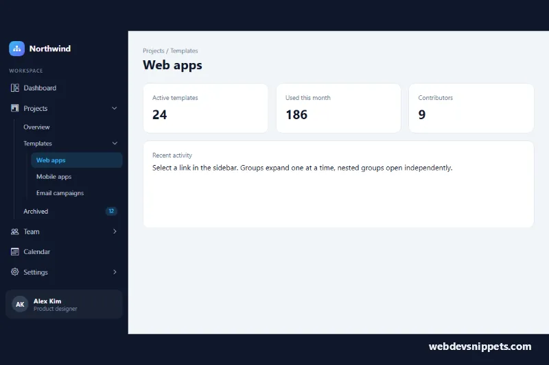
Dark Bootstrap 5 sidebar with three-level collapsible menu groups, accordion behavior, active link highlight and an off-canvas panel on mobile.
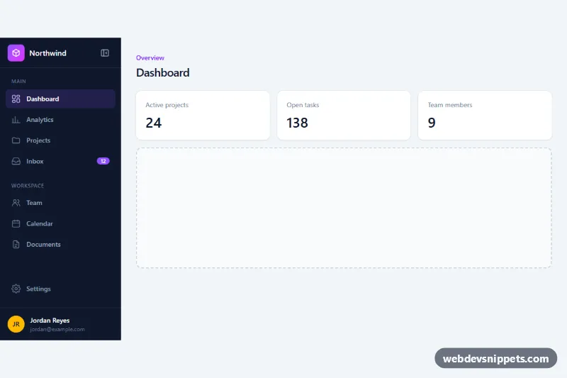
Dark Tailwind CSS dashboard sidebar with icons, grouped sections, an unread badge and a button that collapses it to an icon rail with tooltips.
A sidebar is a vertical navigation panel, usually fixed to the left side of the screen, that lists the main sections of an app or dashboard. It often includes a logo, grouped links with icons, collapsible sub-menus, a user profile area and sometimes a toggle to shrink it to icons only. Sidebars are the standard navigation pattern for admin panels, SaaS products, documentation sites and settings pages.
Choose a sidebar when your app has more sections than fit comfortably in a top navbar, or when users switch between sections frequently and benefit from always-visible navigation. Vertical lists are also easier to scan and scale better as features grow. For simple marketing sites, a top navbar is usually enough.
<nav> element with an aria-label, and mark the current item with aria-current="page".<button> toggles with aria-expanded.aria-label or tooltips that also appear on focus.Sidebar snippets are available for Bootstrap 6, Bootstrap 5, Tailwind CSS and pure CSS. Bootstrap 5 versions typically combine flex utilities with the collapse and offcanvas plugins; the Bootstrap 6 alpha versions use <dialog>-based off-canvas behaviour, ES module JavaScript and theme-* colour roles for light and dark dashboards. Tailwind and pure CSS sidebars are easy to drop into any layout. Pick a framework with the filter, test the collapse behaviour in the live preview, then copy the HTML, CSS and JS or download the snippet and add your own menu items.