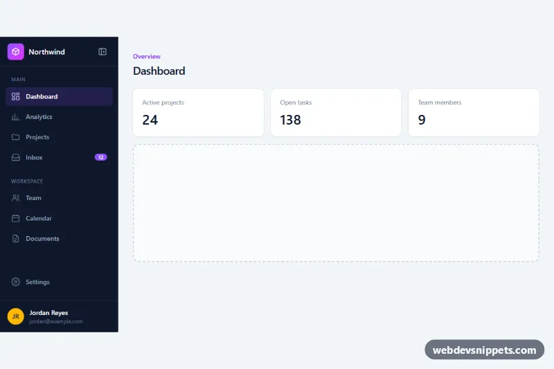
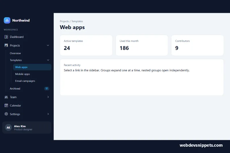
A dark dashboard sidebar built with Tailwind CSS that collapses from a full 16rem navigation with labels to a slim icon rail. It is meant for admin panels, SaaS apps and internal tools where users want more room for content but still need one-click access to every section.
How it works
The root .tsc-root holds the aside and the page main in a flex row, and carries the state in data-collapsed="false" or "true". The root is also a named Tailwind group (group/sb), so every child reacts to the state with group-data-[collapsed=true]/sb: variants: the aside shrinks from w-64 to w-[4.5rem] with a transition-[width], labels and section headings switch to sr-only, the Inbox count turns into a small dot and a thin divider replaces the "Workspace" heading.
Each .tsc-link is its own group/item and contains a tooltip span that only appears in the collapsed state, on hover or keyboard focus. While expanded the aside uses overflow-hidden so labels never spill out during the width animation; when collapsed it switches to overflow-visible so tooltips can extend past the rail.
script.js initializes every .tsc-root on DOMContentLoaded. Clicking the data-tsc-toggle button calls setCollapsed(), which flips data-collapsed, updates aria-expanded and rewrites the visually hidden button label. On screens narrower than 768px (NARROW_QUERY) the sidebar starts collapsed, and Escape collapses it again after it has been expanded.
Customization
data-collapsed="true"on.tsc-root: start with the icon rail on every screen size.w-64andgroup-data-[collapsed=true]/sb:w-[4.5rem]on theaside: change the expanded and collapsed widths.bg-slate-900on theasideandaria-[current=page]:bg-violet-500/15on.tsc-link: swap the sidebar background and active-item highlight, e.g. tobg-zinc-950andemerald.from-violet-500 to-fuchsia-500on the logo mark: change the brand gradient.NARROW_QUERYinscript.js: set the breakpoint where the sidebar auto-collapses, or remove thematchMediacheck to keep it expanded.duration-300on theaside: speed up or slow down the collapse animation.- Move
aria-current="page"to another.tsc-linkto mark a different active page.
Accessibility
The sidebar is an aside with a labelled nav; each section is a role="group" linked to its heading with aria-labelledby. The toggle button has aria-controls, an aria-expanded state and a text label that changes between "Collapse sidebar" and "Expand sidebar". Labels stay in the accessibility tree as sr-only text when collapsed, so screen readers always hear link names, and the unread badge reads "12 unread". Tooltips are aria-hidden duplicates. All links show a violet focus outline, and transitions are disabled with motion-reduce:transition-none.
Usage notes
Give .tsc-root a min-h-dvh class in a real app so the sidebar spans the full viewport height. To remember the user's choice, save the value inside setCollapsed() to localStorage and read it back before the first call.