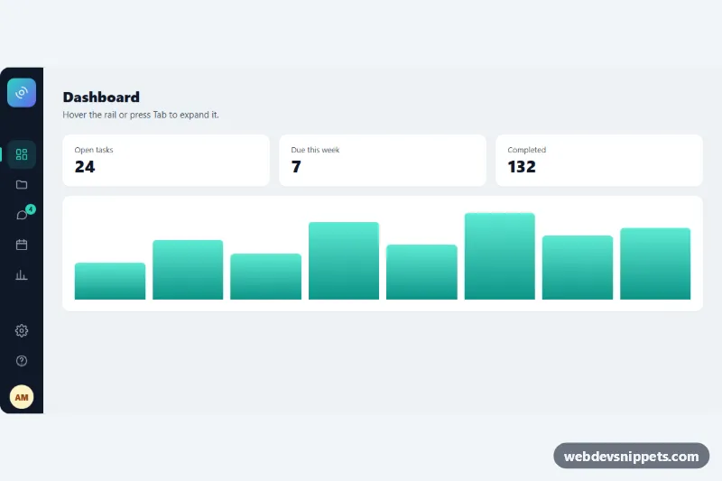
A compact icon sidebar built with pure CSS: a dark, narrow rail of icons that widens to show text labels, section headings and the user profile when you hover it or move keyboard focus into it. It fits admin panels, dashboards and web apps that need the most room for content while keeping navigation one move away. No JavaScript is required.
How it works
The root .ise-shell is a flex container that holds the nav.ise-sidebar and the sample main.ise-main content. The sidebar is absolutely positioned on the left with the width --ise-collapsed, and .ise-main gets the same value as its left margin, so the open rail slides over the content instead of pushing it around.
Each .ise-link contains a fixed-size .ise-icon (a 3rem square with an inline SVG) and an .ise-label. In the collapsed state only the icons are visible because the labels and .ise-heading titles have opacity: 0 and the rail clips everything wider than itself. The selectors .ise-sidebar:hover and .ise-sidebar:focus-within change the width to --ise-expanded, add a shadow and fade the labels in with a short delay, so the text does not appear before there is room for it.
The current page is marked with aria-current="page", which gives the link a tinted background and an accent bar on the left edge. The .ise-badge on Messages sits on the corner of the icon in the narrow rail and moves to the end of the row when the rail opens. At the bottom, .ise-profile is pushed down with margin-top: auto and shows an initials avatar plus name and e-mail.
Customization
--ise-collapsedand--ise-expandedon.ise-shell: the closed and open rail widths, e.g.5remand17remfor larger icons and longer labels.--ise-accent: color of the active link, the left indicator bar, the badge and the focus outline.--ise-rail,--ise-rail-textand--ise-rail-hover: background, icon color and hover background of the rail; set a white rail with gray icons for a light theme.--ise-speed: duration of the width transition, e.g.0.15sfor a snappier rail.- Move
aria-current="page"to another.ise-linkto mark a different page as active. - Remove
.ise-badgefrom Messages, or copy it into any other link to show a count there. - Replace
.ise-mainwith your own page content; keep itsmargin-leftso the rail does not cover your layout.
Accessibility
The rail is a nav landmark with aria-label="Main". Every link has a real text label, which stays in the accessibility tree even while it is faded out, so screen readers always announce "Dashboard", "Messages" and so on. Icons and the avatar are aria-hidden, and the badge includes visually hidden text so it reads as "4 unread". Tabbing into the rail opens it through :focus-within, and every link shows a visible :focus-visible outline. With prefers-reduced-motion: reduce the width, fade and badge transitions are disabled.
Usage notes
For a full-height layout give .ise-shell a min-height of 100vh. On touch screens the first tap focuses a link and opens the rail.