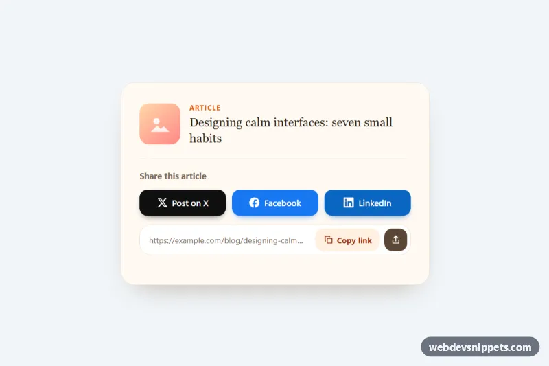
A social share card in pure CSS and vanilla JavaScript with brand-colored buttons for X, Facebook and LinkedIn, a copy-link field and an optional native share button. Place it at the end of blog posts, case studies, product pages or documentation articles.
How it works
The root aside.ssb-share carries two data attributes: data-ssb-url (the address to share) and data-ssb-text (the post text used by X and the native share sheet). Inside, .ssb-preview shows a small article teaser, ul.ssb-list holds the .ssb-link buttons and .ssb-copy-row combines a read-only .ssb-url field with a .ssb-copy button. Each button gets its brand color from a modifier such as .ssb-link--facebook, which sets the local --ssb-brand property used for the background and the colored shadow.
On DOMContentLoaded the script reads the URL (falling back to the current page address) and rebuilds the href of every link with a data-ssb-network value from the NETWORKS templates in script.js. The links already contain working share URLs in the markup, so they still work without JavaScript. Clicking .ssb-copy writes the link with the Clipboard API, falls back to document.execCommand('copy') in older or restricted browsers, and briefly switches the button to a green "Copied" state with the .is-copied class. If copying is blocked, the URL is selected so the visitor can copy it by hand. When navigator.share exists (most phones and some desktop browsers), the hidden .ssb-native button next to the copy button is revealed and opens the system share sheet.
Customization
data-ssb-urlanddata-ssb-texton.ssb-share: set the shared address and text per instance; removedata-ssb-urlto share the current page.--ssb-x,--ssb-facebookand--ssb-linkedin: the brand colors of the three buttons.NETWORKSinscript.js: add another network, for example a Reddit or email template, then add a matching.ssb-linkwith thatdata-ssb-networkvalue.grid-template-columnsin.ssb-list: the buttons stack on phones and sit in three columns from 480px; userepeat(4, 1fr)after adding a fourth network.--ssb-radius: corner radius of buttons and the copy field; use999pxfor pill buttons.--ssb-bg,--ssb-borderand--ssb-accent: the card background, the dividers and the "Article" kicker color.- Remove
.ssb-previewto keep only the buttons and the copy row.
Accessibility
The card is an aside labelled by its heading. Every share link has visible text plus a visually hidden .ssb-sr note that it opens in a new tab, and decorative icons are aria-hidden. The icon-only .ssb-native button is named with aria-label. The URL field has a hidden label. .ssb-status is a role="status" live region that announces the copy result. Links and buttons show a 3px :focus-visible outline in --ssb-focus, and hover lift effects are disabled with prefers-reduced-motion: reduce.
Usage notes
Several cards can share a page; each one uses its own data attributes. The Clipboard API needs a secure context (HTTPS), which is why the fallback exists.