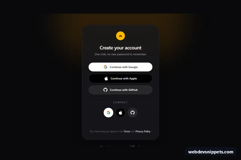
A dark set of "Continue with Google", "Continue with Apple" and "Continue with GitHub" buttons built with Tailwind CSS, for sign-up and sign-in pages that offer OAuth providers. It includes full-width pill buttons with labels and a compact row of round icon-only buttons, both with a built-in loading state.
How it works
The root is the .tsl-auth section, a full-height bg-zinc-950 page with a blurred amber glow and a rounded bg-zinc-900/80 card. Every provider button carries the .tsl-btn class and a data-tsl-provider attribute holding the provider name. The brand logos are inline SVG inside a .tsl-icon span; the wide buttons also have a data-tsl-label span with the visible text.
The script initializes each .tsl-auth on DOMContentLoaded and listens for click on every [data-tsl-provider] button. A click adds .tsl-loading and aria-busy="true" to that button, sets aria-disabled="true" on all buttons in the same root so a second provider cannot be started, changes the label to "Connecting to Google…" and writes the same text into the data-tsl-status message. In style.css, .tsl-loading hides the logo and draws a spinning ring with the tsl-spin keyframes. After the delay the state is restored and the status explains where the redirect would happen. Without JavaScript the buttons still render and can be turned into plain links.
Customization
data-tsl-delayon.tsl-auth: length of the simulated loading state in milliseconds (default1500).- In
script.js, replace thewindow.setTimeoutblock withwindow.location.href = '/auth/' + provider.toLowerCase();to start your real OAuth flow. rounded-fullon the.tsl-btnbuttons: switch torounded-lgfor squarer buttons that match a more formal form.bg-white,bg-blackandbg-zinc-800on the three wide buttons: the brand-approved fills for Google, Apple and GitHub; keep Google white to follow its guidelines.focus-visible:outline-amber-300: changeamberto your brand color to restyle focus rings, the status text and the logo badge together withbg-amber-400.- Add another provider by copying a button, changing
data-tsl-providerand swapping the SVG inside.tsl-icon. - Delete the "Compact" divider and the icon-only row if you only need the labeled buttons.
Accessibility
The section is labelled by its heading through aria-labelledby. Icon-only buttons get an aria-label such as "Continue with Apple", and every logo SVG sits in an aria-hidden span. During loading the script uses aria-disabled instead of the disabled property, so keyboard focus stays on the clicked button, and aria-busy marks it as working. Progress and results are announced through the role="status" paragraph. All buttons and links show an amber focus-visible outline with good contrast on the dark background, the hover lift is disabled with motion-reduce:hover:translate-y-0, and the spinner slows down under prefers-reduced-motion.
Usage notes
Several .tsl-auth blocks can share a page; each one tracks its own loading state.