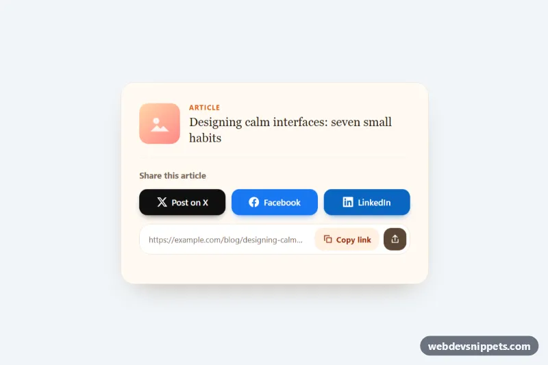
Social Share Buttons
Pure CSS social share card with brand-colored X, Facebook and LinkedIn buttons, a copy-link field with clipboard feedback and a native share fallback.
Share and social login buttons.
2 component(s)
Pure CSS social share card with brand-colored X, Facebook and LinkedIn buttons, a copy-link field with clipboard feedback and a native share fallback.
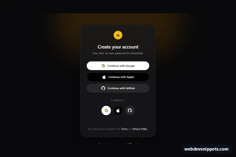
Dark Tailwind CSS social login buttons for Google, Apple and GitHub with full-width and icon-only variants and a loading spinner state.
Social buttons connect a website with external platforms. There are two main kinds: share buttons, which let visitors share the current page on networks or by email, and social login buttons, such as "Continue with Google" or "Sign in with GitHub", which start an OAuth sign-in. Follow buttons that link to your own profiles fall in the same family. They appear on blog posts, product pages, footers and login screens.
Share and follow links are navigation, so use <a> elements with descriptive text such as "Share on LinkedIn"; icon-only versions need an aria-label. If a link opens in a new tab, say so in the label. Social login buttons trigger an action and should be <button> elements or links with clear text, not just a logo. Brand colours do not always meet contrast requirements with white text, so check them. Simple share links built from plain URLs load far faster than third-party share scripts and do not track visitors, which also helps privacy.
These social media buttons HTML CSS snippets come in Bootstrap 6, Bootstrap 5, Tailwind CSS and pure CSS. Logos are inline SVG, so there is no external icon dependency. The buttons are front-end markup only: you add your own share URLs or connect the login buttons to your authentication provider. Filter by framework, check the live preview, then copy the HTML and CSS from the code tabs or download the snippet.